

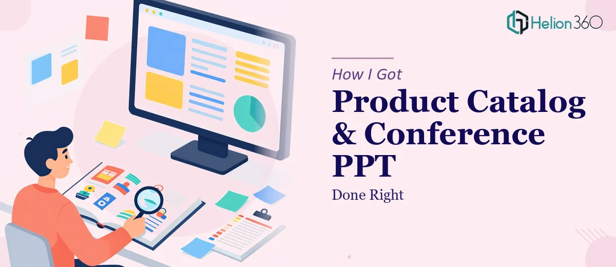
The Deadline Was Real. The Design Skills Were Not.
We had a product launch coming up in six weeks. On paper, the plan was clean — a new product catalog for the sales team and a PowerPoint deck for two upcoming industry conferences. In practice, it turned out to be a much heavier lift than anyone on the marketing team had anticipated.
I took ownership of both deliverables. I figured I could handle the catalog layout in a design tool and pull together the slides on my own. After all, I knew the products well, I understood our brand guidelines, and I had used PowerPoint more times than I could count.
Where Things Started to Break Down
The catalog was the first problem. I knew what information needed to go in — product specs, imagery, pricing structure, use cases — but the moment I started laying it out, I realized how much goes into making a catalog actually work visually. The hierarchy felt flat. The typography wasn't consistent. And every time I added a product image, the layout would shift in ways that looked messy on print preview.
The PowerPoint was a different kind of challenge. We needed slides that summarized key features, highlighted benefits, and walked through two real-world case studies — all in a way that would hold attention during a live conference presentation. My first draft looked like a report, not a presentation. Text-heavy, no real visual flow, and the color scheme didn't match our brand identity the way it needed to.
I spent nearly two weeks going back and forth. The content was solid. The execution wasn't.
Bringing in the Right Team
After hitting a wall, I came across Helion360. I explained both deliverables — the catalog and the conference deck — along with our brand guidelines, the product information, and what the end use cases were. Their team asked the right questions upfront: Who is the target audience? What tone should the catalog carry — premium, functional, or something in between? How many slides, and what's the presentation format at the conference?
That clarity told me they understood the actual problem, not just the surface request.
They took over from there. The catalog design came back with a grid-based layout that made the product pages scannable without feeling sparse. Typography was consistent across sections. The color palette matched our existing brand assets, and the imagery was placed in a way that let the products breathe without crowding the specs.
The PowerPoint slides were structured differently from what I had attempted. Instead of summarizing everything in bullet points, Helion360 broke the deck into clear visual sections — a feature overview, a benefits page built around icons and short labels, and two case study slides that used a simple before-and-after structure with supporting data. The slides were designed to complement what a speaker would say, not replace it.
What the Finished Work Actually Delivered
The catalog went to print and to the sales team within the deadline. Feedback from the field was immediate — people found it easier to navigate than our previous version, and the product visuals read clearly even at smaller print sizes.
At the conference, the deck held up. The audience could follow the presentation without reading ahead, and the case study slides prompted the most questions during Q&A — which is usually a good sign that the information landed.
The biggest lesson for me was understanding that catalog design and presentation design are not just about arranging information. They are about guiding how someone moves through that information. That skill takes more than good intentions and a template.
What I Would Do Differently
I would identify earlier that certain types of design work require a specialist's eye — not because the problem is impossible, but because the gap between functional and effective is where most of the value lives. In both deliverables, the content I provided was accurate. What was missing was the design thinking that made it usable.
Working with Helion360 on both pieces gave me a clearer picture of what a well-designed catalog and a well-structured PPT actually look like — and why those two things are genuinely different disciplines.
If you are working on a product catalog, a conference presentation, or both at the same time, Helion360 is worth reaching out to. They step in when the work gets too layered to manage alone and deliver output that actually holds up under real-world conditions.