

The Brief Was Clear — The Execution Was Not
We had an important round of client meetings coming up, and our leadership team wanted something more than a basic company overview. The goal was a high-end capability deck — one that would communicate what we do, why we're different, and how we deliver results. It needed to cover our unique selling propositions, relevant case studies, and team expertise, all wrapped in a visually sharp presentation design.
I was tasked with putting it together. I had a solid handle on the content — I knew our offerings inside out. But translating all of that into a polished, professional presentation that could hold attention in a boardroom? That was a different challenge entirely.
Where Things Started to Break Down
I started in PowerPoint. I laid out the key sections: an overview of our capabilities, service breakdowns, team bios, and a couple of case study summaries. The structure made sense. But the moment I tried to turn it into something visually compelling, I hit a wall.
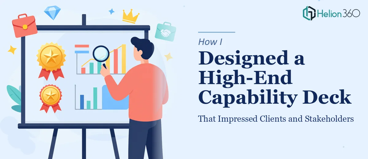
The charts looked flat. The layouts were inconsistent. I spent hours trying to make a single data visualization slide look clean, and it still felt amateur. The design trends I was referencing — layered typography, icon-driven storytelling, dark-mode aesthetics, refined grid layouts — were easy to admire but hard to execute without deep design experience.
I also realized I was spending time I didn't have. The presentation was due, the stakes were high, and I was still tweaking alignment on slide three.
Bringing in the Right Help
After hitting that wall, I came across Helion360. I explained what we needed — a capability deck in PowerPoint that would work for both client pitches and stakeholder reviews. I shared the content, our brand assets, and a few reference decks I admired.
Their team took it from there.
What stood out immediately was how structured their intake process was. They didn't just jump into design — they asked the right questions. What's the primary audience? What action should this deck drive? How much content needs to be on each slide versus what should be spoken?
Those questions shaped everything.
What the Final Capability Deck Looked Like
The finished presentation was a significant step up from what I had been building. Here's what made it work:
Visual hierarchy done right. Each slide had a clear focal point. The headers, body text, and visual elements were balanced so the viewer's eye knew exactly where to go.
Charts and data visualization that actually communicated. Instead of default bar charts, the team built custom visual representations of our performance data. The numbers told a story rather than just filling space.
Case studies that felt like evidence, not filler. The case study slides were structured to highlight the problem, our approach, and the result — all within a two-slide format that was easy to scan.
A consistent design language throughout. Fonts, colors, icon styles, and spacing were all cohesive. It felt like a premium corporate presentation, not a patchwork of individual slides.
The deck was built in PowerPoint but was also exported and optimized for Google Slides, so our team could present from any device without formatting issues.
The Outcome
We walked into that client meeting with a deck that commanded attention from the first slide. The feedback was immediate — one stakeholder commented that it was the most polished capability presentation they'd seen from a company our size. Two others asked if they could keep a copy for reference.
More importantly, the deck did its job. It communicated our value proposition clearly, gave weight to our case studies, and made our team credentials feel credible and specific rather than generic.
Looking back, the content was always there. What was missing was the presentation design expertise to surface it properly. That's not a gap you can close overnight — and trying to force it under time pressure usually makes things worse.
What I'd Tell Anyone in the Same Position
If you're working on a capability deck and you know the content but the design keeps falling short, that's not a reflection of your knowledge — it's just a different skill set. Knowing what to say and knowing how to visually structure it for maximum impact are two separate disciplines.
The details matter enormously in a high-stakes presentation. Spacing, font weight, chart clarity, slide flow — clients and stakeholders notice these things even when they don't consciously register them. A poorly designed deck can quietly undermine even the strongest content.
Need a Capability Deck That Actually Delivers?
If you're preparing for an important client pitch or stakeholder review and your current deck isn't doing justice to your work, Helion360 can help. Their team steps in when the design complexity or timeline makes it impractical to handle everything in-house — and they build presentations that reflect the quality of the work behind them.