

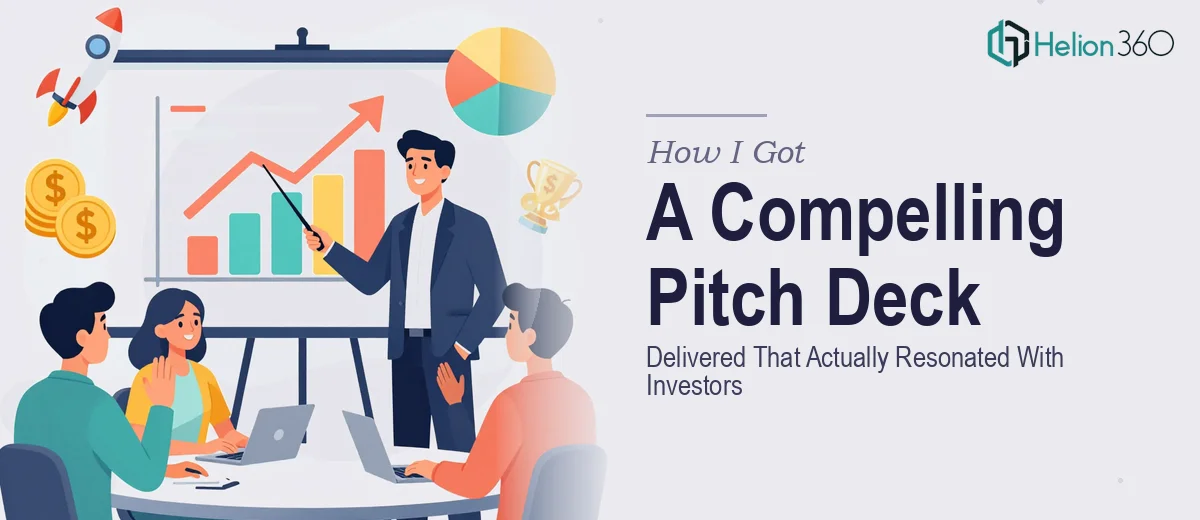
The Moment I Realized This Was More Than a Slide Deck
We had an investor meeting coming up. Not a casual introductory call — a real sit-down with people who see dozens of pitch decks every month and make snap judgments in the first two minutes. The stakes were clear: show up with something sharp and story-driven, or lose the room before the first question.
I had the raw material — a strong business model, early traction, a clear market opportunity. What I didn't have was a presentation that could carry all of that and land with the right weight. I knew what a weak pitch deck costs you. I also knew I didn't have the weeks it would take to figure out how to build a great one from scratch. This needed to be done right, and it needed to be done fast.
What I Found Out a Great Pitch Deck Actually Requires
Once I started looking seriously at what separates a forgettable investor pitch deck from one that moves people to action, the complexity became apparent quickly.
First, it's not a design problem — it's a narrative problem that design solves. Investors aren't reading slides; they're following a story. The structure has to do specific work: establish the problem with enough tension to create urgency, introduce the solution in a way that feels inevitable, and build to the ask without the audience feeling like they're being sold to.
Second, the visual language has to carry credibility. Fonts, color, spacing, hierarchy — these aren't aesthetic choices. They signal whether a company is serious. A misaligned layout or an inconsistent color palette communicates sloppiness before a single word is read.
Third, every data point in the deck — market size, traction metrics, projections — has to be presented in a way that's instantly scannable and defensible. Investors probe these slides. If a chart is ambiguous or a number feels buried, it creates doubt rather than confidence.
I realized quickly that doing this well is a specialized discipline, not a weekend project.
What Building a Pitch Deck at This Level Actually Involves
The work starts with narrative architecture. A strong investor pitch deck follows a proven story structure — problem, solution, market, business model, traction, team, and ask — but the real skill is in calibrating the weight given to each section based on what the specific audience cares about most. Seed-stage investors weight team and vision heavily; later-stage investors lean on traction and unit economics. Getting this calibration wrong means the deck feels generic. Mapping the narrative arc against the audience's decision criteria, then sequencing slides so each one earns the next, takes real craft and experience with how investors actually think.
Once the narrative is locked, the visual mechanics have to execute it precisely. A proper pitch deck uses a consistent layout grid — typically a 12-column structure — with a typography hierarchy of roughly 36pt for headlines, 24pt for subheads, and 16pt for body copy. The color palette is disciplined: three to four brand colors maximum, with a clear primary, secondary, and accent. Deviating from this even slightly across slides — a rogue font weight here, an off-brand shade there — breaks the visual coherence that makes a deck feel premium. Setting this up correctly in master slides and propagating it consistently across 15 to 20 slides is painstaking work that trips up even experienced PowerPoint users.
Data visualization is its own challenge inside a pitch deck. Market size slides, traction charts, and financial summaries each require chart types chosen to communicate a specific point, not just display data. A TAM/SAM/SOM breakdown rendered as nested circles reads instantly; the same data in a table forces the audience to do mental work they won't do in a live meeting. Annotations, callouts, and highlighted data points have to be placed so the eye lands exactly where the story needs it. Getting this right requires both design judgment and a clear understanding of what investors are looking for when they scan each of these slides.
Why I Brought Helion360 In to Handle the Full Project
I looked at what the work actually involved — the narrative architecture, the visual system, the data presentation — and it was immediately clear that attempting this myself wasn't the right call. Not because it's impossible to learn, but because I didn't have the weeks to learn it at the level needed, and the meeting wasn't moving.
Helion360 handled the full project end-to-end. That meant starting from the raw content I had — bullet points, data exports, a rough deck outline — and building a complete, investor-ready pitch deck from the ground up. They handled the story structure, the visual system, the chart design, and the final polish across every slide. The whole thing was turned around quickly — done in days, not weeks — and the output was at a level I couldn't have reached on my own in the time available. That's exactly what you need when the meeting is real and the timeline is fixed.
The Outcome, and What I'd Tell Anyone Seeing What I Saw
The deck that came back was cohesive, visually sharp, and structured in a way that made the business case feel clear and compelling without overselling. Every section did the job it needed to do. The investor meeting went well — the questions were substantive, which is what you want. The deck held up under scrutiny because it was built to.
If you're looking at a similar situation — real investor meetings, high stakes, and a recognition that building a pitch deck at this level requires expertise you don't have time to develop right now — Helion360 is the team to engage. They deliver fast, they handle the full execution depth this kind of work demands, and the result is a deck that actually does the job.