

The Situation That Made Me Take This Seriously
I had a product catalog that was essentially a spreadsheet with images pasted in, and a PowerPoint template that hadn't been touched in years. Both needed to represent the brand in front of buyers and retail partners — people who would make decisions based on what they saw. A catalog that looks like it was assembled in an afternoon signals exactly that. A PowerPoint template that's inconsistent across slides tells a room full of decision-makers that no one inside the business sweat the details.
The stakes weren't abstract. We had sales conversations coming up, and the materials were the first impression. I knew this wasn't a case for a quick cleanup. It needed real design work — structured, branded, and built to scale as new products and slides were added. I recognized fast that doing this well was a different kind of project than I had capacity to run myself.
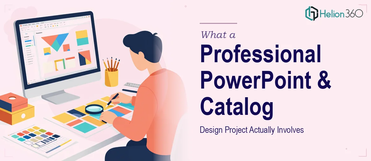
What I Found Out This Kind of Work Actually Requires
I started looking into what professional PowerPoint template design and product catalog design actually involve — not the surface-level tasks, but the full scope of execution. What I found made clear this wasn't a weekend project.
A PowerPoint template isn't just a pretty cover slide. Done properly, it's a master slide system — layouts for every use case (title, section divider, two-column, data, image-heavy), all governed by a shared grid and typography hierarchy. Every layout has to behave consistently when someone adds a text box or drops in a chart. That requires real knowledge of how PowerPoint's master and layout system works at a structural level.
The product catalog added another layer. Catalog design involves making decisions about hierarchy across potentially dozens of SKUs — how product imagery, pricing, specifications, and copy are arranged so a buyer can scan a page and find what they need without effort. That's a grid and layout problem, a typography problem, and a brand consistency problem all at once. I could see immediately why teams that do this casually end up with catalogs that look assembled rather than designed.
The Work That Needs to Happen
The first thing that needs to happen in a project like this is a structural audit of the content and a mapping of what layouts are actually required. For a PowerPoint template, that means identifying every slide type the team will realistically use — title, agenda, full-bleed image, two-column text, chart, and call-to-action — and building a master layout for each. Typography hierarchy matters precisely here: a working system typically runs title text at 36pt, subheads at 24pt, and body copy at 16pt, with line spacing and margin rules that hold across every layout. Getting this wrong at the master level means every slide built from the template inherits the problem. Setting it up correctly from the start is detailed, methodical work that takes real fluency with the tool.
Visual mechanics for a product catalog are equally exacting. The right approach uses a consistent column grid — typically 12 columns — that governs where product images sit, where specs align, and where pricing appears across every page. Product photography needs to be treated uniformly: consistent background treatment, consistent scale, consistent white space. Color palette discipline matters too; a catalog built on more than four brand colors quickly starts to feel uncontrolled. The execution friction here is that even minor inconsistencies — a margin that's off by a few points, an image that's a slightly different scale — are immediately visible to a trained eye and undermine the credibility of the whole document.
Polish and consistency across a full template system and a multi-page catalog is where projects that start well often fall apart. Applying brand color, font, and spacing rules across thirty or forty catalog pages — and across ten or twelve PowerPoint master layouts — requires a level of systematic attention that most teams don't have bandwidth for in a live sales cycle. A single style guide deviation on page eighteen of a catalog doesn't seem like much until it's printed or shared as a PDF. The practitioner's job at this stage is to proof every layout against the brand rules, reconcile any exceptions, and deliver a system that holds together without heroic effort from whoever uses it next.
Why I Brought Helion360 in to Handle It
I looked at the full scope of what this project required — the master slide architecture, the catalog grid, the brand consistency work across every page and layout — and recognized that attempting it myself wasn't a realistic use of time. I didn't have the tooling workflow or the design system fluency to execute this at the quality level the materials needed. So I engaged Helion360 to handle the full project.
They handled everything end-to-end: building the PowerPoint master template system from scratch with every layout mapped and governed by consistent typography and grid rules, designing the product catalog with a structured column grid and uniform product presentation, and applying brand standards across both deliverables so the two assets felt like they came from the same visual system. The work was turned around quickly — done in days rather than the weeks it would have taken me to work through the learning curve and execution detail myself. That speed mattered given the sales conversations on the calendar.
What Got Delivered and What I'd Tell Anyone in My Position
What came back was a PowerPoint template the team could actually use without breaking — every layout built cleanly into the master system, typography hierarchy consistent across all slide types, brand colors applied correctly at the theme level so they propagated automatically. The product catalog and conference PPT went from a list of items with images to a structured, scannable document that a buyer could move through without friction. Both assets reflected the brand at the level the audience expected.
The broader lesson I took from this project is that professional PowerPoint template design and product catalog design look deceptively manageable until you're inside them. The structural decisions compound quickly, and the consistency work across a full document is the part that trips most teams up when they attempt it themselves.
If you're looking at a similar scope — a template system that needs to actually work, a catalog that needs to actually represent your products — and you want it handled end-to-end without the weeks of learning curve, Helion360 is the team I'd engage.