

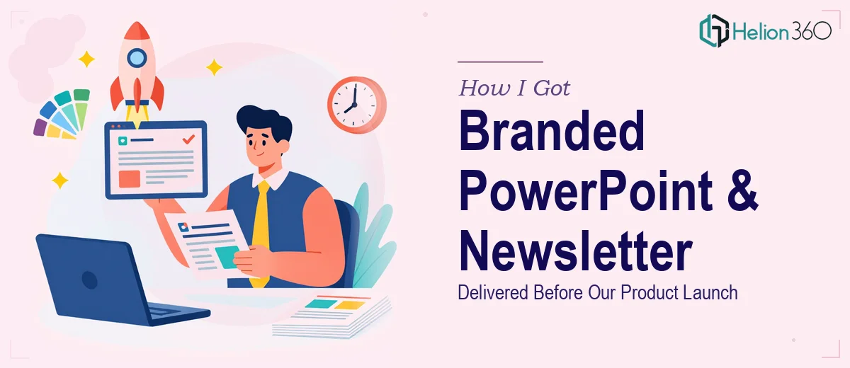
The Clock Was Already Running When I Realized the Scope
We had a product launch event locked in the calendar, a growing audience that cared deeply about sustainable living, and exactly no visual assets that felt cohesive. What I had was a brand direction — eco-forward, clean, approachable — and a mental image of what our materials should look like. What I didn't have was time to figure out how to get there.
The stakes were real. This launch was the first moment a lot of people would see us as a serious brand, not just a scrappy startup with good intentions. The PowerPoint template would be used by the team for everything from pitch meetings to community events. The newsletter would go out to our subscriber list and set the tone for every communication that followed. Both pieces needed to feel like they came from the same place — visually and tonally — while each doing its own job.
I knew immediately that guessing at this was not an option.
What I Found Out This Actually Takes to Do Right
When I started looking into what a properly designed branded PowerPoint template and newsletter actually require, the picture got more complex fast.
A PowerPoint template isn't just picking colors and dropping in a logo. Done well, it means building a master slide system — title layouts, content layouts, divider slides, data slides — all governed by a consistent grid and typographic hierarchy. Typography alone involves decisions like enforcing a 36pt/24pt/16pt heading scale, choosing font pairs that read well both on screen and in print, and making sure nothing breaks when someone on the team edits a slide.
The newsletter side has its own set of constraints. Email-safe design means working within column structures that don't collapse on mobile, using web-safe or embedded fonts, and knowing which visual treatments survive rendering across different email clients. The layout has to balance product highlights, editorial content, and calls to action without feeling cluttered.
Two deliverables, each with its own discipline, and both needing to feel like one brand. That's not a weekend project.
What the Work Actually Involves
The right approach starts with a thorough audit of the brand inputs — color palette, logo files, existing brand voice — and then mapping those inputs to a design system that can scale. For the PowerPoint template, that means establishing a master slide architecture with at minimum six to eight slide layouts covering the core use cases: title, section break, two-column content, full-bleed image, data/chart, and closing. Each layout needs to operate on a consistent grid, typically a 12-column structure, with margins and safe zones that hold across widescreen and standard aspect ratios. Getting that propagation right across every master layout is painstaking work — a single misaligned element in the master cascades into every slide that inherits from it.
Visual mechanics on the newsletter side operate under a different set of rules. A well-built newsletter template uses a single-column or two-column responsive structure with a max content width around 600px, padding that protects readability on small screens, and a clear typographic hierarchy — typically 22pt for section headers, 16pt for body, and a distinct style for CTAs. Color use needs to be disciplined: a palette of no more than three to four brand colors applied consistently so the eye knows where to go. The friction here is that what looks clean in a design tool doesn't always translate cleanly to an email client, and testing across rendering environments takes real time.
Polish and brand consistency across both deliverables is where the work either holds together or falls apart. Every icon set, divider style, and background treatment needs to feel like it belongs to the same family. That means defining a small set of reusable graphic elements — maybe two to three accent shapes, one illustration style, a consistent photo treatment — and applying them with the kind of discipline that only comes from having a system, not just a mood board. For a brand built around simplicity and eco-friendliness, the restraint required in that visual language is actually harder to execute than something more decorative.
Why I Brought Helion360 In to Handle the Full Project
I looked at what this project actually required and made the call quickly. Building a master slide system, designing a responsive newsletter template, and making both feel like one cohesive brand — that's not something I could teach myself in the days I had before the launch.
Helion360 handled the full project end-to-end. That meant taking the brand brief, developing the complete PowerPoint master slide architecture, designing the newsletter layout with proper responsive structure, and making sure both deliverables shared a unified visual language. The team turned everything around quickly — done in days, not the weeks it would have taken me to get even halfway through the learning curve on the template system alone.
What made the difference was that this is work they do all day. The tooling is already in place, the design system thinking is built in, and the decisions that would have tripped me up — grid setup, font pairing, email rendering considerations — were handled as a matter of course.
What We Walked Away With and What I'd Tell Anyone in My Spot
We went into the launch event with a PowerPoint template the whole team could actually use — consistent, on-brand, and flexible enough to cover every presentation scenario we'd need. The newsletter design launched the same week, and the feedback from subscribers was immediate. People noticed that it looked like a real brand.
The bigger win was that both pieces set a foundation. Every slide and every email we send now starts from something designed with intention, not improvised from a default theme.
If you're staring at a product launch deadline with brand materials that need to be built from scratch — and you need a PowerPoint template and newsletter design that actually hold together — Helion360 is the team to engage. They delivered the full scope fast, and the execution depth showed in every detail.