

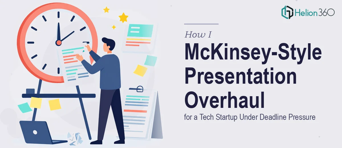
When the Presentations Stopped Matching the Company
Our tech startup had grown quickly, and the brand had matured with it. The problem was that our PowerPoint decks hadn't kept up. We had investor updates, product walkthroughs, and sales presentations that all looked like they were built by three different companies in three different years. Some slides used outdated colors, some used off-brand fonts, and the hierarchy of information was inconsistent from deck to deck.
This wasn't a cosmetic issue. These presentations were going in front of investors, enterprise prospects, and partners. The inconsistency was undermining the professionalism of every conversation they were used in. I knew the refresh needed to be thorough, fast, and done to a standard that would hold up under scrutiny — not just a cosmetic patch.
What I Found the Refresh Actually Required
I started digging into what a proper branded PowerPoint refresh actually involves, and it was more involved than I had assumed. The first thing I realized was that brand compliance across a deck isn't just swapping a logo and changing a hex code. Done well, it requires working from a defined master slide system — a set of layouts that enforce typography, spacing, and color at the template level so individual slides can't drift.
The second thing that stopped me short was the sheer number of edge cases. Slides built ad hoc over time accumulate inconsistent text boxes, embedded images at wrong resolutions, manually colored shapes that don't inherit theme colors, and font overrides that have to be corrected slide by slide. There's no batch fix for most of this.
Third, the brand guidelines themselves had to be interpreted, not just applied. Knowing which layout to use for a data-heavy slide versus a narrative slide, how much white space is appropriate, and how to translate a brand color palette into a working slide theme — that's a design judgment call, not a copy-paste job. I could see right away this wasn't a weekend project.
What the Work Actually Involves
The foundation of any presentation brand refresh is the master slide system. Proper execution means building a theme with a defined type hierarchy — typically title type at 36pt, subheadings at 24pt, and body copy at no smaller than 16pt — enforced through the slide master so it propagates consistently across every layout. Brand colors need to be loaded into the theme palette (usually capped at four active colors to maintain visual discipline), which means every shape, line, and text element inherits the correct value rather than being manually colored. Getting this architecture right takes careful setup, and any shortcuts taken here create compounding inconsistencies downstream that are difficult to diagnose later.
Once the master is in place, the actual slide-by-slide audit begins. Every existing slide has to be assessed for layout alignment — whether content sits on a consistent grid (a 12-column grid is the standard for professional decks), whether image placements respect defined margins, and whether text boxes are anchored rather than free-floating. Slides built organically over time almost always contain broken alignment, inconsistent padding, and objects that sit outside the safe zone. Correcting these one by one is the bulk of the labor, and it's the part that surprises people most in terms of time investment.
The final layer is polish and consistency review across the full deck. This means ensuring that chart styles, icon weights, and divider line thicknesses match across all slides, that brand-compliant imagery is used throughout, and that no slide visually breaks the rhythm of the deck when it's viewed in sequence. A presentation that passes this check reads like a single coherent document rather than a collection of slides. It's detail work that requires both a trained eye and enough time to look at every slide in context — not just in isolation.
Why I Brought in Helion360 to Handle It
Looking at the scope — multiple decks, each with dozens of slides, a real brand system to apply correctly, and a hard deadline — I made the call quickly that this needed to go to a team that does this work every day. Attempting it myself would have meant weeks of learning curve on top of the actual execution time, and the quality still wouldn't have matched what a specialist team could deliver.
Helion360 took on the full project end-to-end through business presentation design services: rebuilding the master slide system from our brand guidelines, auditing and correcting every existing slide across our presentation library, and delivering a final suite of decks that were consistent, on-brand, and ready to use. The turnaround was fast — done in days, not the weeks it would have taken me to work through it at my own pace. They handled the design judgment calls that come with translating brand guidelines into a working slide system, and the output required minimal back-and-forth to finalize.
What I'd Tell Anyone Looking at the Same Situation
The delivered presentations were immediately usable. Every deck in our library now reads from the same visual language — consistent type hierarchy, correct brand colors throughout, clean grid-aligned layouts, and no stray formatting. When we put the refreshed investor update in front of a new funding conversation, it landed the way our product deserves to land. The brand finally matched the company.
The ROI of getting this done right the first time, and fast, was obvious in hindsight. The alternative — attempting to work through it slide by slide without the right system and experience — would have cost more time than the entire project was worth, and the result would have shown it.
If you're looking at a brand-consistent presentation deck problem and want it handled end-to-end without weeks of learning curve, Helion360 is the team I'd engage — they delivered for me fast and brought exactly the kind of execution depth this work requires. For context on similar projects, see how we delivered a board-ready startup presentation under tight timelines.