

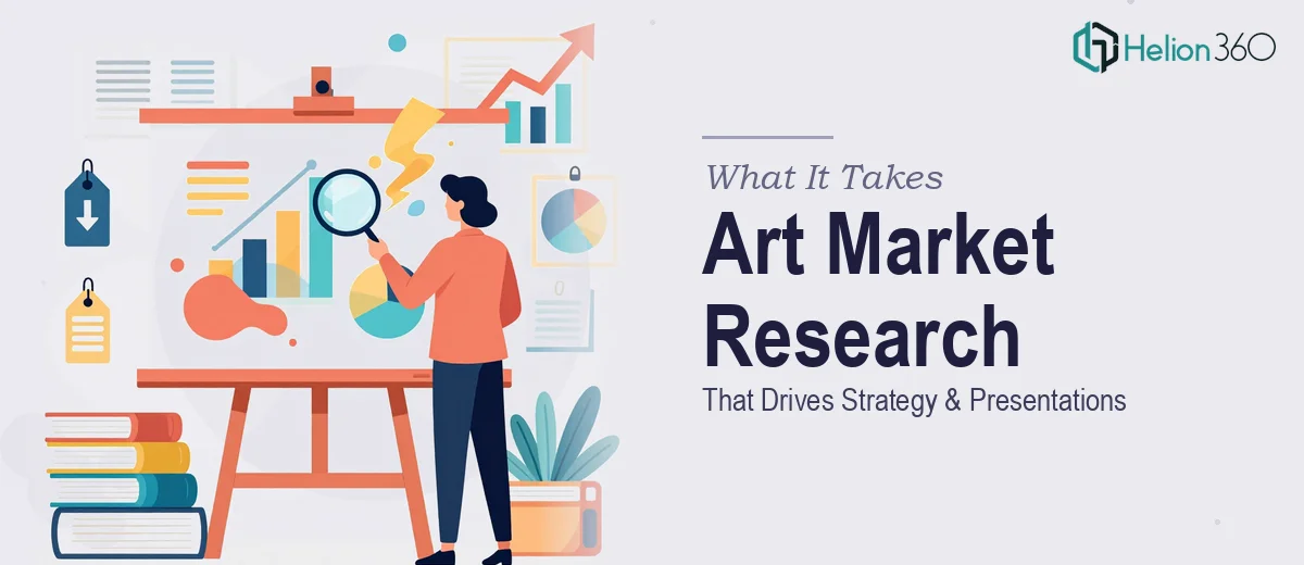
The Problem We Were Staring Down
We run a small but growing gallery in New York City focused on emerging contemporary artists. Over the past couple of years, collector interest has picked up noticeably, and the team had started making decisions more on instinct than on structured data. That needed to change. We had a real opportunity to use market research — sales patterns, trend data, exhibition activity, collector behavior — to actually shape our growth strategy. But the research alone wasn't going to move anyone. It needed to live inside presentations: one that told the story of where the contemporary art market stands today, and one that laid out our gallery's forward vision for stakeholders and partners. The stakes were clear. If the presentations didn't land, the research wouldn't get used. We needed both deliverables done properly, and we needed them fast.
What I Found This Actually Required
I started by mapping out what "done well" actually looked like for this kind of project. The first thing that became obvious was that art market research isn't a single data source — it's a synthesis of auction house reports, gallery sales data, exhibition schedules, collector sentiment, and broader economic signals. Pulling that into a coherent narrative takes genuine domain fluency, not just research skills.
The second thing I noticed was the translation problem. Raw findings — trend lines, segment breakdowns, artist pricing data — don't automatically become a presentation. Someone has to decide which insights are structurally load-bearing, which support them, and which belong in an appendix. That editorial judgment is its own skill set.
The third signal was visual. Contemporary art audiences, collectors, and gallery partners have high aesthetic expectations. A presentation in this space that looks generic or templated immediately loses credibility. The visual execution had to match the subject matter. Putting those three requirements together — domain-specific research synthesis, narrative architecture, and premium visual execution — made it immediately clear this was not a solo weekend project.
The Work That Needs to Happen
The first layer of the work is structural: auditing what the research actually contains and building a narrative spine before a single slide gets laid out. For a market research presentation design, that means sorting findings into a clear hierarchy — macro market conditions at the top, then segment-level trends (e.g., emerging versus mid-career artists, primary versus secondary market), then gallery-specific implications. Each section needs a single governing insight, not a dump of data points. Getting this architecture right typically means multiple passes through the source material. People who skip this step end up with slides that inform but don't persuade — and in a stakeholder setting, that's a failure regardless of how good the underlying research is.
The second layer is visual mechanics. Presentation design that works in an art-world context has specific requirements: a restrained color palette — typically no more than four brand-anchored colors — a clean typographic hierarchy running roughly 36pt for section headers, 24pt for slide titles, and 16pt for body, and a layout grid (usually 12 columns) that keeps every element visually grounded. Charts need to be chosen deliberately: a trend line reads differently than a grouped bar chart, and using the wrong one for a particular data set creates confusion even when the numbers are right. Building this system from scratch in PowerPoint and propagating it correctly across master slides takes hours for someone who doesn't do it daily — and small inconsistencies compound quickly across a 25-to-30 slide deck.
The third layer is polish and brand consistency. For a gallery, the presentation itself is a representation of your curatorial sensibility. That means image selection, spacing discipline, and typographic consistency all carry weight they wouldn't in a generic business context. Every slide has to feel intentional. Palette drift, inconsistent margins, or misaligned icons aren't just aesthetic problems — they signal carelessness to an audience that notices. Applying this level of finish across two full presentations, while keeping both visually related but narratively distinct, requires a practitioner who has done it many times across many slide counts.
Why I Brought in Helion360 to Handle It
Once I understood what the full scope of work actually looked like, attempting it in-house wasn't a real option. The research synthesis, narrative structuring, and visual execution together represented weeks of work for someone building the capability from scratch — and we didn't have weeks.
I engaged Helion360 to handle the project end-to-end. That meant the full research compilation and analysis, the narrative architecture for both presentations, and the complete visual production. They handled the translation from raw market data into a structured story, built out the slide systems, and delivered both decks turned around quickly — in a fraction of the time it would have taken to learn and execute this internally.
What made the difference was that their team already had the tooling, the design systems, and the research presentation experience in place. There was no ramp-up. The work was done in days, not weeks, and it came back at the quality level the subject matter demanded.
What Was Delivered and What I'd Tell Anyone in This Spot
We ended up with two complete, polished presentations. The first gave our team and partners a clear, evidence-backed picture of where the contemporary art market is moving — which segments are active, what collector behavior looks like right now, and where the realistic opportunities sit for a gallery at our stage. The second laid out our gallery's forward strategy in a way that was grounded in the research and genuinely persuasive. Both presentations have since been used in multiple stakeholder conversations and have shaped how we're approaching the next phase of growth.
If you're looking at a similar situation — research that needs to become a real presentation for a real audience, with no time to build the capability yourself — Helion360 is the team I'd engage. They delivered end-to-end, fast, and at the execution depth this kind of work actually requires.