

The Situation and What Was Actually at Stake
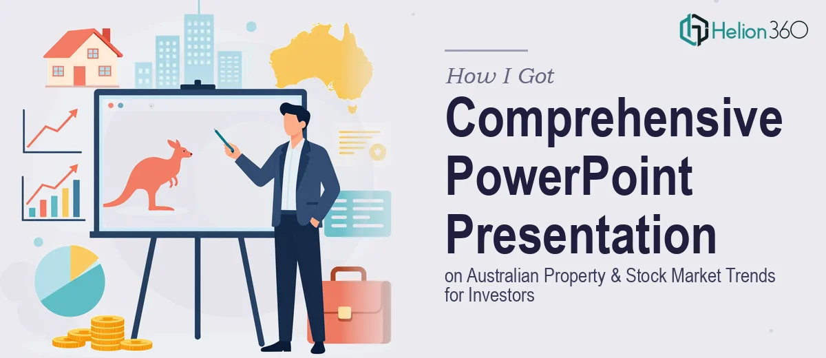
I needed a comprehensive PowerPoint presentation covering Australian property and stock market trends — built for an audience of investor professionals who would scrutinize every data point, every chart, and every narrative claim. This wasn't a summary slide deck for a general audience. It was a structured analytical presentation that had to move through macro economic conditions, sector-specific data, and forward-looking commentary in a way that felt credible, clear, and visually authoritative.
The deadline was firm. The audience was demanding. And the source material — spanning RBA data, CoreLogic property indices, ASX sector performance figures, and independent research — was substantial and scattered. I recognized early that pulling this together into a polished, coherent investor presentation wasn't something I could afford to half-do. It needed to be done right, or it would undermine the credibility of everything being presented.
What I Found a Presentation Like This Actually Required
Once I started mapping out what a proper Australian property and stock market trends presentation would involve, the scope became clear fast.
First, the data sources weren't uniform. Property trend data, equity market performance figures, and economic indicators each come in different formats, updated on different cycles, and carrying different levels of methodological precision. Aligning them into a consistent narrative requires real analytical judgment — not just copy-paste.
Second, investor professionals are a specific audience. They read presentations differently from general business audiences. They expect logical sequencing — macro context first, sector breakdown next, implications last. They notice when chart types are mismatched to the data being shown. They lose confidence in a deck that looks inconsistent or rushed.
Third, the visual treatment of financial and property data has conventions. Dual-axis charts, indexed performance comparisons, heat maps for geographic property data — these aren't decorative choices. They're functional requirements that signal analytical literacy to the audience. Getting them wrong isn't just an aesthetic problem; it's a credibility problem.
The Work That Needs to Happen
The foundation of any presentation covering Australian property and stock market trends is the structural and narrative layer. The work involves auditing all source data, mapping a logical story arc — typically opening with macro conditions (interest rates, inflation, GDP context), moving into property sector performance by segment and geography, then transitioning to equity market trends by sector — and ensuring the argument builds across slides rather than simply listing facts. A well-structured investor presentation runs roughly 20–30 slides with a clear through-line. The friction here is real: source data arrives in tables, PDFs, and spreadsheets that weren't designed to talk to each other, and building a coherent narrative out of them takes time that most people significantly underestimate.
Visual mechanics are the second layer — and this is where complexity compounds. Proper data visualization for this kind of presentation means matching chart types to data types precisely: indexed line charts for relative performance comparisons, clustered bar charts for year-on-year sector breakdowns, and geographic heat maps for property price movement by region. Typography hierarchy follows a strict rule — typically 36pt for slide titles, 24pt for data callouts, and 16pt for supporting annotation. A 12-column layout grid is used to keep chart placement, label spacing, and text blocks optically consistent across every slide. Without a master slide structure that enforces this, alignment breaks across the deck in ways that are easy to see and hard to fix quickly.
Polish and consistency close the loop. An investor-grade presentation applies a maximum of four brand colors with defined usage rules — primary for key data points, secondary for supporting context, neutral tones for backgrounds and grid lines. Every chart legend, axis label, and footnote needs to follow the same formatting convention across all slides. The execution friction here is volume: a 25-slide deck with eight or nine data-heavy charts means dozens of individual formatting decisions that need to be made and then held consistently. A single inconsistent legend label or misaligned axis title reads immediately to a trained audience as a sign the deck was assembled rather than designed.
Why I Brought in Helion360 to Handle It
I didn't attempt to build this presentation myself. Looking at what proper execution actually required — consistent data visualization conventions, a disciplined narrative structure, and a visual treatment that would hold up in front of investor professionals — I recognized immediately that engaging the right team was the smart move.
Helion360 handled the full project end-to-end: source data organization and narrative mapping, slide architecture and layout grid setup, chart construction and brand-consistent visual treatment across all slides. The deck was turned around quickly — done in days rather than the weeks it would have taken me to learn and execute the visual mechanics alone, let alone coordinate the data layer and storytelling.
What made the difference was that this is work Helion360 does all day. The tooling, the templates, the conventions for investor-facing financial presentations — all of it was already in place. There was no ramp-up time, no trial and error on chart formatting, no back-and-forth on layout decisions that didn't resolve.
The Result and What I'd Tell Anyone in the Same Position
What was delivered was a presentation that read like it had been built by a team that understood both the data and the audience. The narrative moved cleanly from macro context through property sector analysis to equity market trends, with each section supported by charts that were appropriately typed, labeled, and visually consistent. The deck held up under scrutiny — which, for an investor professional audience, is the only standard that matters.
The business outcome was straightforward: the presentation performed as intended. The audience engaged with the analysis rather than getting distracted by visual inconsistency or structural gaps. That's the result a well-executed investor presentation should produce.
If you're looking at a similar project — complex financial or market data, a demanding professional audience, and a deadline that doesn't leave room for a learning curve — Helion360 is the team to engage. They handled the full scope fast, and the execution depth showed in the final product.