

When the Brief Looked Simple but Wasn't
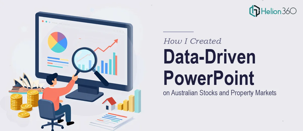
The request seemed straightforward enough: build a PowerPoint presentation covering the Australian stock market and the property sector. Charts, key trends, some global context — that kind of thing. I figured a few days of research and decent slide-building skills would be enough to pull it together.
I was wrong about the timeline.
The moment I started pulling data, I realised how layered this topic actually is. Australian stocks are tied to commodity cycles, interest rate decisions from the RBA, and sector-specific volatility that shifts week to week. The property market is even more fragmented — residential versus commercial, state-by-state pricing differences, vacancy rates, foreign investment flows. Getting all of that into a coherent, well-designed presentation was a different challenge entirely.
The Research Problem
I spent the first two days just gathering data. Economic indicators, ASX sector performance, housing price indices, rental yields, office vacancy trends in Sydney and Melbourne. The numbers were all there across various reports and government datasets, but turning them into something visual and digestible was where things started to slow down.
I knew what I wanted each slide to say. I had a rough flow. But when I opened PowerPoint and started building, the slides looked cluttered. I was cramming too much into each one, trying to show context while also telling the story. The charts I built were technically accurate but visually flat. The data was there — the communication wasn't.
On top of that, the comparison section — where Australian market performance needed to be benchmarked against global counterparts like the US, UK, and Singapore — required a level of visual framing I wasn't confident executing cleanly under time pressure.
Bringing in the Right Support
After hitting a wall on the design side, I came across Helion360. I explained what the deck needed to do — research-backed, data-forward, covering both the Australian stock market and the property sector, with a section comparing these trends globally. Their team understood the brief quickly and asked the right questions about tone, audience, and how technical the slides should be.
From there, they took over the heavy lifting. I passed along all the research I had compiled — the datasets, the rough slide structure, the key points I wanted to land — and they got to work.
What the Final Presentation Covered
The finished deck was structured in a way that made complex information genuinely accessible. It opened with a macro overview of recent Australian economic indicators and how they were influencing equity markets, particularly across resources, financials, and real estate investment trusts. That context made everything that followed easier to understand.
The property section was handled with similar clarity. Rather than throwing every metric onto a single slide, the team broke the analysis across residential and commercial segments, highlighting trends in capital city markets alongside interest rate sensitivity and supply constraints. Charts were clean, well-labelled, and designed to be read quickly — which matters when you're presenting to a room.
The global comparison slides were some of the strongest in the deck. Benchmarking Australian market performance against comparable economies gave the whole presentation a broader perspective without losing the local focus. It gave the audience a way to contextualise what they were seeing, not just absorb raw numbers.
Throughout, the visual design matched the data-driven nature of the content. No decorative noise — just clean layouts, consistent type hierarchy, and charts that communicated at a glance.
What I Took Away From This
This project reminded me that building a market research presentation is not just a design problem or a research problem — it's both at once. The data has to be solid, and the visual language has to carry it properly. When either side is weak, the whole thing falls apart.
I also learned that trying to do both well, quickly, across a topic as multifaceted as Australian stocks and property, is genuinely difficult. Having the right team behind the work made the difference between a functional slide deck and one that could actually hold an audience's attention.
If you're working on something similar — market data analysis, financial analysis, or any presentation where the data is dense and the stakes are real — Helion360 is worth reaching out to. They handled the complexity I couldn't manage alone and delivered a data-driven presentation that was ready to present.