

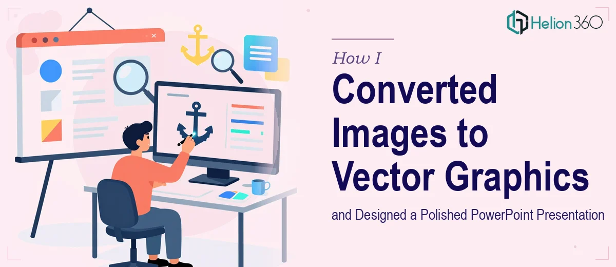
When the Presentation Needed More Than a Screenshot
I had a PowerPoint presentation that needed to look sharp across every screen size — from a laptop to a projected display at a boardroom. The problem was that most of my source images were raster files. They looked fine at small sizes but blurred and pixelated when scaled up. I knew the solution was to convert those images to vector graphics, but I had underestimated how involved that process actually was.
At first, I figured I could handle the conversion myself. I had basic familiarity with design tools and thought a few hours of work would be enough to clean everything up and drop the vectors into the PowerPoint slides.
Where the Process Got Complicated
The images I was working with were not complex illustrations, but they had enough detail — fine lines, subtle curves, text overlays — that an automated trace in any tool produced messy results. Each vector needed manual cleanup to look intentional and professional. I spent a couple of days adjusting paths and anchor points, and the results still did not meet the standard I needed.
Beyond the conversion itself, placing the vectors inside the PowerPoint presentation brought its own set of challenges. Text had to be legible at different scales, spacing had to be consistent across slides, and the overall layout needed to reflect a coherent visual identity. It was not just a technical task — it required real design judgment.
I was running out of time and patience.
Bringing In the Right Help
After hitting a wall with the vector conversion and slide layout, I came across Helion360. I explained the scope — a series of raster images that needed to be redrawn as clean scalable vector graphics, with text added and everything arranged inside a finished PowerPoint presentation. Their team asked the right questions upfront: about the intended output size, the branding style, the fonts I was using, and how the slides would be presented.
That conversation alone told me they understood the full picture, not just the technical steps.
What the Finished Work Looked Like
Helion360 took the source images through a proper vector conversion process using Adobe Illustrator, rebuilding each graphic cleanly rather than relying on automated tracing. The resulting vectors held their quality perfectly regardless of how they were scaled inside the slides.
Once the vector graphics were ready, they integrated them into the PowerPoint with careful attention to text placement, spacing, and visual flow. Every slide felt consistent. The layout had a clear structure, the text was legible without crowding the graphics, and the overall presentation reflected the branding direction I had outlined.
When I reviewed the final file, the difference from where I had started was significant. The slides looked like they had been built with intent, not assembled from workarounds.
What I Took Away from This
Converting images to scalable vector graphics is genuinely skilled work when the output has to be presentation-ready. Automated tools can get you partway there, but professional judgment is what separates a clean vector from a messy one. And once those graphics need to live inside a polished PowerPoint presentation — with consistent branding, proper typography, and a logical visual hierarchy — the complexity multiplies.
I learned that the time I spent trying to do it myself would have been better used reviewing the final work rather than producing it. The presentation was the deliverable. Everything else was a means to get there.
If you are working through something similar — images that need to be vectorized properly and built into a presentation that actually looks finished — Helion360 is worth reaching out to. They handled the parts I could not and delivered exactly the result I needed. Learn more about how I handled similar challenges converting static graphics into editable PowerPoint and Excel files and designing polished PowerPoint presentations for product launches.