

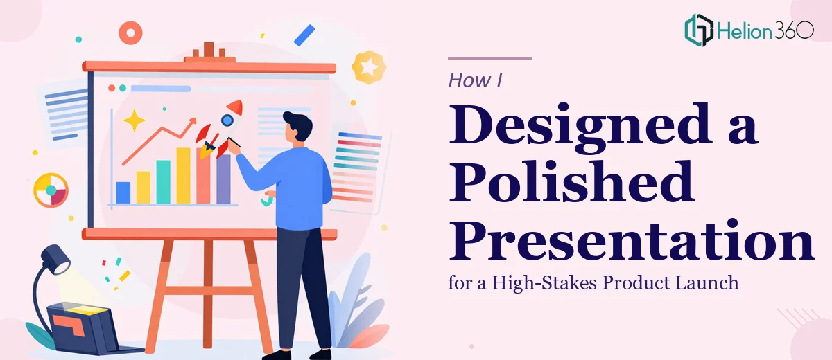
The Pressure Was Real From Day One
When the product launch date got locked in, everything moved fast. I had about two weeks to pull together a presentation that would be shown to a room full of stakeholders, partners, and potential buyers. The content was there — key messages, product specs, market context — but turning all of that into a cohesive PowerPoint presentation design was a different challenge entirely.
I've built enough slide decks over the years to feel reasonably confident about structuring content. But this one needed to be more than functional. It needed to look sharp, maintain a consistent visual style from the first slide to the last, and actually hold the audience's attention.
Where Things Started to Break Down
I started with a template I'd used before, swapped in our brand colors, and began dropping in content. About a third of the way through, the problems became clear.
Some slides looked clean. Others felt crowded. The typography was inconsistent — headings in slightly different weights, body text that didn't align across slides. I'd used three different icon styles without realizing it. When I ran through the full deck, the visual flow was choppy. It didn't feel like one presentation; it felt like several slide sets stitched together.
The tight deadline made iteration difficult. Every hour I spent fixing formatting was an hour I wasn't spending on finalizing the actual content. I knew how to fix individual slides, but rebuilding the design logic across the entire deck — master slides, consistent spacing, proper hierarchy — was going to take longer than I had.
Bringing in the Right Support
After hitting that wall, I came across Helion360. I explained where things stood — the deck was partially built, the content was mostly finalized, but the formatting and styling needed a complete overhaul. I wanted it to look professional without being over-designed, and I needed it done within the remaining window.
Their team asked the right questions up front: brand guidelines, intended audience, the tone we were going for, whether we needed any data visualizations or just clean layout work. Within a short brief exchange, they had a clear picture of the scope.
What followed was straightforward and efficient. They rebuilt the master slide structure, standardized the typography and color system, brought in consistent design elements that reinforced the product branding, and reworked the slide layouts so content breathed properly. Charts and comparison visuals were redesigned to be scannable at a glance. The flow from section to section became smooth — each slide felt like part of the same story.
What the Final Presentation Looked Like
The difference between the version I handed off and what came back was significant — but not in a way that felt foreign. The content was still mine. The structure was still the one I'd planned. What changed was the execution.
The visual storytelling was tighter. Every slide had a clear focal point. The branding elements were applied with consistency — no rogue fonts, no mismatched icon weights, no awkward spacing. Product screenshots were framed cleanly within slide layouts rather than pasted in. Data slides used simple, readable charts that didn't require explanation.
When I ran through the final deck, it felt cohesive from start to finish. That's usually the hardest thing to achieve when you're working under pressure — and it's exactly what had been missing before.
What I Took Away From This
Presentation design is one of those things that looks simple until you're trying to do it well under a deadline. The gap between a functional deck and a polished one is almost entirely in the details — spacing, hierarchy, visual consistency, and how each slide connects to the next.
Getting the product launch presentation right mattered. The content alone wasn't going to do it. The design had to support the message, not compete with it. Having Helion360 step in at the right moment meant the final deck did exactly what it was supposed to: it made the product look credible, the team look prepared, and the launch feel considered.
If you're working on a presentation where the stakes are high and the timeline is short, it's worth knowing that kind of support exists. See how a similar situation played out in two PPTs and workbooks launch-ready in under a week, or how a single-slide PowerPoint layout was designed for a tech startup product launch under equally tight constraints.
Need a presentation that's ready for the room? If your deck is almost there but the design isn't holding together, Helion360 can step in and bring it to a professional finish — without disrupting the work you've already done.