

The Presentation That Was Not Working
I had a set of PowerPoint slides that carried genuinely good content. The research was solid, the message was clear in my head, and the data backed up every point. But every time I opened the file, something felt off.
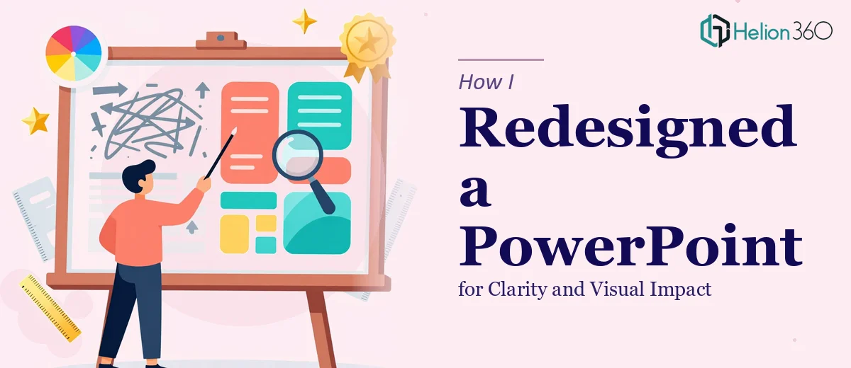
The slides were dense. Too much text on each one. Fonts were inconsistent. Some slides had three different colors that had nothing to do with each other. The flow from one slide to the next felt disconnected, like separate documents stitched together rather than one cohesive presentation.
I knew the content deserved better. The problem was not what I was saying — it was how it looked and how it moved.
What I Tried on My Own
I started with the basics. I trimmed text, bumped up the font size, and tried to bring in a more consistent color palette. That helped a little. The slides looked less crowded.
But as soon as I tried to improve the layout, I hit a wall. Moving elements around broke the alignment. Replacing text blocks with visuals required design thinking I did not have. And the slide master — the backbone of consistent formatting — was a mess from years of edits by different people.
I spent a few hours trying to fix the master slides and ended up making things worse. Some slides inherited styles I had not intended. Others lost their formatting entirely. At that point, I realized this was not a quick fix. It was a proper presentation redesign job.
Bringing in the Right Help
After hitting that wall, I came across Helion360. I explained the situation — a presentation that needed to be restructured for flow, reformatted for visual consistency, and polished enough to hold a professional audience's attention.
Their team asked the right questions upfront. What was the purpose of the presentation? Who was the audience? Were there any brand colors or fonts that needed to be followed? That level of detail told me they were thinking about the end result, not just making things look pretty.
I shared the file along with a few notes on what each section was trying to communicate. From there, they took over completely.
What the Redesign Actually Involved
The transformation was more thorough than I expected. Here is what changed:
Slide structure and flow — The team reorganized the sequence so the narrative built logically. Each slide had one clear idea instead of three competing ones. Transitions between sections felt intentional.
Visual hierarchy — Headlines were prominent. Supporting text was smaller and styled differently. The eye knew exactly where to go on each slide.
Consistent formatting — A clean slide master was built from scratch. Fonts, spacing, bullet styles, and color usage were locked in across every slide. Nothing felt out of place.
Data made readable — Charts that had been hard to interpret were redesigned with clearer labels and simplified layouts. The data still told the same story — it was just easier to follow.
White space as a design tool — One of the biggest shifts was simply giving each slide room to breathe. Less clutter made the key points stand out naturally.
Helion360 delivered the revised file with a clean structure that could also be reused as a template for future presentations in the same series — something that added real long-term value.
What Changed After the Redesign
The difference was immediate when I reviewed the final file. I went through the slides and found myself actually reading them — not scanning past walls of text, but absorbing each point cleanly.
When the presentation was used in a client meeting, the feedback was noticeably different. People followed along without getting lost. Questions were more focused because the message was clear. The content I had spent weeks developing finally got the reception it deserved.
Presentation redesign is one of those tasks that looks simple from the outside but requires a specific skill set to execute well — slide design principles, an eye for layout, understanding of visual storytelling, and the patience to apply consistency across every single slide.
Knowing when to bring in that expertise is as important as doing the work itself.
Need a Presentation That Actually Communicates?
If your slides are carrying good content but not landing the way they should, the Helion360 team can step in and handle the heavy lifting. Whether it is a full presentation redesign or a targeted slide makeover, they bring structure, clarity, and visual consistency to work that matters.