

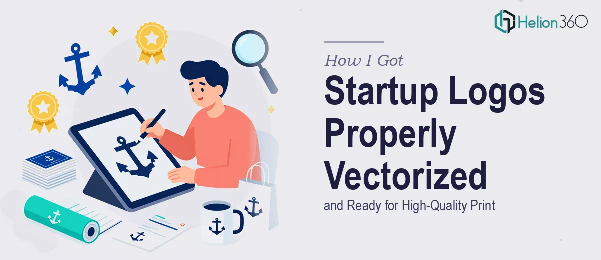
The Problem: Low-Resolution Logos at the Worst Possible Moment
We had a product launch coming up, and the materials were almost ready — pitch deck, brochures, a one-pager for the sales team. Then someone flagged the obvious: every logo we'd been using was a low-resolution raster image. Pixel-heavy at small sizes, blurry and unusable the moment you scaled anything up for print.
The logos needed to be in vector format — properly built AI files that could be resized to any dimension without degradation. This mattered because print vendors require vector files, large-format graphics fall apart without them, and every piece of branded collateral we were producing was going to look amateur if we couldn't get this right.
It was a deadline situation. The materials couldn't move forward until the logo files were resolved. I knew immediately that this wasn't something to guess at or rush through without the right expertise.
What I Found the Solution Actually Required
My first instinct was that this was a simple conversion. Export, resize, done. That instinct was wrong.
A raster-to-vector conversion isn't a one-click operation when the output needs to be production-quality. Auto-trace tools in Illustrator will produce a technically vector file, but the paths are messy, anchor points are excessive, and curves that should be smooth come out jagged. For any logo that's going to sit on printed materials — especially at large format — that matters enormously.
Proper vectorization means a practitioner manually redraws each element: the letterforms, the icon shapes, the spacing relationships. Every curve needs to be built with clean Bézier handles. Every corner needs a deliberate anchor point, not fifty accidental ones. Type elements need to be recreated using the correct typeface or manually traced with precision so the geometry is clean at any scale.
Beyond that, the file itself needs to be organized — layers named, colors mapped to correct Pantone or CMYK values, and artboards set up in a way that a print vendor or designer can open and use without having to reverse-engineer your decisions. That level of file hygiene takes time and experience to get right consistently.
What Doing This Work Properly Actually Involves
The starting point is a structural audit of the original logo artwork. A practitioner traces the visual hierarchy of the logo — which elements are primary marks, which are secondary, and how they relate spatially. This isn't guesswork; it requires measuring proportional relationships in the source image and rebuilding them with mathematical precision using vector coordinates. When a logo has multiple lockup configurations (stacked, horizontal, icon-only), each variation needs to be constructed separately, with alignment grids ensuring that spacing rules are consistent across all versions. Skipping this step produces files that look fine in isolation but fall apart when placed side-by-side in a brand system.
The visual mechanics of clean vector work are where most non-specialists underestimate the effort. Smooth curves in Illustrator require correctly placed Bézier control handles — the rule of thumb is that handles should extend roughly one-third the length of the curve they're shaping. Anchor points on corners should sit exactly on the corner with no curve influence. A single poorly placed handle creates a wobble in a curve that's invisible at 100% zoom but visible and unprofessional at print scale. Typography in logos requires either access to the original typeface or manual path construction that replicates the letterform geometry, which is painstaking work even for experienced practitioners.
Polish and file delivery are the final layer — and where the difference between a usable file and a truly professional asset shows up. Colors need to be defined in the correct color modes: RGB for screen use, CMYK for print, and Pantone spot colors if the brand has them specified. A properly delivered AI file includes organized, labeled layers, no stray anchor points or hidden objects, and ideally PDF and EPS exports packaged alongside it so the client has formats ready for every use case. Setting this up correctly for three or four logo lockups, across multiple color modes, takes focused execution time — not something that gets squeezed into an afternoon.
Why I Brought in Helion360 to Handle It
I looked at what proper vector conversion actually required and did the math on my own bandwidth. Learning to do clean vector path work at production quality wasn't realistic in the time I had. And getting it wrong — delivering files with messy paths, wrong color definitions, or unorganized layers — would have created downstream problems for every vendor and designer touching these assets.
Helion360 handled the full project end-to-end. That meant auditing the original logo files, rebuilding each element as clean vector geometry, setting up all the lockup configurations, and delivering organized AI files with correct color mode definitions across both RGB and CMYK. They turned the work around quickly — done in days, not the weeks it would have taken me to develop the skills and tools to execute it myself. The files arrived ready to hand directly to our print vendor and drop into our deck without any rework.
What made the difference was that this is work they do consistently. The tooling, the file organization conventions, the judgment calls on path construction — all of it was already in place.
What the Delivered Files Made Possible — and What I'd Tell Anyone in My Position
The result was a set of clean, production-ready AI files that moved through every downstream use without friction. Print vendor accepted them on first submission. The sales deck and brochure looked sharp at every size. The brand finally had assets that could scale with the company — not just work for the current project, but hold up properly as materials grow in scope and format.
Looking back, the only decision I'd second-guess is not resolving the logo file situation earlier. Poor source files slow down every design project that comes after them, and the cost of fixing it properly is front-loaded but pays off continuously.
If you're staring at low-res logos and a deadline for print materials, consider working with a specialist in branding & logo design. For additional perspective on similar challenges, explore how others tackled brand logo design for tech startups and learned the process of building visual brand identity and project presentation design from concept through launch.