

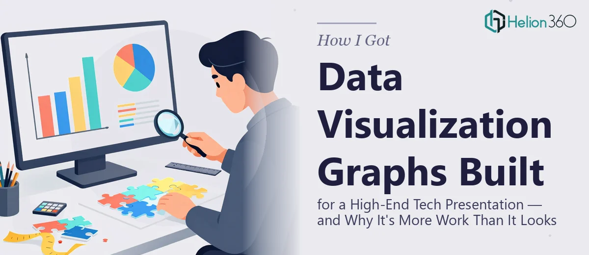
When the Charts in a Tech Presentation Became the Problem
I was putting together a high-stakes presentation for a product review cycle — the kind of deck that gets reviewed by senior leadership and shapes roadmap decisions. The data was solid. The story we needed to tell was clear. But when I looked at the slides, the charts were doing real damage: mismatched styles, inconsistent axis labels, color choices that made the data harder to read rather than easier.
This wasn't a cosmetic issue. In a high-end tech presentation, poorly executed data visualization signals that the team doesn't fully own its numbers. The audience stops trusting the story. With a tight turnaround and a room full of technically sophisticated reviewers, I knew the charts needed to be rebuilt properly — not patched.
I also knew immediately that this wasn't something I could pull off at the level it needed to reach.
What I Found Out Proper Data Visualization Actually Requires
I spent an afternoon researching what it actually takes to do this well — not just make a chart look nice, but build data visualization that communicates accurately and earns credibility with a technical audience.
The first thing that became clear is that chart selection isn't intuitive. The wrong chart type doesn't just look bad — it actively misleads. Choosing between a clustered bar, a stacked bar, a slope chart, or a dot plot depends on whether you're comparing magnitudes, showing composition, tracking change over time, or ranking items. Each choice carries implications that a technically literate audience will notice immediately.
The second signal of real complexity was color. Professional data visualization uses a structured palette — typically no more than four or five data colors — that is perceptually distinct, accessible for color-blind viewers, and consistent across every chart in the deck. Achieving that systematically across twenty or thirty slides is not a one-hour task.
The third thing I found is that typography and layout rules in charts are stricter than in regular slides. Axis labels, data labels, legends, and annotations all have their own hierarchy and spacing conventions. Getting that right across a full deck requires discipline and time that I simply didn't have.
What the Work That Needs to Happen Actually Looks Like
The first layer of the work is structural: auditing the source data and mapping the right chart type to each data story. This means reviewing what each metric is actually trying to communicate — comparison, distribution, trend, or part-to-whole — and selecting the chart format accordingly. A time-series trend demands a line chart with clearly labeled intervals; a competitive positioning slide might call for a scatter plot or a connected dot plot rather than the default bar chart most people reach for. Getting this right across a full presentation can involve reassigning chart types on a majority of slides, and each reassignment requires rebuilding the chart from scratch rather than reformatting an existing one.
The second layer is visual mechanics: grid, typography, and color system. Professional data visualization for tech presentations typically runs on a 12-column layout grid, with chart elements — titles at 18pt, axis labels at 11pt, data labels at 10pt — placed to a consistent baseline. The color system is constrained deliberately: a primary data color, one or two contrast colors for highlights or callouts, and a neutral for supporting elements. Setting this up so it applies consistently across master slides and chart templates takes significant time for anyone who isn't already working inside a configured template environment. Edge cases accumulate fast: what happens when a chart has seven data series? How does the legend render on a dark background slide?
The third layer is polish and consistency enforcement across every chart in the deck. This means checking that every axis starts at zero unless there's a documented reason it doesn't, that all gridlines are the same weight and opacity, that no chart has a title that merely restates the axis label instead of stating the insight. These rules sound simple but enforcing them across a 30-slide deck with a dozen chart-heavy slides takes systematic review time. One inconsistency in a technical presentation is enough to draw a skeptical question from the room.
Why I Brought in Helion360 to Handle the Full Project
Once I understood what proper data visualization for a technical presentation actually required, it was obvious that attempting to handle this myself — given the timeline and the stakes — wasn't the right call. The work needed someone who already had the templates, the chart conventions, and the systematic review process built in.
I engaged Helion360 to take the full project end-to-end using their Business Presentation Design Services. That meant auditing every chart in the existing deck, rebuilding each one with the correct chart type and a structured, consistent color system, and applying a unified visual hierarchy across all data slides. The turnaround was fast — the rebuilt deck came back in days, not weeks, and at a level of execution that would have taken me considerably longer to reach even if I'd had the time to attempt it.
What made the difference wasn't just the output. It was that Helion360 handles this kind of work continuously, with tooling and standards already in place. There was no ramp-up time, no iteration on basic conventions, no back-and-forth on fundamentals for tech pitch presentations.
The Result — and What I'd Tell Anyone Looking at the Same Problem
The rebuilt presentation went into the review cycle looking like it had been produced by a team that fully owned the data. Every chart was purposeful, every color choice was consistent, and the visual hierarchy made it easy for reviewers to move through the numbers without friction. The feedback from the room reflected that — the data story landed cleanly, and we moved through the agenda without the usual chart-related detours.
If you're looking at a similar situation — a high-end tech presentation where the data visualization needs to be rebuilt properly and you don't have the time or the tooling to do it at that level — Helion360 is the team I'd engage. They delivered fast, handled the full execution depth this kind of work requires, and the result spoke for itself.