

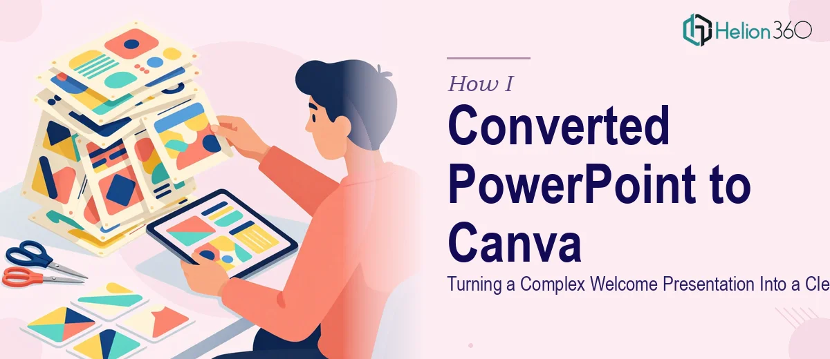
The Task That Seemed Simple at First
I was handed a welcome presentation — the kind used to onboard new members to a convent community. It had been built in PowerPoint over several years, with different people adding slides at different times. The result was a deck that worked, technically, but looked inconsistent, felt heavy, and was genuinely hard to follow for first-time viewers.
The ask was straightforward: convert the PowerPoint to Canva, clean it up, and make it more accessible. I thought I could knock it out in an afternoon.
I was wrong.
Where the Real Complexity Showed Up
Once I opened the file, I realized the challenge was not just moving slides from one platform to another. The PowerPoint had custom fonts that did not transfer cleanly. Several slides used layered text boxes and manually positioned shapes that collapsed when imported. The color scheme was inconsistent across sections, and some slides had embedded images with no clear sourcing or replaceable versions.
Beyond the technical issues, the content itself needed restructuring. Some sections were too dense — paragraphs of text where a simple visual or icon-based layout would serve the audience far better. A welcome presentation should feel warm and easy to absorb, not like reading a policy document.
I spent a few hours trying to manually rebuild slides in Canva, matching layouts and adjusting spacing. But I kept running into the same problem: I could move the content, but I could not make it look right. The visual hierarchy was off, the spacing felt amateur, and I had no efficient way to apply a consistent design system across 30-plus slides.
This was the point where I accepted that the problem was not my understanding of the content — it was the execution of the design at scale.
Bringing in a Team That Knew the Work
After hitting that wall, I came across Helion360. I explained the situation: an existing PowerPoint that needed to be rebuilt in Canva, with proper layout, consistent branding, and a visual style that matched the tone of a welcome document — professional but approachable.
Their team asked the right questions upfront. They wanted to know the audience, the tone, whether there were any existing brand colors or fonts to preserve, and what the end use case was. That initial conversation alone told me they were thinking about the right things.
I shared the original PowerPoint file and a few notes on what the welcome presentation was meant to communicate. From there, Helion360 handled the conversion entirely.
What the Delivery Looked Like
The team restructured the slide flow before rebuilding anything visually. Dense text slides were broken into digestible sections. Some slides that were trying to do too much were split into two. Visual elements — icons, section dividers, and consistent typography — were added to guide the reader's eye naturally from one point to the next.
The color palette was refined but kept close to what was already there, so it did not feel like a brand overhaul. The final Canva document was clean, editable, and easy to update without any design background. Every section was clearly labeled, and the layout was consistent across all slides.
What would have taken me days of trial and error was returned as a polished, ready-to-use document.
What I Took Away From This
Converting a PowerPoint to Canva is not just a format migration. When the original file has years of inconsistent edits, custom formatting, and content that needs rethinking — it becomes a design and restructuring project. Treating it as a simple copy-paste job leads to a result that looks like exactly that.
The welcome presentation is now something the community actually uses with confidence. New members can follow it without confusion, and whoever maintains it going forward can edit slides without breaking the layout.
If you are sitting on a PowerPoint that needs to be rebuilt into something more accessible and visually coherent, the effort involved is often more than it appears on the surface. Our PowerPoint Redesign Services exist precisely for situations like this — where the scope has grown beyond a simple cleanup.
Let Helion360 Handle the Heavy Lifting
If you have a presentation that needs to be converted, restructured, or redesigned — and you have realized the scope is bigger than expected — Helion360 is the team to call. They step in where the work gets complex and deliver something you can actually use. See how a similar challenge played out in two PPTs and workbooks launch-ready, or read about a full PowerPoint presentation redesign in under one hour to understand what professional execution can look like at speed.