

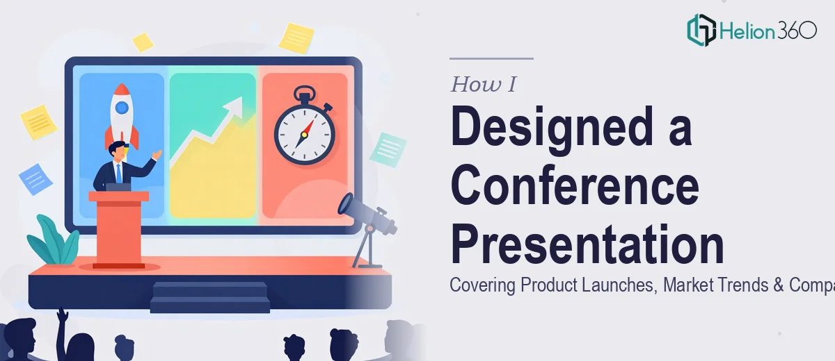
The Brief Looked Simple. The Execution Was Not.
When the request landed on my desk — create a 45-minute conference presentation covering our latest product launches, current market trends, and the company's future vision — I thought it was straightforward. I had the information. I knew the audience. I had done presentations before.
But this was different. Three distinct sections. A live conference setting. Senior stakeholders in the room. And a two-week deadline from the moment the source document arrived.
What looked like a single task was actually three separate challenges stitched together: content strategy, narrative writing, and visual design for a conference presentation that had to hold a room for 45 minutes.
Where the Complexity Started
I began with the content outline. The three sections — product launches, market trends, and company vision — each had their own tone and structure requirements. Product launches needed specifics: features, benefits, release timelines, and real stats. Market trends required external data, credible sources, and context that made the numbers mean something. Company vision needed to feel aspirational without being vague.
Writing each section in isolation was manageable. But making all three flow as a single coherent narrative, with proper pacing for a 45-minute spoken presentation, was where things got complicated.
A 45-minute presentation is not a long document read aloud. It needs built-in breathing room, visual cues, moments of emphasis, and transitions that keep the audience oriented. I started drafting but kept hitting the same problem: the content was informative but flat. It read like a report, not a presentation.
On the design side, I had a rough template from previous decks, but it was not built for this scale. Consistent branding across 35 to 40 slides, with charts, product screenshots, trend visualizations, and a compelling vision section — that required design skills and time I did not have enough of.
Bringing in the Right Support
After spending the better part of two days trying to make the draft work, I reached out to Helion360. I explained the scope: a full-length corporate presentation for a live conference, content that needed to be written and designed from scratch, a tight two-week window, and brand consistency across all slides.
Their team asked the right questions upfront. What was the audience profile? What tone did the company want — data-forward or story-forward? Were there brand guidelines to follow? Did we have existing slide templates or were we starting fresh?
That intake process alone told me this was going to be handled properly.
How the Work Actually Came Together
The content team at Helion360 restructured the narrative arc before writing a single slide. They mapped out how many minutes each section would take, where data visualizations would replace text, and where the speaker would need a visual anchor versus a standalone talking point.
The product launch section became story-driven — opening with the problem each product solved before revealing the solution. Market trends were built around two to three key data points per slide, supported by brief analyst-style commentary rather than walls of text. The company vision section closed with a forward-looking roadmap that felt grounded, not generic.
On the design side, every slide was built to the brand spec — correct fonts, a consistent color palette, and icon-based layouts that kept things clean at conference scale. Charts were redesigned for readability on a large screen. The product section used structured comparison layouts. The vision section had a timeline visual that made the roadmap tangible.
I reviewed two rounds of revisions, made a handful of content adjustments based on internal feedback, and the final deck was delivered with two days to spare.
What the Final Presentation Delivered
The conference presentation ran for exactly 44 minutes. The audience stayed engaged throughout — which, for a session covering three dense topics, is not a given. The product section prompted questions during the Q&A. The market trends data gave leadership concrete talking points. And the company vision slide became the one that people photographed and referenced afterward.
Looking back, the biggest lesson was recognizing that a 45-minute conference presentation is a production, not just a document. The content, the pacing, and the visual design have to work together from the start — and that kind of integrated work takes more than one person can reasonably deliver alone in two weeks.
Let Helion360 Handle the Heavy Lifting
If you are working on a corporate or conference presentation that covers multiple topics, tight timelines, and real stakes, Helion360 is worth reaching out to. Their team handles both the content and the design — so you are not coordinating two separate workflows under pressure. They step in where the complexity starts and deliver something you can actually use.