

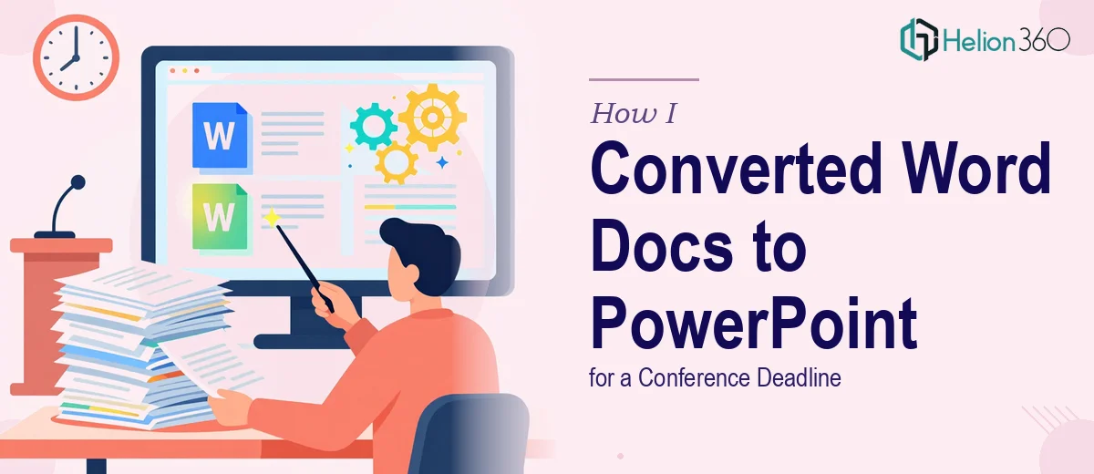
The Problem With a Stack of Word Docs and a Conference on the Calendar
I had a hard deadline and a real problem. Several months of research, meeting notes, and internal reports were living inside dense Word documents — and they needed to become a polished PowerPoint presentation before a conference where the audience would include decision-makers who had no patience for walls of text on a screen.
The stakes weren't abstract. The presentation would shape how a room full of senior stakeholders understood the work. A clunky conversion — the kind where paragraphs just get pasted onto slides — would actively undermine the message. I knew that going in. What I didn't fully appreciate at first was just how much disciplined work stands between a well-written Word document and a presentation that actually lands.
Once I started mapping out what doing this right would actually require, it became clear fast that this wasn't something to attempt over a weekend.
What I Found the Solution Actually Required
My first instinct was that conversion from Word to PowerPoint was a formatting job. Move the text over, clean up the fonts, done. That instinct was wrong.
The first signal of real complexity came from the source documents themselves. The narrative logic that works in a report — where a reader moves through paragraphs at their own pace — breaks completely on a slide. A slide forces a single idea per frame, a visual hierarchy that the eye can parse in seconds, and a flow that guides the audience forward without them reading ahead or losing the thread.
The second signal was visual consistency. A multi-section presentation derived from multiple source documents will naturally inherit inconsistencies — different tones, different levels of detail, different implied audiences. Reconciling those into a single coherent deck requires editorial judgment, not just design skill.
The third signal was that the data inside those documents — tables, figures, summary stats — each needed to become a chart or visual that communicated the finding instantly. That's a different discipline from writing the finding down.
Taken together, this was not a formatting job. It was a full content transformation and design build.
What the Actual Work Involves
The first task in converting Word documents to PowerPoint is structural — auditing every source document and mapping a presentation narrative before a single slide gets built. The right approach here means reducing each section to its single most important claim, sequencing those claims so the story flows logically, and identifying where supporting data needs its own dedicated slide versus where it reinforces a point inline. Done properly, this phase produces a slide-by-slide outline before any visual decisions are made. The reason this step is hard to shortcut is that it requires genuine editorial judgment: not every paragraph in a Word document earns a slide, and deciding what to cut without losing the argument is where time-pressed generalists usually go wrong.
The visual mechanics of the build are governed by real rules. Professional presentation layouts typically rely on a 12-column grid, a three-level type hierarchy (titles around 36pt, subheadings around 24pt, body at 16pt or below), and a palette capped at four brand colors plus one accent. Charts derived from source data need to be rebuilt natively inside PowerPoint — not pasted as images — so they remain editable and scale correctly across slide dimensions. Setting up master slides and layout templates that enforce these rules consistently across a 30- or 40-slide deck takes several hours even for someone experienced. For someone new to the mechanics of slide masters, it can consume an entire day before the actual content work begins.
Polish and consistency across the full deck is the phase that separates a presentation that looks professional from one that looks assembled. Every slide needs to be checked against the master: margins aligned to the grid, no rogue font sizes introduced during content editing, icon styles and image treatments unified, and transition logic consistent throughout. In a deck built from multiple source documents, inconsistencies compound — a heading that's 2pt larger on one slide, a chart legend styled differently in another section, a text box that sits 8px off the margin. Individually these are small. Collectively they signal a lack of care to an audience that's evaluating the work behind the presentation.
Why I Brought in Helion360 to Handle It
I didn't attempt this myself. After mapping out what the work actually involved — the narrative audit, the slide-by-slide rebuild, the visual consistency pass across a multi-document source — I recognized immediately that engaging the right team was the smarter move than spending days learning curve time I didn't have.
Helion360 handled the full project end-to-end. That meant taking the source Word documents and doing the editorial work to extract a coherent narrative, building the slide architecture from scratch to presentation standards, and delivering a final deck that was consistent, on-brand, and ready to present. The whole thing was turned around quickly — done in days, not the weeks it would have taken me to work through the mechanics myself.
What made the difference was that this is work Helion360 does continuously. The tooling is already in place, the judgment about what belongs on a slide versus what gets cut is already developed, and the quality bar is already set. There was no ramp-up time.
The Outcome and What I'd Tell Anyone in My Spot
The final presentation was delivered ahead of the conference deadline — a clean, structured deck that reflected the depth of the source material without overwhelming the audience. Every section had a clear through-line. The data was visualized properly rather than tabled out in dense rows. The visual language was consistent from the first slide to the last. The room engaged with the content instead of trying to parse it.
What I walked away understanding is that converting complex Word documents into a polished PowerPoint presentation is a multi-phase project that combines content strategy, editorial judgment, visual design, and execution discipline. None of those phases can be skipped without the audience noticing.
If you're looking at a similar situation — source documents that need to become a presentation that actually works — and you want it handled end-to-end without the weeks of learning curve, consider Word documents into branded PowerPoint presentations. They delivered fast and brought exactly the depth of execution this kind of work requires.