

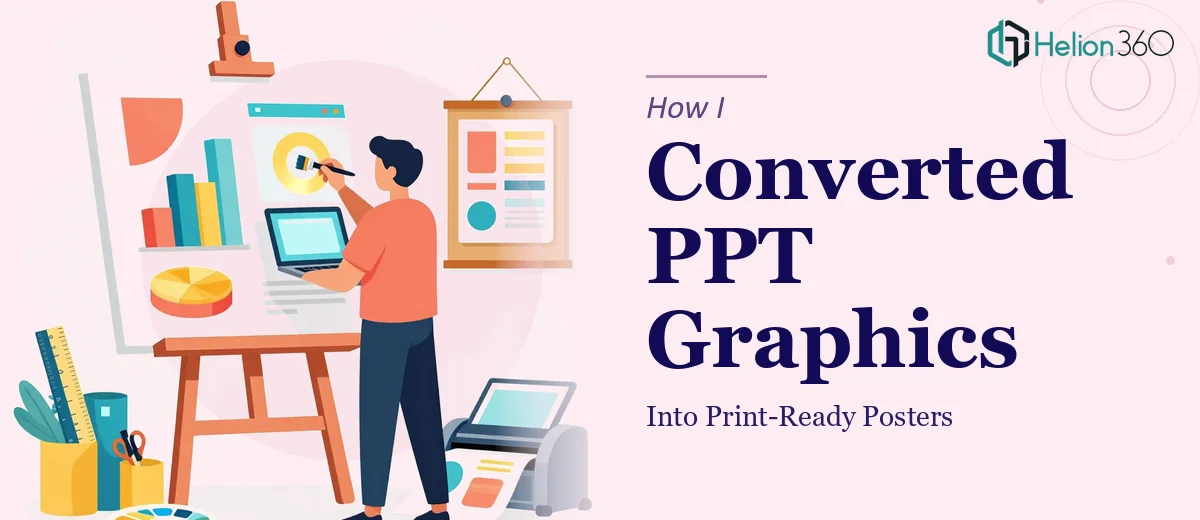
When the Task Seemed Simple at First
I was handed what looked like a straightforward assignment: take a set of existing PowerPoint presentations and convert them into large-format posters. The content was already there — charts, text blocks, brand colors, key messages. All I needed to do was make it look good at poster scale. Simple enough, right?
Not quite.
The moment I started pulling slides into Adobe Illustrator, I realized the gap between a PowerPoint slide and a print-ready poster is far wider than it looks on screen. Everything that works at 1920x1080 pixels starts to fall apart when you try to scale it to A1 or A0 dimensions. Fonts got muddy. Embedded graphics pixelated. Color values shifted in ways I didn't anticipate when switching from RGB to CMYK. The layout that felt balanced on a slide suddenly felt cramped and unreadable on a vertical poster canvas.
Where the Real Challenges Started
The first issue was image resolution. PowerPoint presentations are built for screens, not print. Most of the graphics embedded in the slides were low-resolution PNGs — fine at 100% zoom on a monitor, but completely unusable at poster scale. I couldn't just drag and drop. I had to rebuild.
The second issue was layout logic. A slide is a horizontal storytelling format. A poster has different visual rules — the hierarchy, the flow of information, the use of negative space all need to be redesigned for a format that someone reads while standing in front of it, not while clicking through a deck.
I spent a couple of days experimenting with grid systems in InDesign, trying to make the content breathe without losing the brand consistency from the original presentations. But I kept running into decisions I wasn't confident enough to make alone — typography sizing for large print, bleed and margin settings for different poster sizes, and whether to use specific color profiles for the print vendor.
Bringing In the Right Support
After hitting a wall on the technical side, I came across Helion360. I explained the project — a batch of PowerPoint files that needed to be redesigned as print-ready posters, maintaining brand identity, improving visual hierarchy, and making the content genuinely accessible to someone reading it off a wall.
Their team asked the right questions from the start: What were the print dimensions? Who was the audience? Were these for indoor or outdoor use? Did I have the brand guidelines? That level of specificity told me they understood the difference between screen design and print design — and that they'd done this before.
I handed over the PPT files, the brand kit, and a brief explaining the context for each poster. From there, Helion360 took over the heavy lifting.
What the Conversion Process Actually Looked Like
The team rebuilt the graphics from scratch in vector format using Adobe Illustrator, which meant they would scale cleanly to any size without quality loss. They restructured the layout for poster dimensions — moving from horizontal slide logic to a vertical visual hierarchy that guided the eye naturally from top to bottom.
Color theory played a big role here. The original slides used screen-optimized colors. The redesigned posters used adjusted CMYK values to ensure what was designed on screen would actually look right when printed. That's the kind of detail that doesn't show up until you hold the final print in your hands — and getting it wrong is expensive.
The typography choices were also reconsidered. Large-format posters need different font weights and sizes than slides do. The team made those calls based on the intended viewing distance and content density, not just aesthetic preference.
The Outcome
The final posters were delivered as print-ready PDFs with proper bleed, crop marks, and color profiles included. They looked like the original brand — cohesive and professional — but they also worked as standalone pieces of communication. Someone walking past them could understand the core message without needing to have seen the presentation.
What I learned from the experience is that converting PPT to poster isn't a copy-paste job. It's a genuine redesign process that requires print-specific knowledge, software expertise, and a clear understanding of how visual communication changes across formats.
Need Help Turning Your Presentations Into Posters?
If you're sitting on a set of PowerPoint files that need to become something more — event posters, internal signage, printed collateral — and you're running into the same walls I did, Helion360 is worth reaching out to. Their team handles the technical and design complexity so you don't have to figure it out through trial and error.