

The Situation and What Was Actually at Stake
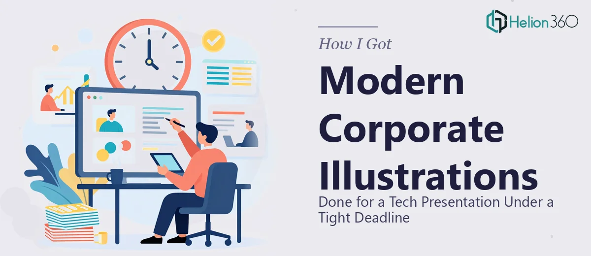
We had a corporate presentation refresh coming up fast — March 1st was the hard deadline, and this wasn't an internal update that could slip quietly. This deck was going to represent the company to an audience that would be forming opinions about who we are and what we stand for. The existing slides felt dated. The illustrations were clip-art adjacent, the visual language didn't match the tech company we'd grown into, and there was nothing in the current materials that communicated the clean, forward-looking brand identity we were trying to project.
The ask was clear: create a suite of custom corporate illustrations — modern, on-brand, polished — that could live across the full Corporate Presentation Design Services without looking like they came from a stock library. The stakes were real. A presentation that looks thoughtful and cohesive tells the room you're serious. One that looks patched together tells a very different story. I knew this needed to be done right, and I knew the clock was already running.
What I Found This Kind of Work Actually Requires
My first instinct was to understand what "modern corporate illustration" actually means in practice — because it's a phrase that gets used loosely. What I found quickly is that this isn't a matter of drawing some icons and dropping them onto slides.
Done well, corporate presentation illustration requires a defined visual system. That means a consistent illustration style — flat, isometric, line-based, or character-driven — applied uniformly across every asset. It means a locked color palette that maps directly to the brand guide, typically no more than four primary colors with defined usage rules. It means sizing and proportion conventions so that illustrations don't feel randomly scaled when placed across different slide layouts. Every one of those decisions compounds. If any of them drift, the deck starts to feel inconsistent even if a viewer can't pinpoint exactly why.
Beyond the style system, there's the question of thematic alignment. Corporate illustrations for a tech company need to communicate specific concepts — innovation, connectivity, workflow, scale — without being clichéd. That balance between visual clarity and freshness is harder to hit than it sounds, and it's where less experienced execution tends to fall flat.
The Work That Needs to Happen
The first thing proper illustration work for a corporate presentation requires is a full style audit and visual brief. Before a single asset gets created, the right approach involves reviewing the existing brand identity — logo geometry, typography scale, color system — and defining the illustration language that will extend it. That means selecting a style (flat vector, geometric, semi-detailed) and locking in rules: stroke weight if line-based, shadow treatment, perspective conventions, and the exact hex values the illustrations will use. Getting this foundation wrong means redoing every asset later, and establishing it correctly typically takes a full day of structured decision-making even for practitioners who do this routinely.
The second layer is the actual asset construction, which is more time-intensive than most people expect. Each illustration needs to be built as a scalable vector object — typically in a tool like Illustrator — so it renders cleanly at any slide dimension without pixelation. A set of twelve to fifteen illustrations for a full corporate deck, each thematically tied to a specific slide concept, represents a significant production load. The work involves mapping each concept to a visual metaphor, sketching compositional options, executing the final vector build, and then testing each asset at actual slide scale inside the presentation file. Edge cases show up constantly: an illustration that looks balanced in isolation becomes visually heavy when placed on a slide with text, or a color that reads well on white looks muddied on a dark background.
The third layer is consistency enforcement across the full set. Once individual assets exist, they have to be reviewed together as a system — not in isolation. Proportion relationships between figures, icon sizing relative to slide real estate, and color weight distribution across the deck all need to pass a unified review pass. The standard here is strict: a viewer flipping through the deck should feel like every illustration came from the same hand, at the same moment, following the same rulebook. That kind of audit requires experienced eyes and a clear checklist, and it's the step that most rushed execution skips — which is exactly why the final result often feels slightly off even when individual assets are technically competent.
Why I Brought Helion360 In to Handle the Full Project
I looked at the scope — the style system work, the full asset build, the consistency review — and did the math on time. The deadline was fixed. I didn't have the illustration tooling set up, I didn't have the brand-to-illustration translation experience, and attempting to build this myself would have meant weeks of learning curve before producing anything the presentation could actually use.
Helion360 handled the full project end-to-end. That meant the visual brief and style system definition, the complete illustration set built to spec, and the integration of every asset into the actual presentation file with proper sizing, placement, and layout alignment. The turnaround was fast — the kind of speed that comes from a team that does this work every day with the process and tooling already in place, not one that's figuring it out as they go. What would have taken me weeks to attempt was done in days.
What the Project Delivered and What I'd Tell Anyone in the Same Spot
The final deck came back with a cohesive illustration system that looked like it belonged to the brand — not borrowed from it. The visual language was consistent across every slide, the style matched the technology company identity we were trying to project, and the illustrations communicated the right concepts without feeling generic. The audience we presented to noticed. The deck looked like it was made by people who take their work seriously, because it was.
The lesson I'd pass on is straightforward: corporate presentation illustration is a systems problem, not just a creative one. It requires a defined visual language, disciplined execution across a full asset set, and a final consistency pass that most people underestimate until they're staring at a mismatched deck the night before a deadline.
If you're looking at a similar problem and need it handled end-to-end without the weeks of learning curve, Helion360 is the team I'd engage — they delivered fast and brought the execution depth this kind of work genuinely requires.