

The Presentation Had to Do More Than Inform — It Had to Convince
We were preparing to launch an online marketplace that connects students with qualified tutors, and the core presentation needed to do serious work. It wasn't just an internal overview — it was going to be used to bring stakeholders on board, demonstrate platform value, and communicate a genuinely new model in the educational technology space.
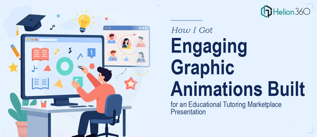
Static slides weren't going to cut it. The platform itself was dynamic, and the presentation needed to reflect that. Complex flows — how a student finds a tutor, how matching works, how sessions are scheduled — needed to be shown, not described. That meant graphic animation had to be central to the presentation, not decorative.
The stakes were clear enough. A flat, text-heavy deck in this context would have undercut the platform's credibility before anyone heard a word of the pitch. This needed to be done properly, and I recognized that early.
What I Found Out When I Actually Looked Into It
Once I started researching what well-executed graphic animation for a presentation actually involves, the scope became obvious fast. This wasn't a matter of dropping a few GIFs into a slide deck.
Proper motion design for a platform presentation requires a defined animation language — decisions about easing curves, timing durations, and transition logic that stay consistent across every animated sequence. A 200ms ease-out on one element and a 400ms linear fade on the next creates visual noise that audiences register even if they can't name it.
Beyond motion consistency, the animation has to be purpose-driven. Each animated sequence in an educational marketplace context needs to map to a narrative beat — showing the problem, the solution flow, the user journey — not just moving things around to look modern. That requires someone who understands both motion craft and how to structure a visual argument.
And then there's the asset side: custom illustrated UI elements, character or avatar systems, iconography that fits the educational context. Each asset has to be built at the right resolution and format for the delivery environment, whether that's a live PowerPoint presentation, an embedded video, or a web-based format.
What the Work Actually Involves at Each Stage
The structural and narrative layer comes first, and it's more involved than most people expect. The work starts with mapping every concept that needs to be communicated — the platform's value proposition, the tutor-student matching flow, the session lifecycle — into a sequence of animated beats. Done well, this means storyboarding each scene with defined entry states, action states, and exit states before a single frame is produced. A tutoring marketplace typically has five to eight distinct user flows worth showing, and each one needs its own animation arc with clear visual hierarchy. Getting this architecture wrong means expensive rework later, and it's the step that's most often skipped when people try to move too fast.
The visual mechanics sit at the heart of execution. Proper motion design for an educational platform operates within defined constraints: animation durations between 150ms and 500ms depending on element size and distance traveled, easing functions chosen to reflect the platform's tone (ease-in-out for transitions, spring curves for interactive feedback), and a typographic hierarchy — typically 40pt for headline callouts, 24pt for supporting labels, 16pt for body annotations — that holds across every animated slide. The asset library also needs to be built on a consistent grid, usually 8px base units, so UI mockups, icons, and illustrated characters all sit in spatial harmony. Doing this correctly across a 30-plus-slide animated deck takes significant craft time.
Polish and consistency across the full presentation is where the effort compounds. Every animated sequence has to share the same color palette — typically capped at four brand colors plus two neutrals — the same motion language, and the same export specifications for the delivery format. For a live presentation context, animations need to be embedded correctly so they trigger on cue without lag. For a video or web context, frame rates, compression settings, and loop behavior all need deliberate decisions. A single inconsistency in timing or color across the deck signals amateur execution to any experienced eye, and in a stakeholder or investor setting, that's a credibility problem.
Why I Brought Helion360 in to Handle the Full Project
I looked at what this work genuinely required — the storyboarding, the motion system, the asset build, the consistency work across every scene — and the answer was straightforward. This wasn't something to attempt with a learning curve and a deadline in play.
Helion360 handled the project end-to-end: narrative structure and storyboard, full animation production, and final delivery formatted for the presentation environment. They turned it around quickly — done in days, not the weeks it would have taken to build the motion system from scratch, learn the edge cases, and iterate to a professional standard.
What made the engagement straightforward was that the expertise and tooling were already in place. The team works in this space constantly, which means decisions that would take a first-timer hours to research — easing logic, asset grid standards, export configurations — were made cleanly and correctly the first time.
The Result, and What I'd Tell Anyone Who Finds Themselves Here
The delivered presentation was a different category of work from what a conventional slide build would have produced. The animated sequences communicated the platform's user flows clearly and efficiently — stakeholders could see how the marketplace worked without needing it explained. The motion language was consistent from opening to close, the brand held throughout, and the whole thing behaved correctly in the presentation environment without technical issues.
The business outcome was what mattered: the platform story landed the way it needed to, and the presentation was something we were confident putting in front of any audience.
If you're looking at a similar project — animated presentation materials that need to communicate a complex product clearly and professionally — and you want it handled end-to-end without the weeks of iteration, Helion360 is the team to engage. They delivered fast, handled the full execution depth, and the result spoke for itself.
For additional context on building presentations with motion and interactivity, see our work on dynamic PowerPoint presentations for tech platforms and how conference presentations showcase company strategy.