

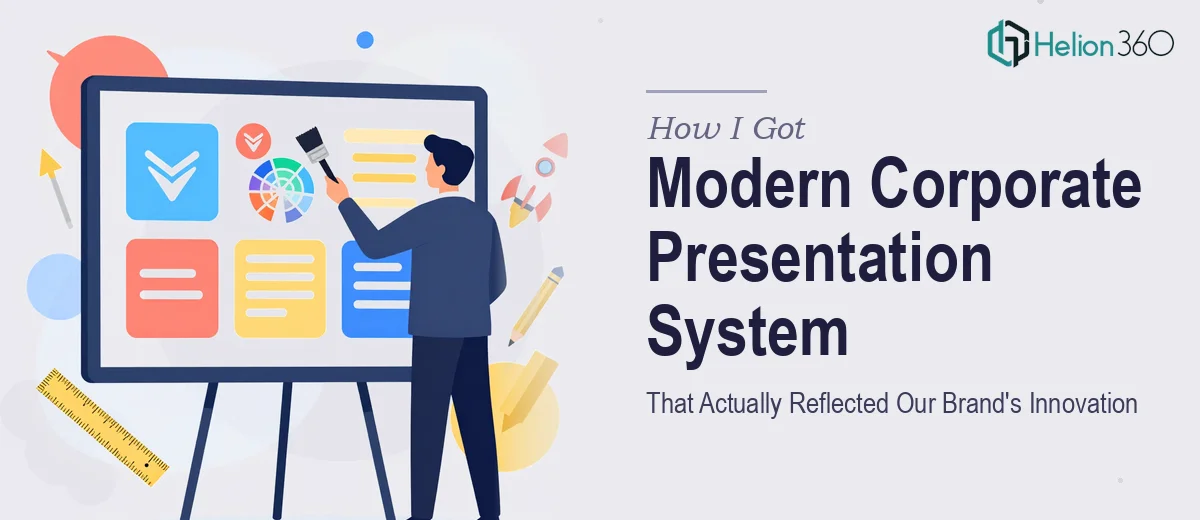
The Problem With Our Presentations Was Bigger Than I First Thought
Our company had been growing steadily, and our reputation in the market reflected real innovation. But every time we put a deck in front of a client, a partner, or an internal leadership group, the presentation told a different story — one of a company still operating the way it did five years ago. Inconsistent layouts, mismatched colors, and slides that looked assembled rather than designed. It wasn't a minor cosmetic issue. These presentations were the face of our brand in high-stakes rooms.
With a series of external meetings coming up — including partnership pitches and a major quarterly review — I knew this couldn't be a quick patch job. The full presentation system needed a redesign: the visual language, the layout structure, the color system, the typography, and the way our brand identity showed up across every slide. It needed to be done right, and it needed to be done fast.
What I Found a Real Corporate Presentation Redesign Actually Requires
Before I made any decisions about how to move forward, I spent time understanding what a proper corporate presentation redesign actually involves. What I found made it clear this was not a weekend fix.
A redesign at this level isn't just swapping colors and cleaning up fonts. It requires building a coherent visual system from the ground up — one where every slide template, master layout, and design element behaves consistently and communicates the same brand story. That means working from brand guidelines (or building them if they're underdeveloped), establishing a color palette with defined primary, secondary, and accent values, and setting typographic rules that hold across every slide type.
Beyond the visual system, there's the structural layer — mapping out which slide formats the organization actually needs (title slides, section dividers, data slides, quote slides, full-bleed imagery slides) and designing each one to serve its purpose without looking disconnected from the others. Then there's the execution layer: getting all of that built into a master slide system that non-designers can use without breaking it. The complexity compounds quickly.
What the Work Itself Actually Involves
The starting point of any serious corporate presentation redesign is a structural audit of the existing materials paired with a brand alignment review. The practitioner needs to answer: what slide types exist, which are missing, which are being misused, and how closely the current visuals align with the brand's actual positioning. From there, a new narrative and layout architecture gets defined — typically organizing the system into a master file with a clear hierarchy of slide templates. Typography alone requires disciplined decision-making: heading sizes in the range of 36–40pt, subheadings around 24pt, and body text no smaller than 16pt, with line spacing and margin rules that hold across every format. Getting this right at the audit and architecture stage determines whether the final system is usable or just beautiful in isolation.
Visual mechanics are where a lot of well-intentioned redesigns fall apart. A proper 12-column layout grid needs to be set up correctly at the master slide level so that content areas, image zones, and text blocks align predictably across dozens of templates. Color discipline matters just as much: a well-built presentation system typically limits the active palette to four brand colors — primary, secondary, one accent, and a neutral — with defined usage rules for each. Charts, icons, and divider elements all need to be built to those same grid and palette rules, not dropped in freehand. Setting up a grid that propagates correctly through every master layout, and ensuring charts and graphics actually conform to it, takes hours of careful build work even for experienced designers.
Polish and brand consistency across a full presentation system is the final layer — and the one most likely to be underestimated. When a system spans 20 or more slide templates, small inconsistencies multiply fast: a slightly off-brand blue on a section divider, an icon at a different stroke weight, a footer that shifts two pixels on certain layouts. Enforcing palette discipline, maintaining visual weight consistency, and ensuring that every template looks like it belongs to the same family requires methodical review at every stage of the build. For someone doing this for the first time, that review cycle alone can consume more time than the initial design work.
Why I Brought Helion360 in to Handle the Full Redesign
Once I understood what the work actually required, the decision was straightforward. I wasn't going to attempt a full corporate presentation redesign in parallel with everything else on my plate — the structural audit, the master slide build, the typography and palette system, the template library. The risk of producing something inconsistent or half-built was too high given what was at stake.
I engaged Helion360 to handle the project end-to-end. They took on the full scope: auditing the existing materials and mapping the redesign architecture, building out the visual system with a properly defined brand palette and typographic hierarchy, and delivering a complete master slide library with all the template formats we needed. The turnaround was fast — done in days, not weeks, and handled in a fraction of the time it would have taken me to learn and execute it properly myself. The team clearly does this work at depth, with the tooling and design expertise already in place.
The Outcome, and What I'd Tell Anyone Looking at the Same Problem
What we received was a complete, brand-consistent presentation system — a master file with a full library of slide templates, a locked visual language, and a color and typography system that held together across every format. The first time we walked into a room with the redesigned deck, the difference in how the brand landed was immediate. Stakeholders noticed. The presentation matched the company's actual ambition, not its past.
The structural work also meant our team could use the new templates without breaking them — a detail that matters more than it sounds when you're distributing a presentation system across departments.
If you're looking at the same situation — presentations that no longer reflect where your company actually is, and a redesign scope that's bigger than a quick fix — Helion360 is the team to engage. They delivered the full system fast and handled every layer of execution this kind of work demands.