

When the Brand Needed to Show Up Consistently — Across Everything
We had an upcoming round of client meetings and partner outreach, and our materials were all over the place. The presentations looked like three different companies. The leaflets used fonts and colors that had drifted from our actual brand. Nothing was wrong in an obvious way — but nothing was right either, and I knew it the moment I laid everything out side by side.
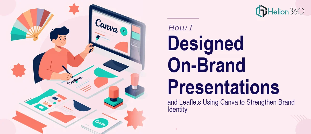
The stakes weren't abstract. These materials were going in front of people who were evaluating us. First impressions built on inconsistent design quietly signal disorganization, even when the content itself is strong. I needed a complete set of on-brand presentations and leaflets — built in Canva, reflecting our brand identity precisely — and I needed them to hold together as a system, not a collection of one-off files.
It was clear this needed to be done properly, not patched together.
What I Found That Told Me This Was More Involved Than It Looked
My first instinct was that Canva makes design accessible — and it does. But accessible isn't the same as straightforward when brand identity is on the line. The moment I started mapping out what the project actually required, the scope clarified quickly.
The brand identity itself needed to be translated into Canva's system correctly. That means building a Brand Guidelines Design Services with exact hex codes, locking the right font pairings, and setting up shared color palettes — not just eyeballing it slide by slide. Any drift at the kit level compounds across every asset.
Beyond setup, there's the question of layout logic. Presentations and leaflets follow different compositional rules. A presentation slide is designed to be read at a distance in a room; a leaflet is held in someone's hand and scanned in seconds. The visual hierarchy, type sizing, and white space decisions are fundamentally different — and both have to feel like the same brand.
I also realized that maintaining consistency across a series of materials is where most attempts quietly fall apart. Getting one slide right is very different from getting twenty slides and three leaflet formats to feel unified.
What the Work Actually Involves
The foundational work starts with a brand audit and system setup. Every element — primary and secondary colors, typeface hierarchy, logo usage rules, and spacing conventions — needs to be formalized before a single layout is touched. In Canva, this means configuring a Brand Kit with precise hex values and font assignments so that every new asset inherits the right defaults automatically. The typographic hierarchy alone requires clear decisions: headline sizes, subhead sizes, and body copy typically follow a ratio like 36pt / 24pt / 16pt, and those relationships need to hold across both presentations and print-ready leaflets. Getting this right at the start takes methodical thinking; skipping it means retrofitting every asset later.
Once the system is in place, the layout and visual mechanics work begins. Presentations and leaflets require different grid strategies — a presentation slide typically uses a structured column grid to anchor content zones and maintain visual breathing room, while a leaflet demands tighter information hierarchy compressed into a smaller, foldable format. Color application has rules too: a well-disciplined brand palette rarely uses more than four colors in any single layout, with clear roles for dominant, accent, and neutral tones. The practitioner decisions here — what gets visual emphasis, where white space creates pause, how imagery is cropped and sized — aren't arbitrary. Each choice either reinforces or undermines the brand's personality.
The final layer is consistency and polish across the full asset set. Even when a Brand Kit is correctly configured, individual layouts drift during production — a text box nudged off-grid, an image with a slightly different crop ratio, a heading that breaks the established size rule on one slide. Catching and correcting these requires a disciplined review pass across every file, comparing each asset against both the brand standards and the rest of the set. This is time-consuming work that demands fresh eyes and a systematic approach. It's also where the difference between a polished set and a nearly-polished set becomes visible to exactly the audience that matters most.
Why I Brought in Helion360 to Handle It
I looked at the scope clearly and made the call quickly: this wasn't a project to attempt in spare hours. The brand system setup, the layout decisions, the cross-format consistency work — all of it required both design fluency and Canva-specific execution depth that I didn't have the time to build from scratch.
Helion360 handled the full project end-to-end. That meant taking the brand identity inputs, configuring the Canva Brand Kit correctly, designing the full presentation deck, and producing the leaflet formats — all as a coherent system. The work was turned around quickly, in a fraction of the time it would have taken me to work through the learning curve and production passes myself.
What made the difference was that this is the kind of work they do continuously. The tooling is already in place, the layout judgment is already developed, and the quality control process is already built in. There was no ramp-up time lost.
What Got Delivered and What I'd Tell Anyone Facing the Same Situation
What came back was a complete, production-ready set — a multi-slide presentation and a series of leaflets that looked unmistakably like the same brand. The color discipline held. The typography was consistent. The layouts were clean and appropriate for each format's context. When those materials went in front of clients and partners, the brand showed up with the kind of coherence that builds quiet confidence.
The practical outcome was also that we now have a Canva system we can extend. New assets start from a correct foundation rather than a blank slate.
If you're looking at a similar situation — brand materials that need to hold together across formats and genuinely reflect your identity — Helion360 is the team to engage. They delivered fast, handled the full execution depth the work required, and the result was exactly what the project needed.