

The Reporting Cycle That Was Eating Up My Week
Every month, the same routine played out. I would pull financial data from three different sources, stitch it together in Excel, run SUMIFS across budget categories, and eventually produce a report that took most of a day to build and another hour to explain in the client meeting. The numbers were accurate. The problem was everything around them.
The spreadsheets were functional but not readable. Stakeholders would ask me to scroll back to a specific row mid-presentation, or they would lose track of which figure mapped to which project. I was spending more time managing the confusion than actually discussing the insights.
I knew the solution involved better-structured Excel dashboards and cleaner cost analysis presentations. I just did not fully know how to get there from where I was.
What I Tried to Build on My Own
I started by restructuring the workbook. I separated raw data from summary sheets, built pivot tables to group costs by department and time period, and used VLOOKUP to pull client-specific figures into a master summary tab. That part went reasonably well.
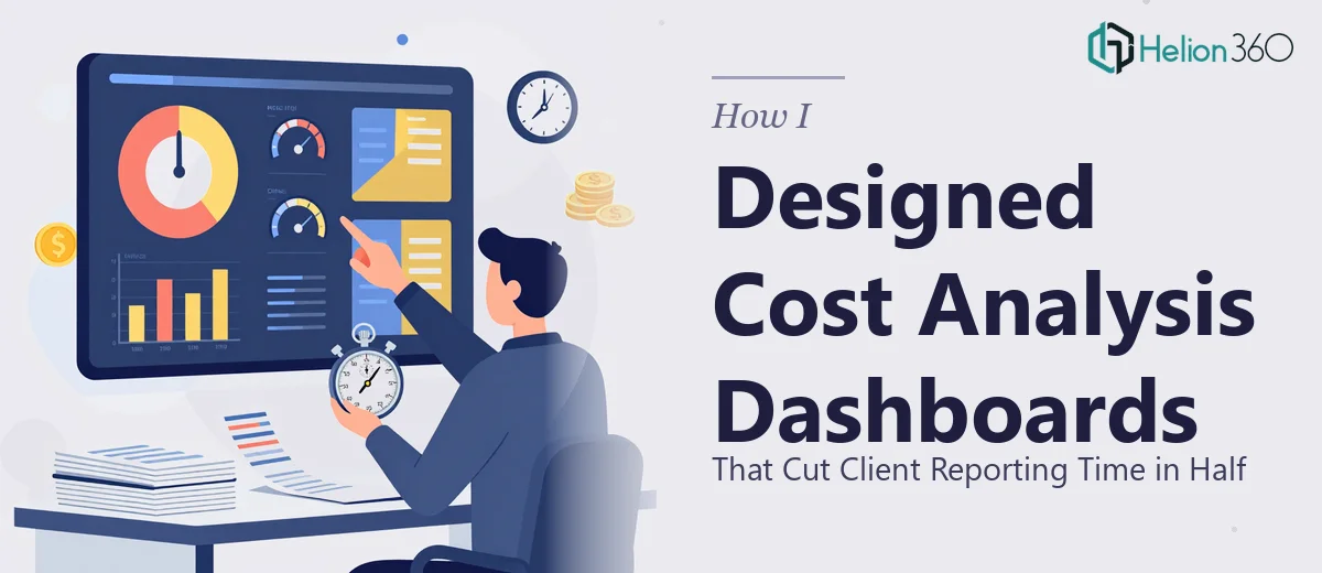
Where I got stuck was the presentation layer. I wanted the dashboard to update automatically as new data came in and to display budget forecasts alongside actuals in a way that was immediately clear to someone who had not built it. I also needed the final output to work as both an internal Excel view and as something I could drop into a client-facing presentation without reformatting everything from scratch.
The more I tried to build it, the more I realized the gap was not just technical. It was also visual. A well-structured dataset still needs thoughtful layout, consistent formatting, and a clear hierarchy of information before it becomes a useful client cost analysis presentation.
Bringing In the Right Help
After spending two evenings trying to make the dashboard behave the way I needed it to, I reached out to Helion360. I explained what I had built, what was not working, and what the end deliverable needed to look like. They asked a few clarifying questions about how the data flowed and who the final audience was, and then their team took it from there.
What came back was a significantly cleaner version of what I had started. The Excel model was restructured with a proper input sheet, automated summary calculations, and a dashboard tab that used conditional formatting and chart combinations to make budget versus actual comparisons immediately legible. The cost categories were grouped logically, and the forecasting section was built so I could update a few input cells each month and have the whole model refresh.
More importantly, the visual design of the reporting layer was done properly. Charts were formatted consistently, data labels were placed where they actually helped rather than cluttered, and the layout followed a reading flow that matched how stakeholders actually process financial information.
What Changed in the Actual Reporting Process
The first time I used the new dashboard in a client meeting, the difference was obvious. Instead of walking people through rows of numbers, I was presenting one summary view that answered the main questions before anyone had to ask them. Cost trends over the quarter, variance from forecast, and category-level breakdowns were all visible on a single screen.
Monthly reporting time dropped significantly. What used to take most of a day now takes under two hours, most of which is data entry rather than formatting or explanation. Client feedback has been cleaner too — fewer follow-up questions, faster sign-offs.
The Excel work was always capable of producing useful analysis. The missing piece was structure and design, and that combination is harder to get right than it sounds when you are also responsible for the underlying financial modeling.
What This Experience Taught Me About Cost Analysis Presentations
Building a cost analysis dashboard that actually works for client reporting is not just an Excel problem. It is also a communication design problem. The data needs to be accurate, yes, but it also needs to be organized so that the person reading it can form conclusions without needing a guided tour.
Getting both right at the same time, under a deadline, while managing everything else that comes with a project management role, is genuinely difficult. Knowing when to bring in support is part of working efficiently — not a shortcut.
If you are dealing with the same cycle I was — functional data, messy output, too much time spent on preparation — Helion360 is worth a conversation. They handled both the Excel structure and the reporting design, and the result was something I could actually hand to a client with confidence.