

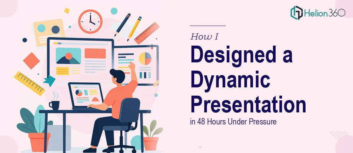
When a 48-Hour Deadline Meets a High-Stakes Product Launch
The message came in on a Tuesday afternoon: the launch team needed a polished, visually dynamic PowerPoint presentation ready within 48 hours. The content was already written — product specs, positioning statements, competitive advantages — all sitting in a shared document. What was missing was a professional presentation design that could actually do the content justice in front of a live audience.
I figured I could handle it. I had built slides before. I opened PowerPoint, pulled in the text, and started laying things out. Two hours in, I had 12 slides that looked exactly like what they were — a functional template with text dropped in and not much else. The color scheme felt generic. The charts were plain. Nothing about it said "product launch."
Where DIY Slide Design Hits Its Limits
The problem was not the content. The content was solid. The problem was translating that content into a visually dynamic PowerPoint presentation — one with clear slide layouts, engaging infographics, intentional typography, and a consistent visual language throughout. That kind of work requires more than knowing how to use PowerPoint. It requires design thinking, layout experience, and the ability to work fast without cutting corners.
I tried reworking the slides with a downloaded template. Better, but still not right. The infographics looked mismatched. The data slides were cluttered. The overall flow did not feel like a professional presentation — it felt like someone had dressed up a first draft.
With less than 36 hours left, I needed a different approach.
Bringing in the Right Team at the Right Time
A colleague had mentioned Helion360 a few weeks earlier. I looked them up, explained the situation — tight deadline, content ready, needed a visually dynamic PowerPoint presentation designed from the ground up — and sent over the material.
Their team responded quickly. They asked a few focused questions about the audience, the brand tone, and the key messages we needed to land. Then they got to work.
What a Professional PowerPoint Design Actually Looks Like
What came back roughly 24 hours later was a completely different level of work. Every slide had a clear, intentional layout. The data was visualized through clean, well-labeled charts that made comparisons easy to read at a glance. Infographics replaced what had been walls of bullet points. The color scheme was consistent with the brand and carried visual weight without being distracting.
The typography was handled properly — hierarchy was clear, nothing competed with itself. Key product differentiators each had their own visual moment instead of being buried in a list. The presentation felt like it had been built for an audience, not just assembled from content.
Helion360 also included subtle motion on a few slides — entrance animations that guided the eye without slowing the pace of the presentation. It was exactly the kind of detail that separates a professional presentation design from something put together under pressure.
What I Took Away from the Experience
A few things became clear after going through this process. First, having well-developed content is only half the work. The visual design layer of a PowerPoint presentation carries its own weight — especially when the stakes are high. Second, the gap between a functional slide deck and a visually stunning presentation is larger than it looks until you are staring at both side by side.
The product launch went well. The presentation held the room's attention throughout and the slides communicated the key messages clearly. I received direct feedback that the deck looked polished and professional — which, if I am being honest, the version I had built would not have earned.
The 48-hour deadline taught me that professional PowerPoint design is not something to approximate under pressure. When the output matters, the design process matters too.
If you are facing a similar deadline with a presentation that needs to look and perform at a high level, Helion360 is worth reaching out to — they stepped in at the most critical point and delivered exactly what the situation required.