

The Presentation Looked Fine — Until It Didn't
I was working on a set of presentations that needed to go out to a fairly important internal audience. The decks covered quarterly performance, process timelines, and a few data-heavy sections with charts and visual summaries. On paper, the content was solid. But when I looked at the slides together, something felt off.
The icons I had pulled from generic libraries were inconsistent. Some were outlined, some filled, some had rounded corners, others were sharp-edged. They came from three different packs and it showed. For a presentation meant to reflect our brand, it looked patchy at best.
I realized the problem wasn't the content — it was the visual language. The iconography for the Google Slides and PowerPoint decks needed to be cohesive, purposeful, and on-brand.
Why Fixing It Myself Wasn't Straightforward
I'm comfortable working inside Google Slides and PowerPoint. Formatting, layout adjustments, even some basic design work — that's manageable. But creating a full set of custom icons that matched our brand guidelines across multiple slide types was a different challenge entirely.
I spent about half a day trying to make it work — adjusting existing icons, editing SVGs, attempting to create a few shapes manually. The results were inconsistent and frankly, they didn't look professional. Icon design for presentations requires a specific kind of visual precision: every icon in the set needs to share the same stroke weight, visual weight, and conceptual style. It's not just drawing shapes — it's building a system.
I also had a deadline. And between managing the actual content of the presentations and coordinating with the rest of the team, I didn't have the bandwidth to learn icon design from scratch.
Bringing in the Right Help
After hitting a wall, I came across Helion360. I explained the situation — we had a mix of Google Slides and PowerPoint files, specific brand colors and typography, and a need for icons covering categories like data visualization, timelines, process flows, and charts. The icons needed to work at small sizes inside slides without losing clarity.
Their team asked the right questions upfront: What's the brand palette? What style — flat, outlined, or filled? What contexts would the icons appear in? That conversation made it clear they understood presentation design, not just generic graphic work.
What the Process Looked Like
Helion360 started with a small batch of concept icons to align on style before moving to the full set. This was useful — I could see early on whether the visual direction matched what I had in mind, and we made a couple of adjustments to the stroke weight before they continued.
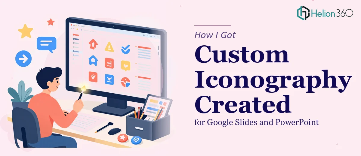
The full icon set covered everything I needed: process steps, data and chart indicators, timeline markers, status symbols, and a few category-specific icons for the performance sections. Each icon was delivered in formats compatible with both Google Slides and PowerPoint, and they were clean enough to resize without distortion.
What stood out was the consistency. Every icon felt like it belonged to the same family. The visual weight, the corner radius, the spacing — it all held together across the slide deck.
The Difference It Made
When I dropped the new icons into the presentation templates, the slides immediately looked more intentional. The data visualization slides in particular — where icons sat alongside charts and graphs — felt much cleaner. The audience's attention stayed on the information rather than getting distracted by mismatched visuals.
The presentations went out on time, and the feedback on the visual quality was noticeably positive. A few people asked which design tool we had used, which was a good sign.
More practically, having a consistent icon set now means I can reuse these assets across future decks without the same scramble. It was a one-time effort with long-term value.
What I Took Away From This
Iconography for presentations is one of those things that looks simple until you try to do it properly. Getting it right means more than finding something that looks decent — it means creating a set of visual elements that reinforce the brand, work at scale, and don't distract from the content.
For anyone working across Google Slides and PowerPoint with real brand standards to uphold, trying to piece together icons from free libraries is a short-term fix that usually creates more work later.
Working on a presentation that needs a consistent visual identity? If the iconography or overall design is taking more time than the content itself, Helion360 is worth reaching out to. Their team handles exactly this kind of work — from custom icon sets to full presentation design — and they know how to make it work inside the tools you're already using.