

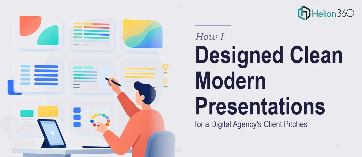
The Brief Sounded Simple. The Reality Was Not.
When our marketing team at a growing digital agency in Sydney started planning for a round of client pitches, I was tasked with pulling together the presentations. The scope covered recent campaign results, upcoming project proposals, and key performance indicators — across three separate decks for different clients.
On paper, it seemed manageable. I had the content. I had PowerPoint. I'd built slides before.
But as I started working through the first deck, the gap between "putting slides together" and "designing a clean, modern PowerPoint presentation" became obvious very quickly.
Where Things Got Complicated
The core challenge wasn't the content — it was making that content look like it belonged to a credible, design-forward agency. Our brand had specific colors, a defined type system, and a visual tone that communicated confidence without being loud. Replicating that consistently across dozens of slides while also making data readable, layouts balanced, and the overall flow engaging — that's a different skill set.
I spent two evenings trying to build the first deck from scratch. I had a rough structure, a few slides that looked decent, and a growing pile of inconsistencies. The KPI slides felt flat. The campaign summary section was text-heavy. The fonts didn't feel cohesive. And we had a deadline coming up fast.
The problem wasn't lack of effort. The problem was that professional PPT design — especially for client-facing pitch decks — requires a combination of visual judgment, layout experience, and brand discipline that takes time to develop.
Bringing in the Right Help
After hitting a wall, I came across Helion360. I reached out, shared the brief, our brand guidelines, and the raw content I'd assembled. Their team asked a few focused questions about the audience, the tone we wanted to strike, and any specific slide types we needed — like data charts, timeline visuals, and KPI summaries.
What I appreciated was that they didn't just take the content and disappear. They came back early with a sample slide set to align on direction before building everything out. That quick checkpoint saved a lot of back-and-forth later.
What the Final Decks Looked Like
Helion360 delivered three complete pitch decks within the agreed timeframe. Each one was tailored to its audience while staying visually consistent with our brand identity.
The KPI slides used clean data visualization — simple charts with clear labels, no unnecessary noise. The campaign recap sections used a mix of visual hierarchy and structured layouts that made the content easy to scan. The upcoming project slides had a professional but approachable tone that matched what we'd brief verbally in the room.
Every deck had consistent typography, a coherent color system, and a structure that guided the viewer from context to insight to next steps. It felt like our agency had genuinely produced it — which was exactly the point.
What This Experience Taught Me
Presentation design for client pitches is not the same as making slides for internal updates. When the deck is going in front of a client, every visual decision carries weight. Misaligned fonts, crowded slides, or inconsistent colors signal a lack of attention — and that's the last thing you want a potential client to feel before you've even spoken.
I also learned that having someone else handle the design doesn't mean losing control of the story. The content, the narrative, the key messages — those came from us. Helion360 translated them into a format that could actually hold a room.
If You're in a Similar Position
If you're managing presentations for client pitches and the design side is slowing you down, it's worth knowing that there are teams who do this work specifically — and do it well. Helion360 handled a genuinely complex, deadline-driven project with a clear process and solid output. Sometimes the smartest move is recognizing when the work needs a specialist.