

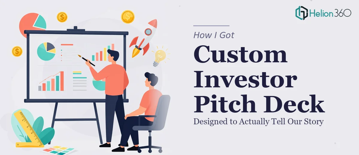
The Deck We Had Wasn't Telling the Right Story
We had a pitch deck. It had slides, it had data, it technically covered our digital marketing solutions. But every time I looked at it before a prospective investor meeting, I felt a knot in my stomach. The information was there — but the story wasn't. The visual design didn't match the caliber of the company we were building, and the structure made it hard to follow the thread from problem to solution to opportunity.
This wasn't a cosmetic issue. This was the deck we were going to carry into our most important funding conversations. Investors see dozens of decks. A presentation that looks unpolished or buries its strongest points signals something about the team behind it — and not something good. I knew immediately that getting this right wasn't optional. It needed a complete rethink, not a patch job.
What I Discovered Designing a Pitch Deck Well Actually Requires
I started researching what a properly designed investor pitch deck actually involves, and the complexity surfaced fast. It's not about making slides look nicer. The work starts at the narrative level — identifying the precise sequence of information that takes an investor from unfamiliar to convinced, which means every slide has a job to do and the deck has to earn each next slide.
Then there's the visual layer. Investor decks for digital marketing companies carry specific expectations: the design needs to signal digital fluency without being flashy for its own sake. Typography has to communicate authority and clarity simultaneously. Data slides — market size, traction metrics, revenue projections — need to be readable at a glance and defensible at depth.
And then there's brand consistency across every slide, with no drift in color, no inconsistent font weights, no layout that breaks the visual rhythm the deck establishes in its opening slides. Each of these layers is a separate discipline. Doing all three well, in one coherent deck, under a real deadline — that's not a weekend project.
What the Work Itself Actually Involves
The right approach to a custom pitch deck starts with a structural audit of the existing narrative. A practitioner maps what each slide is trying to communicate, identifies where the logical thread breaks down, and rebuilds the sequence so the problem-solution-traction-ask arc is unambiguous. For an investor deck, this typically means a 12-to-16 slide structure where each slide advances a single argument — no slide is doing double duty, and no critical claim is buried inside a paragraph. Getting this architecture right before touching any visual element is what separates presentations that hold attention from ones that lose it by slide six.
Once the narrative scaffold is in place, the visual mechanics work begins. A properly designed pitch deck operates on a consistent layout grid — typically a 12-column base that keeps content anchored across slide types — with a strict typographic hierarchy: 40pt or larger for headlines, 24pt for supporting text, 16pt for footnotes or data labels, and nothing smaller than that. Color usage follows a disciplined palette of no more than four brand-aligned values, with one accent color reserved for emphasis. Designing this system correctly once and propagating it across every master slide takes real time. Doing it in a way that holds up when slides are reordered or content is updated takes even more.
Data slides carry their own execution challenges. Market sizing, revenue projections, and traction charts each call for a specific chart type chosen for how the data actually needs to be read — a TAM/SAM/SOM breakdown typically requires a nested visual treatment, while month-over-month growth calls for a clean line chart with annotated inflection points rather than a cluttered bar chart. The friction here isn't knowing the formats; it's applying judgment about which visual encoding makes each claim land fastest for a time-pressed investor, and then building those charts so they're editable, accurate, and visually consistent with the rest of the deck.
Why I Brought Helion360 In to Handle the Full Project
I looked at the scope and made a straightforward call. The narrative work, the visual system, the data slides, the brand consistency across every slide — doing all of that well, without the experience and tooling already in place, would have taken weeks I didn't have. And the risk of getting it wrong was too high.
Helion360 handled the investor pitch deck project end-to-end. That meant starting from the structural audit, rebuilding the story arc, designing the full slide system, and producing every data visualization to the standard the deck needed. They handled the typographic hierarchy and layout grid, applied brand consistency across all slide variants, and delivered the complete deck fast — done in days, not weeks, and at a level of execution depth that would have taken me far longer to reach on my own.
What made the difference was that this is work they do every day. The tooling, the design judgment, the experience with investor expectations — it was already in place. I didn't have to manage a learning curve. I just had to brief them clearly and review the output.
The Outcome — and What I'd Tell Anyone Looking at the Same Problem
The deck that came back was a fundamentally different artifact from what we started with. The narrative was clean and sequenced correctly. The visual design signaled the kind of company we are. The data slides were readable and defensible. When we took it into investor meetings, the feedback shifted — people were engaging with the content instead of fighting to follow it.
The business outcome was what the project was always about: a deck that gave our pitch the best possible chance of landing. Getting there required the full scope of work — structure, visuals, data, consistency — executed at a standard that matched the stakes.
If you're looking at a pitch deck that isn't doing justice to your company's story and you need it rebuilt properly and quickly, Helion360 is the team I'd engage — they delivered end-to-end with the speed and execution depth this kind of work demands.