

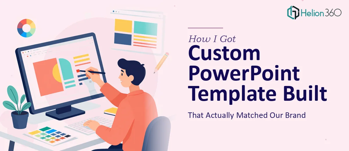
When a Generic Template Stopped Being Good Enough
We had a presentation coming up that mattered — a formal pitch to a professional audience that had seen hundreds of decks before ours. The slides we were using looked like every other corporate presentation: a stock theme, mismatched fonts, and brand colors that were close but never quite right. The kind of deck that signals you didn't take the meeting seriously.
The stakes were clear. This wasn't an internal update or a casual walkthrough. It was a room full of people who would form an impression of our organization within the first thirty seconds of seeing our slides on screen. A generic PowerPoint template wasn't going to cut it. We needed something built to our brand, flexible enough to handle different content types, and polished enough to hold up under scrutiny. I knew immediately this needed to be done properly — not patched together overnight.
What I Found Out a Proper Custom Template Actually Requires
I started looking into what a well-built custom PowerPoint template actually involves, and the complexity surfaced fast. It isn't just swapping in brand colors and uploading a logo. Done properly, a custom PowerPoint template is a structured design system — one that has to work across dozens of slide types, present consistently regardless of who's editing it, and enforce brand standards without needing a designer in the room every time someone adds a new slide.
Three things stood out immediately as signals that this was serious work. First, the master slide architecture — a properly built template uses a layered master and layout system that controls formatting globally, meaning a change at the master level cascades correctly without breaking individual slides. Second, brand application isn't just colors — it's type hierarchies, spacing rules, and icon style that all have to cohere. Third, the template needs to be future-proof: built so that anyone on the team can use it without accidentally breaking the design system. That combination of technical precision and design judgment isn't something you can fake.
What the Work Actually Involves
The structural foundation of a custom PowerPoint template starts with the Slide Master and layout hierarchy. A well-architected template uses a single master with a carefully organized set of child layouts — typically 10 to 20 layouts covering title slides, section dividers, content grids, data slides, and blank canvases. Each layout inherits from the master so that font changes, color updates, or logo swaps propagate in a single edit rather than requiring manual updates across every slide. Getting this hierarchy right requires methodical setup and an understanding of how PowerPoint's inheritance model behaves — something that trips up even experienced users who haven't built templates from scratch before. Done wrong, the whole system breaks the moment someone customizes a slide.
Visual mechanics come next, and they require a level of precision that goes beyond aesthetic preference. A properly built template works on a 12-column underlying grid, with consistent margin gutters (typically 0.5 to 0.75 inches), a defined three-level type hierarchy (commonly 36pt for headlines, 24pt for subheads, 16pt for body), and a capped brand palette of no more than four primary colors plus two neutrals. Every graphic element — divider lines, accent shapes, icon sets — follows a single style rule so the deck reads as one coherent system rather than a collection of individually designed slides. Establishing these rules and then building placeholder objects that enforce them takes far longer than most people expect, especially when accounting for how elements behave across different slide dimensions and screen ratios.
Polish and consistency across the full template set is where most self-built templates fall apart. It isn't enough to design five good-looking slides — the system needs to hold together across every layout variant, including edge cases like slides with heavy data, slides with minimal text, and slides that mix imagery with copy. Checking that text boxes don't overflow at maximum content, that image placeholders crop correctly across aspect ratios, and that no element sits outside the safe zone for projected display is painstaking work. A complete QA pass on a 15-to-20-layout template, done to a professional standard, can take as long as the initial design itself.
Why I Brought Helion360 In to Handle the Full Build
I looked at what the work actually involved and made a straightforward call: this wasn't something to attempt internally on a tight timeline. The master slide architecture alone requires a level of PowerPoint systems knowledge that takes real hours to develop, and we needed the template ready before the presentation window closed.
Helion360 handled the full project end-to-end and delivered fast. They took the brand inputs — color codes, typography, logo files, and a brief on the audience — and turned around a complete, production-ready template in days, not weeks. The build covered the full master and layout hierarchy, the complete slide variant set including data layouts and section dividers, and a QA pass to confirm the system held up across content types. That's the kind of execution depth that comes from a team that does this work every day with the tooling already in place — not from someone learning the master slide system for the first time under deadline pressure.
The Result and What I'd Tell Anyone Facing the Same Call
What came back was a template that looked like it belonged in the room. The brand came through cleanly — not just in colors but in the way the typography, spacing, and visual hierarchy all pointed in the same direction. Every layout held up under real content. The team could open it, add slides, and maintain the design standard without any design knowledge required.
The presentation landed well. More importantly, we now have a reusable asset that every deck going forward starts from — which means every future presentation carries the same standard without starting from scratch.
If you're looking at the same problem — a presentation that needs to represent your brand properly and a template system that needs to actually work — Helion360 is the team to engage. They handled the full build fast, and the execution depth shows in every slide.
Learn more about what building a master PowerPoint slide template actually takes, and discover how a branded PowerPoint template can hold up across investor pitches and major presentations.