

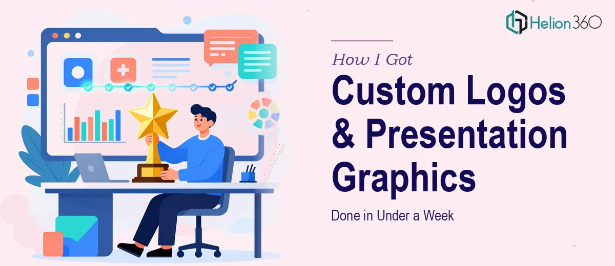
The Conference Was a Week Out and Our Slides Looked Like a Draft
I was preparing for a conference that mattered — a genuine opportunity to put our tech startup in front of the right people, generate real interest, and walk away with conversations worth having. We had the content. We had the data. What we didn't have was a presentation that looked like it belonged on a professional stage.
The slides were rough. The logo needed work to hold up at larger sizes. The charts and infographics were functional but flat — the kind of visuals that make an audience glance at the screen once and look back down at their phones. For a conference like this, that wasn't an option.
I knew immediately that this needed to be executed properly — custom graphics, a cohesive visual system, and a logo treatment that could anchor the whole deck. The question wasn't whether to fix it. The question was how to get it done in under a week without compromising on quality.
What I Found Out This Kind of Work Actually Involves
Once I started looking into what proper conference presentation design actually requires, the scope became clear fast.
The logo alone wasn't a quick resize. A logo that works across a presentation environment needs to be assessed for contrast behavior — how it reads on dark backgrounds versus light ones, whether the mark holds at small sizes in a corner watermark and also scales cleanly to a full title slide. That requires vector-level work and a clear understanding of how the mark interacts with the broader color palette.
Then there's the slide graphics layer. Infographics and data charts for a tech presentation aren't just dropped in — they have to be built to a visual standard that matches the brand's tone. A startup with an innovative, modern identity needs graphics that communicate that, not generic clip-art-adjacent shapes.
And all of it has to feel like one cohesive system. Every asset — the logo, the charts, the section headers, the icon set — has to look like it came from the same design decision, not from five different directions.
That coordination is where things get complicated fast, especially under deadline.
What the Work Itself Actually Takes to Do Right
The right approach starts with the visual identity foundation. Logo refinement for a presentation context means reviewing the existing mark against a strict contrast ratio standard — at minimum a 4.5:1 ratio for text-adjacent elements, and a clear decision on which version of the logo (full color, reversed, monochrome) applies in each slide context. Typography needs its own hierarchy: a title size around 36–40pt, supporting text at 24pt, and caption or label text no smaller than 14pt. Getting these rules wrong and applying them inconsistently across 20 or 30 slides is one of the most common mistakes in presentation design, and it's tedious to fix after the fact.
The visual mechanics of the slide graphics layer carry their own complexity. A professional presentation grid — typically a 12-column layout — governs where charts, infographics, and text blocks sit relative to each other. Charts need to be built natively within the presentation environment or imported in a format that allows clean resizing without pixelation. Infographics that illustrate technology trends or product metrics need deliberate icon choices, a maximum palette of four brand colors with defined usage rules, and enough whitespace to breathe. People underestimate how many micro-decisions this involves: which data gets a bar chart versus a timeline, where an icon supports the point versus distracts from it, how much text annotation a chart can hold before it stops communicating anything.
Finally, consistency across the full deck is the piece that most people find genuinely time-consuming. Every slide needs to be checked against the master template — alignment, padding, color usage, font weights. Even a small inconsistency in the logo placement or a rogue font weight on a single slide will read as unpolished to a sharp audience. Auditing a 25-slide deck for this kind of consistency, fixing the outliers, and then running a final pass takes hours — and that's assuming the master slide structure was set up correctly to begin with, which is its own technical task.
Why I Brought Helion360 in to Handle the Full Project
I looked at what this required — logo refinement, branded infographics, chart design, and a fully consistent deck ready for a live conference — and made a quick decision. Attempting to execute this myself across a five-day window wasn't realistic. I don't have the design tooling set up, and the learning curve alone on master slide architecture would have eaten the week.
Helion360 handled the full project end-to-end. That meant reviewing and refining the existing logo for presentation contexts, building the branded graphics and infographics to match the startup's visual identity, and designing the charts to communicate the data clearly without visual clutter. The deck came together as a cohesive system — everything aligned, everything on-brand.
The turnaround was fast. What would have taken me weeks of iteration and rework was handled in days. That's the value of a team that does this work constantly and has the process, the tooling, and the design judgment already built in.
What Came Out of It and What I'd Tell Anyone in the Same Position
The materials we walked into that conference with were exactly what the moment called for. The logo held up cleanly on title slides and section headers. The infographics communicated our technology story without overwhelming the audience. The charts were legible, well-labeled, and consistent with the brand palette across every slide. The whole deck looked like it was built with intention — because it was.
The response from the room confirmed it. When the visuals are credible, the content lands differently. People take you seriously in a way they simply don't when the design signals that you didn't have time to care.
If you're looking at a similar situation — a deadline bearing down, a presentation that needs real graphic work, and no time to figure it out yourself — Helion360 is the team I'd engage. They delivered fast, handled every layer of the execution, and the result spoke for itself.