

The Problem With Presenting a TV App UI to Stakeholders
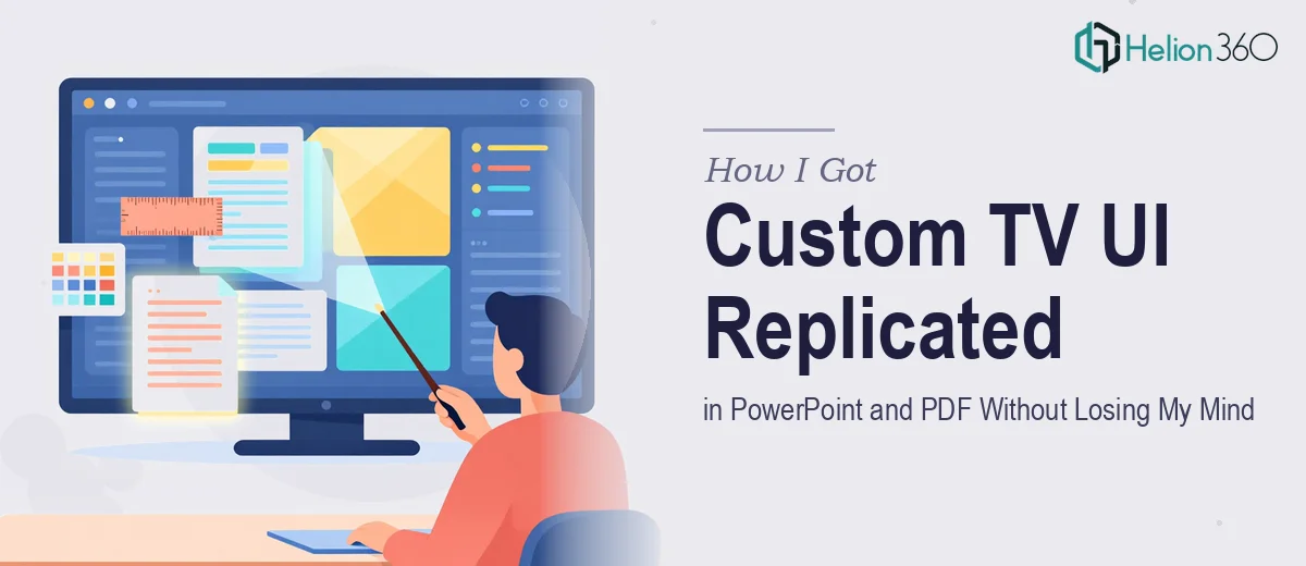
I was working with a tech startup that had built out wireframes for a new television application. The product was ready enough to show — but the team needed polished, accurate visual representations of the UI across multiple screens, packaged into both a PDF and a PowerPoint deck for stakeholder and internal team reviews.
This wasn't a casual slide update. The materials were going in front of people making real decisions about the product's direction. A rough screen grab or a loosely interpreted layout wasn't going to cut it. The UI needed to be replicated faithfully — design language intact, screen states clear, the full visual logic of the product communicated precisely.
I knew straight away this wasn't a task to patch together over a weekend. Getting it right required a level of craft and tooling that demanded the right team from the start.
What I Found This Kind of Work Actually Requires
Once I looked into what a proper UI replication project involves, the complexity became obvious fast. This isn't a case of screenshotting wireframes and dropping them onto slides. Doing it well means reconstructing each screen as a clean, production-quality graphic — respecting spacing, color values, iconography, and interaction states exactly as defined in the design language.
The PDF and PowerPoint outputs add another layer. A PDF stakeholder document has different layout and fidelity expectations than a live presentation deck. One needs pixel-perfect static fidelity across print-ready pages. The other needs to hold up on a projector at scale, with slides that guide a room through a product story rather than just display assets.
Three things stood out as signals of real complexity: maintaining design system consistency across every screen variant, translating UI components accurately without the native design tools the product team used, and structuring both output formats so they told a coherent product story rather than functioning as a flat asset dump.
The Work That Needs to Happen
The foundation of any UI replication project is a thorough audit of the source material. The work involves reviewing every wireframe, annotation, and design reference provided, then mapping out a clear screen hierarchy — which states need to be shown, in what order, and what story each screen is meant to tell. Done well, this structural work precedes any visual execution. Without it, screens get recreated in isolation and the final deck feels fragmented rather than purposeful. Getting the narrative structure right at this stage typically takes significant back-and-forth with the source team, and the decisions made here shape everything downstream.
The visual mechanics of replicating a TV interface are demanding in their own right. Television UIs operate on a 1920×1080 pixel canvas with specific grid conventions — typically a safe-zone margin of around 5–10% on all sides to account for overscan, tight typographic hierarchies using large display fonts at roughly 48pt or above for primary labels, and dark-background color palettes with high-contrast accent colors. Reconstructing these elements accurately in PowerPoint or as PDF-ready graphics, without access to the original design files, means rebuilding components from scratch. That process is painstaking and easy to get subtly wrong in ways that undermine the presentation's credibility.
Polish and consistency across both output formats is where most non-specialists run into serious trouble. A PDF deck and a PowerPoint deck are not the same artifact. The PDF needs bleed-safe layouts, embedded fonts, and a reading flow optimized for a document viewer. The PowerPoint needs master slide architecture, consistent placeholder behavior, and graphics that render cleanly at various display resolutions. Applying a unified visual identity across both — same palette, same component fidelity, same typographic rules — while respecting the constraints of each format takes discipline and experience. Doing this across 20 or more screens without drift requires a level of systematic quality control that is hard to sustain without the right process in place.
Why I Brought in Helion360 to Handle It
I recognized quickly that attempting this in-house wasn't realistic. The scope — accurate UI replication, two distinct output formats, stakeholder-grade fidelity — required a team that does this kind of work regularly, with the tooling and process already in place.
Helion360 handled the full project end-to-end. That meant taking the wireframes and design language references, rebuilding each screen as a polished visual asset, and packaging everything correctly into both the PDF stakeholder document and the PowerPoint presentation deck. They also handled the structural narrative work — organizing the screens into a logical flow that made the product story clear to a non-technical audience.
What stood out was how quickly it moved. The kind of execution this project needed — rebuilding UI components with precision, maintaining consistency across two format types, quality-checking every screen — was handled in a fraction of the time it would have taken to learn and execute it without that depth of experience already built in. Done in days, not weeks.
The Outcome and What I'd Tell Anyone in My Spot
What came back was a set of materials the team could actually use in the room. The PDF held up as a leave-behind document — clean, print-ready, every screen represented with the fidelity the product deserved. The PowerPoint deck worked as a presentation tool, structured to walk stakeholders through the UI logic without requiring a live demo. The product story was legible, the design language was intact, and the team could present with confidence.
If you're looking at a similar problem — wireframes that need to become stakeholder-ready presentation materials, across formats, without cutting corners on fidelity — Helion360 is the team I'd engage. They delivered fast and handled the kind of end-to-end execution depth this work genuinely requires.