

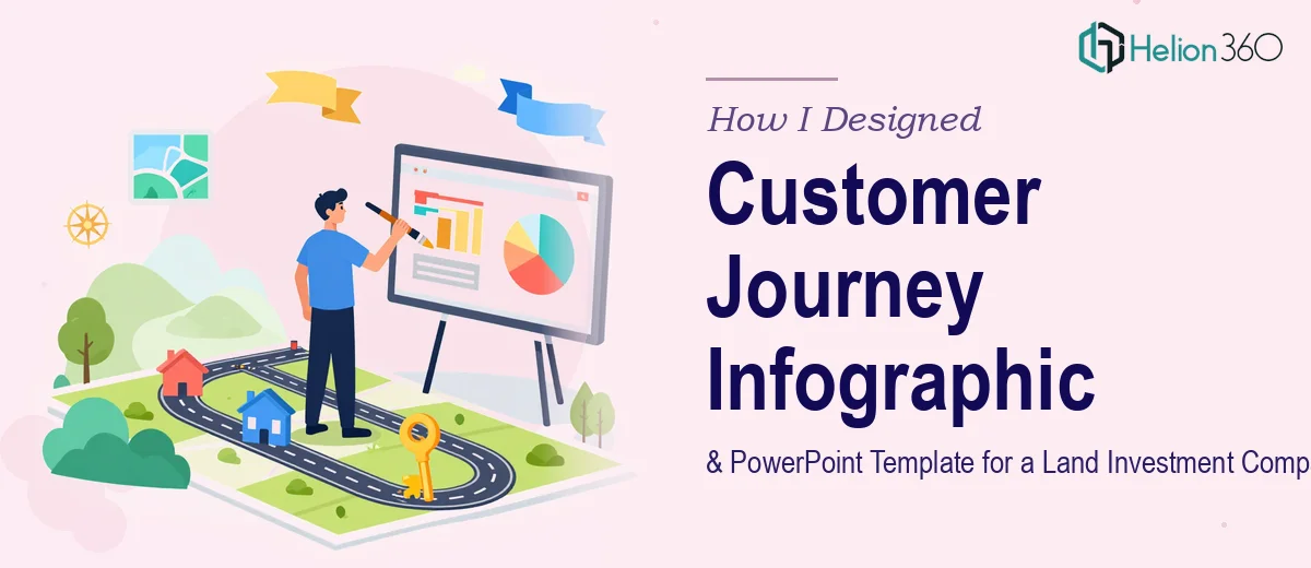
The Brief Sounded Straightforward. It Wasn't.
When I first received the project outline, it seemed manageable enough. A land investment company needed two things: a customer journey infographic that mapped the investor experience from first contact to final decision, and a polished PowerPoint template for use across seminars, webinars, and internal meetings.
Both pieces had to reflect the company's brand — innovation, transparency, and reliability — while staying consistent with existing brand guidelines covering color schemes, typography, and iconography. The timeline was two weeks. I had worked on similar projects before, so I felt reasonably confident.
Then I opened the brand guidelines document.
Where the Complexity Started to Surface
The first challenge was the infographic. Mapping a customer journey for a land investment company isn't the same as sketching a simple funnel. The stages were nuanced — awareness, research, evaluation of land parcels, financial consideration, legal due diligence, and finally the investment decision. Each stage had multiple touchpoints, and the goal was to make that entire arc visually accessible to potential investors who may not have deep industry experience.
I started blocking out the flow in a basic design tool. The content structure made sense on paper, but turning it into something visually coherent — icons that fit the brand, a layout that didn't feel cluttered, typography that matched the guidelines — was proving far more time-consuming than expected.
The PowerPoint template added another layer. It needed to work across different contexts: a formal investor seminar, a company meeting, and a live webinar. That meant designing a flexible master layout with enough slide variety to cover all scenarios, while keeping the visual identity consistent throughout. Getting the master slides right, building out section breaks, title slides, data slide formats, and content layouts — all while adhering to the brand guidelines — was a significant technical undertaking.
After three days of iterations, I had drafts that were functional but not presentation-ready. The infographic felt flat. The PowerPoint template lacked the visual polish that the company's positioning demanded.
Bringing in the Right Team
After hitting that wall, I came across Helion360. I explained the project — the two-week deadline, the brand guidelines, the dual deliverables, and what I had already attempted. Their team reviewed my drafts and the brand document and came back with a clear plan.
They took over the infographic first. The designer restructured the customer journey layout into a clean, stage-by-stage horizontal flow that felt intuitive to read. Each stage had custom iconography aligned with the brand guidelines, and the color progression naturally guided the viewer's eye from initial interest through to the investment decision. Complex ideas — like the due diligence phase — were broken down into digestible visual cues without oversimplifying the content. Our Infographic Design Services are built specifically for this kind of challenge — turning layered processes into clear, brand-aligned visuals.
For the PowerPoint template, Helion360 built a full master slide system in PowerPoint that covered every use case the company had outlined. Title slides, section dividers, content slides with text-and-image balance, data visualization slide formats, and a clean closing slide — all locked to the brand's color palette and typography. The template was built to be editable, so internal teams could update content without breaking the design structure.
What the Final Deliverables Looked Like
The infographic came back as a single-page visual that walked potential investors through six clearly defined stages. It was designed to work both as a printed piece and as a digital asset for webinar use.
The PowerPoint template included over twenty slide layouts covering the full range of presentation contexts. Each layout followed a consistent grid, and the master slide setup meant that any team member could use the file without needing design experience.
Both deliverables were completed within the two-week window, which mattered. The company had upcoming events, and the materials needed to be ready ahead of those dates.
What I Took Away From This
The experience clarified something important. Designing a customer journey infographic for a specialized industry like land investment isn't just a visual task — it's a content and communication challenge that requires both design skill and an understanding of how investors process information. The same applies to a multi-purpose PowerPoint template: it needs to be built with real use cases in mind, not just look good in a preview.
When the scope is this specific and the brand standards are this defined, the gap between a functional draft and a truly polished deliverable is wider than it appears at the start.
Need Help With a Similar Project?
If you're working on presentation design or infographic creation for an investment or corporate context and the scope is getting more complex than expected, Helion360 is worth reaching out to. Their team handles exactly this kind of work — brand-aligned, deadline-driven, and built for real-world use.