

The Brief Seemed Simple. The Execution Was Not.
I was tasked with putting together a construction industry presentation for a mixed audience — engineers, project managers, and senior decision-makers from adjacent industries. The presentation had to cover current market trends, ongoing challenges, emerging technologies, and the growing push toward sustainable construction practices. It also needed to be data-driven and visually sharp enough to hold the room.
On paper, that sounded manageable. In practice, it turned into one of the more demanding projects I had taken on in a while.
Where I Started — and Where I Ran Into Trouble
I began by gathering data. Industry reports, global construction market forecasts, regional infrastructure investment figures, and sustainability benchmarks. The raw material was there, but the sheer volume of it was the first problem. I had data points from a dozen different sources and no clear visual language to tie them together.
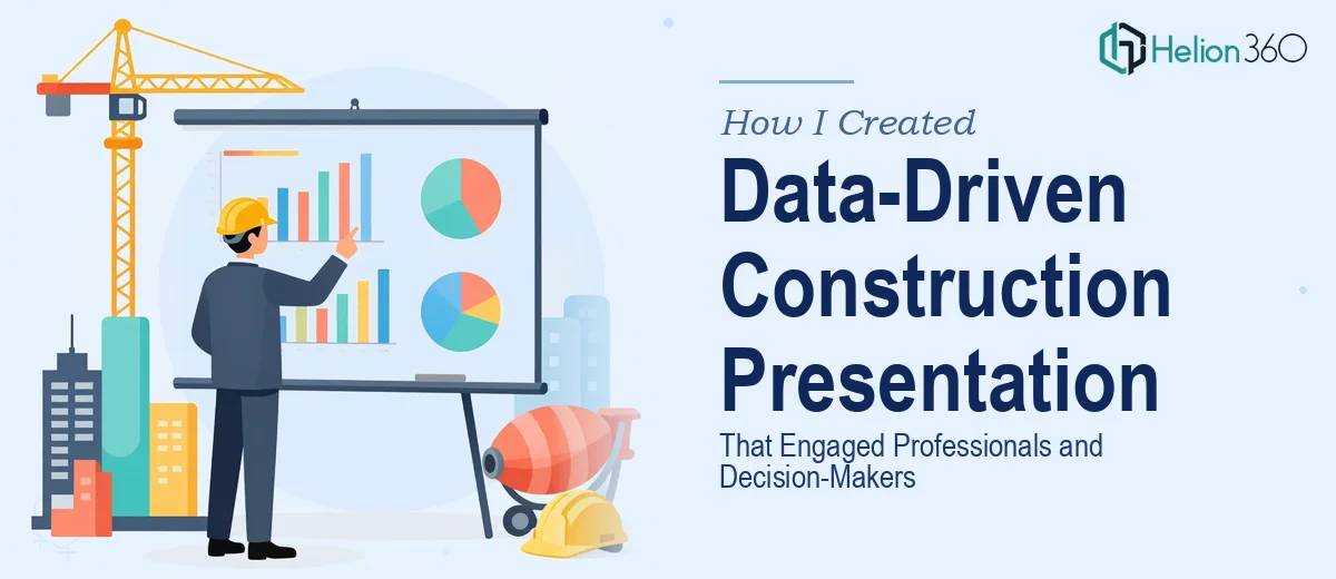
I tried building the slides myself. I put together a structure — market overview, key challenges, technology adoption, sustainable practices, and a forward-looking section on what decision-makers should consider. But the moment I started designing, the gaps became obvious. The charts looked inconsistent. The flow between sections felt abrupt. And the slides were carrying too much text, which is a fast way to lose a room full of professionals who have seen a hundred presentations before.
The dual audience made it more complicated. Engineers respond to technical depth and precise data. Executives want strategic framing and clear takeaways. Trying to serve both groups in the same deck, without dumbing down for one or overwhelming the other, required a level of design thinking I did not have the bandwidth for at that point.
Bringing In the Right Support
After spending more time than I had reworking slide layouts that still did not feel right, I reached out to Helion360. I explained the scope — the audience type, the content areas, the tone I was aiming for, and the fact that the data visualization needed to carry real weight without becoming dense or hard to read.
Their team asked the right questions from the start. They wanted to understand who would be in the room, what the presentation was meant to achieve, and which data points were most critical to the narrative. That framing conversation alone helped clarify what the deck actually needed to do.
What the Final Presentation Looked Like
Helion360 took the content structure I had roughed out and rebuilt it with a clear visual hierarchy. Each section had a distinct layout logic — the market overview used clean data visualization with annotated charts, the technology section used a more graphic-heavy treatment to show adoption curves, and the sustainability section was designed to resonate with both the technical and executive sides of the audience.
The data was presented in a way that told a story rather than just reporting numbers. Trends were contextualized. Challenges were framed alongside solutions. The slide on new construction technologies — modular building, BIM adoption, AI-driven project management — was structured so that a project manager could read the detail while an executive could scan the headline and walk away with the key point.
The visual consistency across the deck was something I had not been able to achieve on my own. Every slide felt like part of the same conversation, which made the presentation much easier to follow.
What I Took Away From This
Building a construction industry presentation that works for a technical and strategic audience at the same time is genuinely difficult. The content knowledge is one part of it. The design thinking — knowing how to present data without drowning the viewer, how to pace a complex narrative, how to make a 30-slide deck feel like one cohesive argument — is an entirely different skill set.
I learned that getting the structure right early saves a lot of rework. And that data-driven presentations live or die on how the data is visualized, not just how much of it is included.
If you are working on a similar presentation — one where the content is complex, the audience is demanding, and the stakes are real — Helion360 is worth reaching out to. They handled the parts I was stuck on and delivered a deck that held up in the room.