

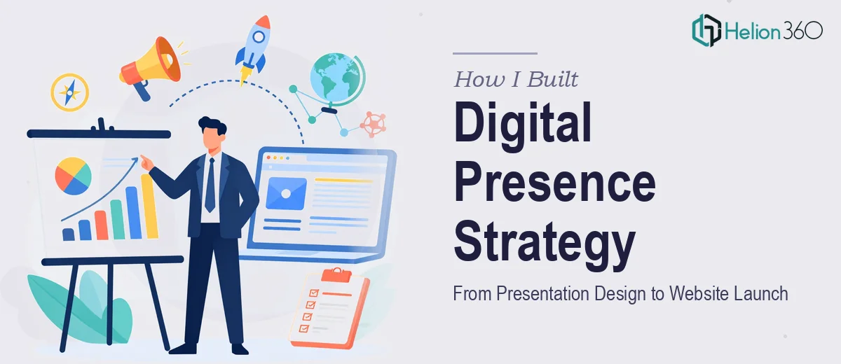
When One Project Quietly Became Two
It started as a straightforward assignment. A consulting firm was launching a new service line and needed two things: a polished presentation that could communicate their value proposition clearly, and a website that would bring their brand to life online. Both were meant to work together as part of a single digital presence strategy.
I figured I could manage it. I had done presentations before, and I understood the basics of organizing content for the web. I started with the consulting presentation — pulling together the firm's service overview, case studies, and key differentiators into a slide deck that could be used in client meetings and internal pitches.
The slide structure came together reasonably well. But then the real challenge showed up.
Where the Complexity Started Compounding
The consulting firm's leadership had specific expectations. The presentation had to feel authoritative but accessible — not the generic corporate template look, and not something that looked like it was thrown together over a weekend. They wanted a visual identity that carried consistently across every slide and then translated directly into the website design. Same typography, same color logic, same tone.
That cross-channel consistency is harder to execute than it sounds. I could design slides or draft web content, but doing both at a professional level — with unified branding, clean UX thinking, and presentation design that actually communicated the consulting firm's positioning — was stretching the project beyond what I could deliver alone within the timeline.
I also realized that the presentation needed more than just good-looking slides. It needed to tell a coherent story: who the firm serves, what makes them different, and why a prospective client should trust them with a real business problem. That kind of visual storytelling requires a design sensibility I was still developing.
After spending a few days running into the same walls, I reached out to Helion360. I explained the situation — the dual scope of presentation and digital presence, the branding consistency requirement, and the timeline. Their team understood the project immediately and took it from there.
What the Design Process Actually Looked Like
Helion360 started with the consulting presentation. Rather than jumping into slide layout, they worked through the content logic first — identifying the core message for each section and making sure the narrative arc was clear before anything was designed. The result was a presentation that moved from problem framing to solution positioning to proof points without feeling like a brochure.
The visual execution was sharp. Consistent use of the firm's brand colors, clean data visualization where metrics were involved, and a typographic hierarchy that made the deck easy to skim in a meeting room setting. It looked like something a senior consulting firm would actually put in front of a client.
From there, the same design language was carried into the website structure. Page layouts, section organization, and visual tone all drew from what had been established in the presentation. That made the website feel like an extension of the same brand, not a separate project bolted on afterward.
What I Took Away From This
The biggest lesson from this project was that presentation design and web design look like separate disciplines, but when they're built for the same brand and the same audience, they need to be developed with a shared vision. Treating them as two independent tasks was exactly what slowed me down in the first week.
I also came to appreciate how much thought goes into a consulting presentation that actually works. It is not just about making slides look clean. It is about understanding how a consulting firm builds trust with a potential client, and then designing a flow that supports that process visually and structurally.
The consulting firm ended up with a presentation they could use in prospect meetings and a website that reinforced the same message to anyone who looked them up afterward. Both pieces held up because they were built to work together from the start.
If you are working on something similar — a consulting presentation, a company profile deck, or a digital presence that needs to hold together across formats — Helion360 is worth talking to. They stepped in when the scope outgrew what I could manage alone and delivered work that genuinely reflected the firm's positioning.