

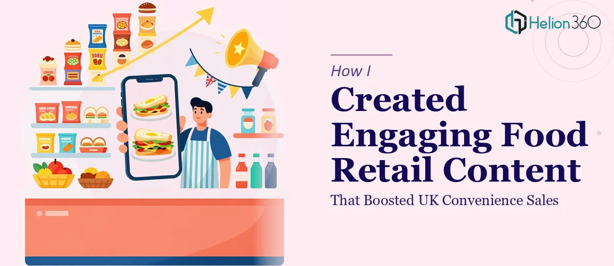
The Brief Looked Simple. The Execution Was Not.
I was working on a content and presentation project for a food retail brand operating in the UK convenience and online grocery space. The goal seemed straightforward: take existing documents, reorganize them, add some supporting data, and build a presentation that would communicate new brand initiatives clearly to internal stakeholders and potential retail partners.
On paper, it was a tight but manageable scope. In practice, it turned into something much harder to pull off.
Where It Got Complicated
The materials I was working with included a mix of marketing copy, raw sales data, category performance stats, and some rough notes about online convenience activation strategies. None of it was in a consistent format, and the story they were supposed to tell was buried underneath a lot of disconnected content.
I started by trying to reorganize the documents myself. I pulled out the key data points, identified the themes, and began building slides around the UK food retail narrative. But the more I worked on it, the more I realized the problem wasn't just structural — it was visual. The data needed to be presented in a way that felt compelling without being overwhelming. The food retail context required a design sensibility that balanced brand identity with clarity, and the online convenience angle needed its own visual logic to separate it from the in-store messaging.
I also kept second-guessing the hierarchy. What leads? The consumer trend data? The channel activation breakdown? The brand positioning statement? Every time I tried to lock in a structure, something else felt out of place.
Bringing in the Right Support
After spending more time than I had restructuring slides that still didn't feel right, I reached out to Helion360. I explained the project — food retail content for the UK market, a mix of in-store and online convenience activation, and a need for clean, persuasive presentation design that could hold up in a commercial setting.
Their team asked the right questions upfront: Who is the primary audience? Is this meant to sell in to retail buyers, align an internal team, or both? What tone does the brand carry? Those questions alone helped me realize I hadn't fully defined the presentation's purpose, which was part of why I was going in circles.
From there, Helion360 took the scattered source material and built a coherent content structure. The food retail data was visualized cleanly — category stats presented as digestible charts rather than raw numbers dropped into text boxes. The online convenience section was given its own visual identity within the deck, clearly differentiated but still consistent with the overall brand tone.
What the Final Presentation Looked Like
The finished deck opened with a sharp market context slide anchored in UK food retail trends, then moved into the brand's specific activation strategy for both physical convenience and online channels. Data points that previously looked like a spreadsheet dump were turned into clear, well-labeled visuals that supported the narrative instead of interrupting it.
The flow made sense. Each section built on the last, and the presentation could realistically be delivered in a focused meeting without the audience losing the thread. It felt like a professional retail pitch deck — not a collection of slides that happened to be in the same file.
What I Took Away From This
The content itself was never the real problem. The data existed. The initiatives were real. What was missing was a clear editorial and visual structure that made the food retail story easy to follow and hard to ignore. That kind of structure takes more than reorganizing slides — it takes design thinking applied to the content itself.
I also learned that when a presentation is being used to drive commercial outcomes — whether that's convincing a retail buyer or aligning a sales team around a convenience channel strategy — the design has to earn its place. It cannot just look professional. It has to actively support the argument being made.
If you're working on a similar project — food industry content, retail activation materials, or any presentation where the data and the story aren't quite connecting yet — Helion360 is worth talking to. They took what I had, figured out what it needed, and delivered something that actually worked.