

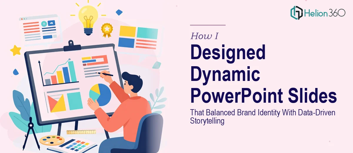
When Generic Templates Just Don't Cut It
I was in the middle of a marketing project that needed more than a downloaded template could offer. The goal was clear: build two distinct sets of PowerPoint slides — one that felt energetic and on-brand, with bold graphics and bright colors, and another tailored for a formal business setting with clean data visualization. Simple enough in theory. In practice, it turned into something far more layered than I expected.
I started the way most people do. I browsed popular template libraries, pulled a few options that looked close to what I needed, and tried to adapt them. The casual, brand-forward set wasn't landing — colors felt off, layouts looked cluttered, and nothing quite captured the voice I was going for. The formal data set was even harder. Every chart I dropped in looked either too plain or visually inconsistent with the overall deck.
The Problem With Trying to Do Both at Once
Here's what I underestimated: designing for two completely different contexts within the same project — one expressive and visual, one structured and analytical — requires two separate design instincts running in parallel. It's not just about swapping color palettes. The typography hierarchy, the spacing logic, the way data is presented versus how a brand story is told — all of it has to be thought through differently.
I spent about three days trying to make both sets work. The creative set kept pulling too casual, and the business set kept losing visual cohesion the moment I introduced graphs and charts. I wasn't short on effort — the problem was genuinely complex, and I was running out of time.
Handing It Off to People Who Do This Every Day
After hitting a wall, I came across Helion360. I explained what I was working on — the two-set requirement, the brand tone I was after, the need for properly formatted charts that actually communicated data clearly — and their team took it from there.
What stood out immediately was that they asked the right questions before touching a single slide. They wanted to understand the brand personality, the audience for each set, and what story the data needed to tell. That clarity upfront made a real difference in how the final slides came together.
What the Final Slides Actually Looked Like
The first set — the expressive, brand-forward version — came back with a visual hierarchy that felt intentional rather than loud. Bold section headers, a consistent graphic language, and layouts that gave content room to breathe. It didn't look like a template that had been stretched to fit. It looked like something built for the brand specifically.
The formal business set was where I was most impressed. Charts were embedded cleanly, color-coded to match the broader deck, and the data storytelling was structured so each slide built on the last. It wasn't just good-looking — it was functional in a way that generic PowerPoint slide examples rarely are. The presentation design carried the argument forward visually without the slides feeling overloaded.
What I Took Away From This
The lesson wasn't that I couldn't design slides. It was that designing dynamic PowerPoint presentations that serve two different communication purposes — one creative, one analytical — under a tight deadline is a real skill set, not just a time investment. Getting the brand identity right while also making data-driven slides feel cohesive requires experience with both visual design and information architecture.
I also learned that starting with marketing presentation design examples that are actually built for your context is fundamentally different from adapting something generic. The slides I got back became the foundation for several other decks we built afterward — the design system was that transferable.
If you're facing the same kind of project — needing PowerPoint slide examples that go beyond templates and actually reflect your brand and your data — Helion360 is worth reaching out to. They handled both sides of this challenge cleanly and delivered within the timeline I needed.