

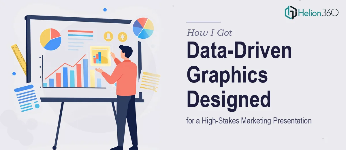
The Presentation Was High-Profile — and the Graphics Had to Match
The marketing presentation I was working on wasn't an internal team update. It was going in front of decision-makers who would be forming opinions within the first few slides. The deck needed to carry research findings, performance data, and strategic narrative — all packaged in a way that landed clearly and looked credible on a big screen.
The problem wasn't the content. The findings were solid. The problem was the visual layer. Raw data tables and placeholder charts weren't going to cut it. The graphics needed to do actual work — clarifying complex information quickly, reinforcing the brand, and giving the audience something they could follow without effort.
I recognized early that this wasn't a situation where "good enough" slides would serve the goal. The stakes were too high and the timeline too tight to risk it.
What I Found Out the Moment I Started Researching What This Actually Involves
My first instinct was to look at what strong presentation graphics actually require — not just aesthetically, but functionally. What I found was more layered than I expected.
First, choosing the right chart type isn't obvious. Bar charts, waterfall charts, dot plots, area charts — each communicates a different relationship between data points. The wrong choice doesn't just look off; it actively misleads the reader. That decision alone requires someone who understands data visualization conventions at a working level.
Second, infographic design inside a slide deck is not the same as standalone illustration. Each graphic has to function within a constrained aspect ratio, respect text hierarchy, and still be legible at varying screen sizes. That's a different discipline from general graphic design.
Third, brand consistency across multiple graphic styles — charts, icons, process diagrams, callout boxes — requires a tight system, not slide-by-slide decisions. Without that system, the deck reads as assembled rather than designed.
That combination of factors told me clearly: this was specialized work that needed a specialist.
What the Actual Work Involves When You Do This Properly
The first thing proper presentation graphics work requires is a structural audit of the source content paired with clear decisions about what each visual needs to communicate. A data point that belongs in a bar chart because it shows comparison over categories will fail if it's rendered as a line chart implying trend. Practitioners making these calls reference established data visualization rules — for instance, limiting a single chart to no more than five to seven data series before the visual becomes unreadable, and using annotation layers to direct the viewer's eye to the most important number. Getting this right for every graphic in a deck takes time even for experienced designers, and for someone without that background it's the kind of decision that looks simple until it produces a slide that confuses the room.
The second layer is visual mechanics — the actual construction of charts and infographics and layout grids that hold everything together. A well-built marketing presentation graphic sits inside a consistent layout system: typically a 12-column grid, with type set at a defined hierarchy (headline at 36pt, body at 20pt, caption at 14pt), and brand colors applied from a fixed palette of no more than four primary and two accent tones. Deviating from that system on even a few slides creates visual noise the audience registers even if they can't name it. Setting up slide masters and style guides that enforce this system across 20 or 30 slides is detailed, painstaking work that doesn't tolerate shortcuts.
The third element is brand consistency — making sure every graphic element, from the color fill on a bar chart to the weight of an icon stroke, reflects the brand standards. This means applying the exact hex values, the correct typeface weights, and the right spatial relationships defined in the brand guidelines — consistently, across every single asset. One off-brand chart in a high-profile deck breaks the visual trust the audience has built with the brand up to that point. Experienced designers work from a pre-built brand asset library and a locked style guide; without those tools already in place, building brand consistency from scratch is a substantial additional task layered on top of the design work itself.
Why I Brought Helion360 In to Handle the Full Project
Once I understood what proper presentation graphics required, the decision was straightforward. I didn't have the specialized data visualization knowledge, the brand asset system, or the time to build either from scratch. Attempting it myself would have meant weeks of learning curve with an uncertain result — and a high-profile presentation is not the place to run that experiment.
I engaged Helion360 to take on the full project end-to-end. They handled the content audit and graphic selection decisions, built out the full suite of charts and infographics, and applied brand colors and typography consistently across every asset. The work was turned around quickly — done in days, not weeks — which mattered given the timeline I was working against. What would have taken me several weeks of trial and error was handled in a fraction of that time by a team that does this work every day with the tooling already in place.
What the Project Delivered — and What I'd Tell Anyone in This Spot
The final presentation landed well. The graphics were clean, the data was easy to read, and the brand came through consistently across every slide. Decision-makers in the room were engaged rather than squinting at cluttered charts trying to decode what they were looking at. The visual layer did what it was supposed to do — it supported the narrative without getting in the way of it.
The deeper takeaway was understanding how much real craft goes into presentation graphics when the stakes are high. It's not a matter of making things look nice. It's structural decisions about how data is displayed, mechanical precision in how layouts are built, and disciplined brand application across dozens of individual assets. None of that is quick work and none of it is forgiving of shortcuts.
If you're looking at a similar situation — a high-profile marketing presentation where the graphics need to genuinely perform — Helion360 is the team I'd engage. They handled the full scope fast and delivered the execution depth this kind of work demands.