

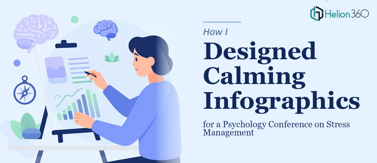
The Pressure Behind a Psychology Conference Presentation
I had a conference date locked in — four weeks out — and a presentation on stress management research that needed to land with a room full of psychologists, clinicians, and academics. The content was solid. The problem was the visual layer. I needed infographics that didn't just display research findings accurately, but did so in a way that felt intentional for the subject matter. A stress management presentation that looks visually chaotic is its own kind of irony.
The stakes were real. Conference audiences in this field are skeptical of flashy slides that oversimplify nuanced research. At the same time, a wall of text and generic bar charts wasn't going to hold a room. I needed a visual design approach that communicated scientific credibility while using color, layout, and composition deliberately — to set a tone that matched the content. I recognized quickly that this was not a problem I could solve by opening a slide deck and improvising.
What I Found This Kind of Work Actually Required
When I started researching what good psychology presentation design actually involves, two things became clear fast. First, the visual language has real rules. Color psychology in a clinical or mental health context isn't decorative — it's functional. Palettes built around desaturated teals, soft sage greens, and muted warm neutrals signal calm to an audience neurologically. That's not an opinion; it's grounded in decades of environmental psychology research. Choosing the wrong palette — something too saturated, too high-contrast, or too corporate — actively undercuts the message.
Second, translating research data into infographics is a discipline of its own. The kinds of findings that appear in stress management studies — effect sizes, comparison across intervention types, longitudinal trend lines — each have visualization conventions that a knowledgeable audience will notice. Getting those conventions wrong, or choosing chart types that obscure rather than clarify, damages credibility in a room full of researchers. I was looking at a real design challenge that required domain awareness, not just aesthetic taste.
What the Work Itself Actually Involves
The right approach to this kind of presentation starts with a structural audit of the research content. Before a single graphic gets built, the data needs to be mapped against a narrative arc — what finding leads, what supports it, and what the audience should carry out of the room. In a stress management context, that often means organizing around an intervention-outcome structure: here is the problem, here is the mechanism, here is the evidence. That sequencing work takes real time, and getting it wrong means even beautiful graphics feel disjointed. Most people underestimate how many revision cycles this narrative layer generates before the visual work can begin in earnest.
Once the structure is set, the visual mechanics need to be built with precision. A presentation like this typically runs on a constrained brand palette — no more than four core colors, with one dominant calm anchor (think muted teal or sage at roughly 60% usage), one supporting neutral, and two accent values used sparingly. Typography follows a clear hierarchy: a 36pt headline, 24pt subhead, and 16pt body minimum for readability in a conference room setting. Layout grids — typically a 12-column base — need to propagate consistently across every slide so that text blocks, data labels, and icon elements align without manual adjustment. For someone new to building master slide systems, that propagation work alone can consume an entire afternoon.
The infographic execution layer is where the complexity concentrates. Each data finding requires a deliberate chart-type decision: clustered bar charts for direct comparison across intervention groups, area charts for longitudinal trend data, icon arrays for proportion-based findings that need to feel human rather than abstract. Every chart needs axis labels at a legible size, source citations formatted consistently, and visual weight calibrated so no single graphic dominates the slide at the expense of the narrative. In a psychology conference setting, the audience will read the fine print — so citation formatting, scale accuracy, and label precision are non-negotiable. These aren't decisions that can be made quickly without prior experience in research presentation design.
Why I Brought in Helion360 to Handle It
I looked at what this project genuinely required — the palette discipline, the chart-type decisions, the master slide architecture, the research-to-narrative mapping — and made the call immediately. I didn't have the two to three weeks of learning and iteration that doing this well would have demanded. I had a conference date.
Helion360 handled the full project end-to-end. That meant taking the raw research findings and building out the narrative structure, designing the full palette and typography system aligned to a calming visual language, and producing every infographic with the chart types and labeling precision that a clinical audience expects. The turnaround was fast — the kind of speed that only comes from a team that does this work every day with the tooling and process already in place. What would have taken me weeks of trial and error was done in days, with a level of visual and structural quality I couldn't have reached on my own timeline.
The Result and What I'd Tell Anyone Facing the Same Problem
What came back was a complete presentation — cohesive visual system, properly structured infographics, a calm and credible palette that held together across every slide. The conference room response confirmed what the design work set out to do: the audience engaged with the findings rather than fighting through the visuals to reach them. Several people commented on how approachable the data felt, which in a room of researchers is about the best outcome a presenter can hope for.
If you're facing a similar situation — research-heavy content, a specific audience that will scrutinize both the data and the design, and a deadline that doesn't leave room for a learning curve — Helion360 is the team to engage. They delivered fast, handled the full execution depth this kind of work requires, and freed me to focus on the presentation itself rather than the production behind it.