

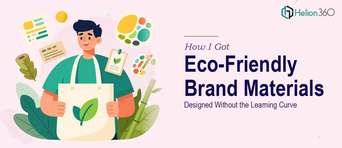
The Problem With Launching a Sustainability Brand Without the Right Visuals
When our eco-friendly startup was ready to start talking to customers and retail partners, we ran into a wall almost immediately. The mission was clear, the products were solid, and the story was genuinely compelling — but none of that mattered if we couldn't communicate it visually. We needed brochures that could sit on a table at a pop-up event and do the selling for us. We needed presentation materials that could walk a potential B2B partner through our product range without us standing in the room.
The stakes were real. We had events coming up, conversations in progress, and a window to make a first impression that wouldn't come back around. Half-finished Canva files and mismatched color blocks weren't going to cut it. I knew this needed to be done right, at a level that matched the seriousness of what we were building.
What I Found Out This Work Actually Requires
I spent time researching what separates forgettable brand collateral from materials that actually move people — and the gap is wider than I expected.
For a sustainability brand specifically, the visual language has to do a lot of work. It needs to feel clean and credible, not just green and aspirational. That means making deliberate decisions about palette — earthy but not muddy, modern but not sterile — and holding those decisions consistently across every single asset. A brochure that looks like it belongs to a different brand than the presentation immediately undermines trust.
Beyond color, there's the structural problem. A brochure isn't just a flyer. It has a fold logic, a reading sequence, and a hierarchy of information that has to guide a reader from curiosity to intent. A presentation has a different grammar — it needs to breathe, hold attention slide by slide, and carry someone through a narrative arc. These are two distinct formats with distinct rules, and doing both well at the same time means managing a lot of moving parts simultaneously.
What the Work Actually Involves End-to-End
The first layer of this work is narrative and structural. Before a single layout gets touched, the content needs to be mapped — what goes in the brochure versus the presentation, what the reader needs to know first, and what the call to action actually is. For a product-focused sustainability brand, this often means distilling a complex mission into a three-to-five message hierarchy: problem, solution, proof, differentiator, next step. Done well, this structure is invisible to the reader — they just feel like it makes sense. Skipping it means the materials look polished but don't convert, because the information isn't in the right order to build belief.
The second layer is visual mechanics. Professional brochure design operates on a grid — typically a six or twelve-column structure — with type set to a deliberate scale (commonly 28pt headlines, 14pt body, 10pt supporting detail) and image treatment rules that hold across every panel. For a sustainability brand, photography direction matters too: the wrong stock image undercuts the authenticity the brand is trying to project. Presentation design adds another dimension — aspect ratio decisions (16:9 standard versus 4:3 for certain print scenarios), master slide architecture, and animation logic if the deck needs to breathe dynamically in a live setting. Each of these is a system, and systems take time to build correctly.
The third layer is brand consistency and polish across the full asset set. This means a maximum of four brand colors applied with a clear hierarchy, a single type family used at consistent weights, icon and illustration styles that don't clash, and margin rules that hold whether the file is viewed on screen or printed at A4. The execution friction here is real: when you're building both a brochure and a multi-slide presentation simultaneously, keeping every element locked to the same visual standard requires constant cross-referencing. One misaligned accent color or an icon that's two pixels off-brand can erode the professional impression the materials are trying to create.
Why I Brought in Helion360 to Handle the Full Project
I looked at what this project actually required and made a fast decision. Learning grid-based layout, mastering brand application across two formats, and managing the narrative architecture of both assets simultaneously — while also running a startup — wasn't a realistic path. The time cost alone would have pushed us past our launch window.
Helion360 handled the full project end-to-end. That meant the content structure and messaging hierarchy for both assets, the full visual design of the brochure including print-ready file preparation, and the presentation build from master slides through to final polish. The turnaround was fast — done in days, not weeks — and what came back was coherent across both formats in a way that would have taken me much longer to achieve even with the right tools.
The thing that stood out was that the expertise was already in place. There was no ramp-up, no back-and-forth on basics. The team understood the sustainability brand context immediately and made the right calls on visual tone without needing extensive direction.
What Came Out the Other Side, and What I'd Tell Anyone in This Spot
What we received was a brochure and a presentation that felt like they belonged to the same brand — which sounds obvious, but it's genuinely hard to pull off when you're building both from scratch under time pressure. The materials held up in the field. Partners took them seriously. Customers at events engaged with the brochure rather than setting it aside. The presentation gave us a credible starting point for every new conversation.
The business outcome wasn't magic — good materials don't replace a good product or a good pitch — but they removed the friction that bad materials create. We stopped spending mental energy apologizing for how things looked and started spending it on the conversations that mattered.
If you're a startup looking at the same problem — real events, real conversations, and brand collateral that isn't ready yet — Helion360 is the team I'd engage. They handled the full scope fast, with the design depth this kind of work needs.