

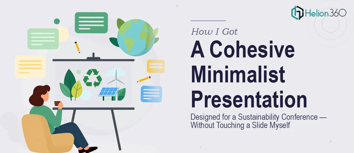
The Presentation That Couldn't Look Generic
I run a small startup in the sustainable living space, and we had a real moment coming up — a slot at an industry conference and a trade show appearance within the same month. The slides weren't a nice-to-have. They were the face of the brand in front of exactly the kind of audience we'd been trying to reach.
The brief was clear enough on the surface: clean, minimalist graphics, simple infographics, nothing cluttered or corporate-looking. But the moment I started pulling together what we actually needed — a cohesive deck that communicated our mission visually, held up on a large conference screen, and felt unmistakably on-brand — I realized this wasn't a matter of dropping some icons into a template. This needed to be done right, and done right meant doing it properly from the start.
What I Found the Work Actually Required
I spent some time researching what professional minimalist presentation design actually involves before assuming it was straightforward. The word "minimalist" is deceptive. It sounds like less work. In reality, achieving a genuinely clean aesthetic requires more discipline than a busy layout — because there's nowhere to hide inconsistency.
The first thing that caught my attention was how much structural thinking comes before any visual work. Knowing what each slide is trying to do, how the narrative flows from one to the next, what role each infographic plays in the overall story — that's foundational. Without it, the visuals end up decorative rather than functional.
The second signal was color and typography discipline. A minimalist deck typically operates on a maximum of three to four brand colors, with strict rules about when each appears. Typography hierarchies — title, subtitle, body, caption — need to be locked in and applied without deviation across every slide. The third thing I noticed was how technically involved Google Slides master slide structures can be when you're building them to propagate correctly. It's not the same as just editing individual slides one by one.
The Work That Goes Into Getting This Right
The foundation of a well-executed minimalist presentation is narrative structure. The right approach starts with auditing all source content — mission statements, campaign messaging, data points, product descriptions — and mapping it against a clear slide-by-slide story arc. For a conference context, that arc needs to move an unfamiliar audience from awareness to understanding in roughly fifteen to twenty slides. Practitioners working at this level will trim aggressively, keeping each slide to a single idea, which means making editorial decisions about what earns a slide and what gets cut entirely. That kind of structural discipline takes experience and is where most DIY attempts lose the thread early.
Visual mechanics are where minimalist design either works or falls apart. A properly built deck uses a consistent layout grid — typically a 12-column base — with defined margins and alignment zones that every element snaps to. Icon sets need to come from a single family so line weight and style remain uniform. Infographic elements like process flows or comparison visuals need to be built from scratch rather than pulled from incompatible stock sources. Typography runs on a strict hierarchy: 36pt for slide titles, 24pt for section headers, 16pt for body copy, with line spacing and letter spacing locked per style. Getting all of that right across thirty or more slides is technically precise work.
Brand consistency across the full deck is the part that quietly undoes otherwise good work when it isn't handled systematically. A sustainable living brand carries specific visual values — earthy or neutral palettes, purposeful whitespace, imagery that feels genuine rather than stock-photo generic. Applying a palette of three to four colors with defined usage rules (primary for headlines, secondary for accents, tertiary for background zones) requires master slide architecture in Google Slides, not manual slide-by-slide editing. When a color or font is adjusted late in the process, a properly built master propagates the change across all slides instantly. Building that infrastructure correctly from the start is the difference between a brand-consistent marketing presentation that's easy to maintain and one that breaks every time someone touches it.
Why I Brought in Helion360 to Handle It
I looked at what this project actually required and made the call quickly. I didn't have the design tooling, the Google Slides master-building experience, or the time to develop either in the weeks before the conference. Attempting it myself would have produced something that looked homemade on a large screen — the worst possible outcome for this specific audience.
Helion360 handled the full project end-to-end: narrative structure and slide mapping, minimalist graphic and infographic creation, and the complete brand-consistent Google Slides build with properly configured master slides. They turned it around fast — the kind of speed that only comes from a team that does this work every day, with the process and tooling already in place. What would have taken me weeks of learning and iteration was done in days.
What We Got and What I'd Tell Anyone in the Same Position
The deck that came back was exactly what a conference appearance needed: clean, visually coherent, immediately communicating what the brand stands for without a word of explanation. The infographics read clearly on a large screen. The color discipline was consistent from the first slide to the last. The narrative moved the way it needed to move for an audience encountering the brand for the first time. The response at both the conference and the trade show told me the visual presentation did its job.
If you're looking at a similar challenge — a conference deck, a campaign presentation, or any situation where the visual quality of your slides carries real stakes — and you can see what the work actually requires, Helion360 is the team to engage. They deliver fast, handle the full scope end-to-end, and bring exactly the kind of execution depth this work demands.