

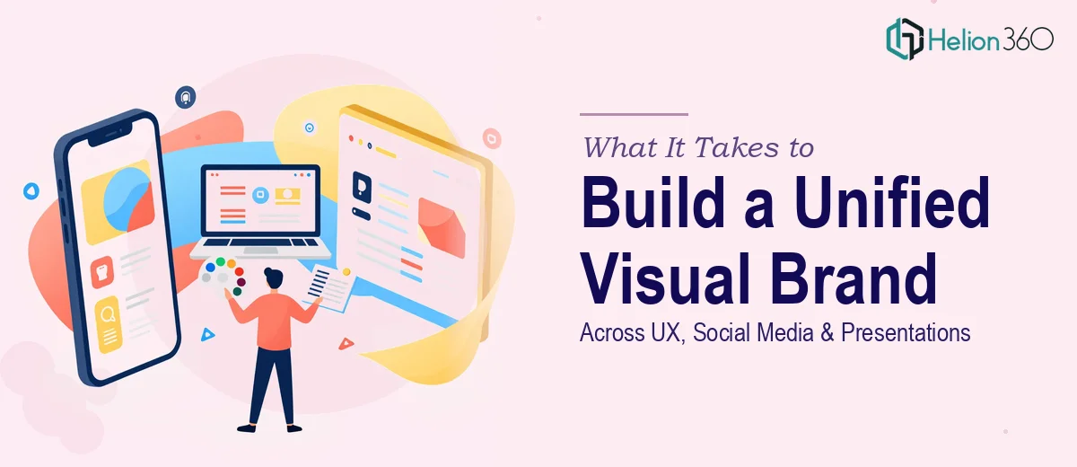
When Your Brand Needs to Show Up Everywhere at Once
I was working with a growing startup that had reached an inflection point. The product was ready, the team was growing, and the pitch calendar was filling up fast. But every time we put something in front of an external audience — whether it was a social post, a deck for a stakeholder meeting, or a product walkthrough — the visuals told three different stories. The typography didn't match. The colors were inconsistent. The presentation looked like it came from a different company than the website.
It wasn't a small problem. When you're asking investors, partners, and early customers to believe in what you're building, visual inconsistency reads as organizational inconsistency. I knew this needed to be solved properly — across every surface — before the next round of external appearances.
What I Found Out This Actually Involves
I started researching what a proper brand alignment across UX, social media, and presentations actually requires. What I found made it clear this wasn't a weekend project.
First, it's not a single discipline. UX design, social media graphics, and presentation design each operate under different constraints and conventions. A layout that works in a slide doesn't automatically translate to a social media card. A UI component from a product screen doesn't drop cleanly into a deck without significant reworking.
Second, the visual system has to be defined before anything gets applied. Without a documented brand system — covering color palettes, typeface hierarchies, spacing rules, and component logic — every designer making assets will improvise. And improvisation at scale is exactly what creates the mismatched look I was trying to fix.
Third, the volume of deliverables is real. Across UX screens, social content formats (Stories, feed, banners), and a full presentation template set, you're talking about dozens of distinct outputs that all need to feel like they came from the same source.
The Work That Goes Into Getting This Right
The foundation of any cross-platform visual system is a properly constructed brand identity layer. This means defining a primary palette of no more than four brand colors with documented hex, RGB, and print values, a typeface hierarchy using typically three levels (display at 36pt+, body at 16–18pt, caption at 12–13pt), and a spacing grid that governs padding and margins across all formats. Without this foundation locked in first, any individual asset produced is just a guess. Getting this right requires careful audit of existing brand assets, decisions about what to keep and what to standardize, and documentation that every downstream designer can actually follow — a process that takes real experience to do without over-engineering it.
Once the system exists, applying it to UX and social media surfaces is its own body of work. UX components need to inherit brand colors and typography through a design token system so that a button or card looks right across every screen state. Social media requires templates built to exact pixel dimensions for each platform format — a 1080×1080 feed square, a 1080×1920 Story, a 1200×628 link preview — with safe zones accounted for so no critical content gets clipped on mobile. Each format has different visual weight requirements, and a layout that looks balanced on desktop often reads as cluttered on a phone screen. This is where most in-house attempts stall.
Presentation design is where brand consistency is most visibly tested, because every slide is a side-by-side comparison to everything else the audience has seen from you. Proper presentation work at this level means building a master slide system — not just applying colors to existing templates, but constructing layout masters, content placeholders, and chart style presets so that every new slide a team member creates is on-brand by default. Getting a master slide architecture right, including propagating font and color defaults correctly through the PowerPoint or Google Slides file, takes hours even for someone experienced. For someone new to it, it's a trap that consumes days and still produces inconsistent results.
Why I Brought Helion360 In to Handle the Full Scope
Once I understood the full scope — brand system, UX graphics, social templates, and presentation architecture — it was obvious this wasn't something I could route through a stretched internal team or cobble together piecemeal. The work needed to move fast, and it needed to be coherent from start to finish.
I engaged Helion360 to handle the entire project end-to-end. They took the brief, audited the existing visual assets, and built the brand system from the ground up. From there, they applied it across the UX interface graphics, produced the social media template set across all required formats, and delivered a fully structured presentation master that the team could use going forward.
The turnaround was fast — done in days, not weeks. What would have taken me weeks of learning curve, trial and error, and cross-discipline coordination was handled by a team that does exactly this kind of work every day, with the tooling and process already built in. There was no ramp-up time on my end, and nothing came back needing to be redone.
The Result and What I'd Say to Anyone in This Position
What came out of the engagement was a visual system that actually held together across every surface. The social posts, the product screens, and the presentations all read as the same brand — not three departments improvising from the same logo file. Internal teams had templates they could work from without breaking the system. Stakeholder meetings had a noticeably different feel. The brand looked like it had earned its place in the room.
The lesson I'd pass on is straightforward: when the work spans multiple disciplines and the stakes are real, the cost of attempting it without the right expertise isn't just time — it's the compounding cost of inconsistency that follows you into every external touchpoint until someone fixes it properly.
If you're looking at a similar situation and need it handled end-to-end without the weeks of learning curve, Helion360 is the team I'd engage — they delivered fast and brought exactly the execution depth this kind of cross-platform brand work requires.