

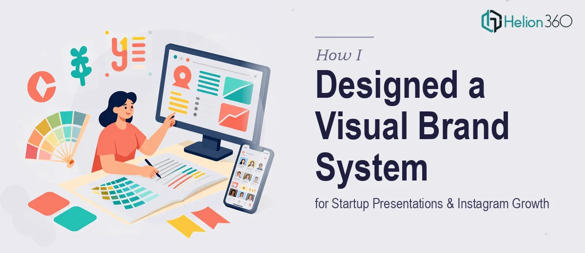
When One Startup Needed Everything at Once
I was brought in to help a young startup pull together their visual identity across two very different channels — business presentations for conferences and webinars, and an Instagram page that was barely getting off the ground. On paper it sounded manageable. In practice, it turned into one of the more complex design challenges I had tackled in a while.
The brand had energy and a clear personality. What it lacked was consistency. Their slides looked nothing like their social posts, their color usage was all over the place, and there was no shared visual language tying everything together. Before a single new slide or Instagram graphic could be created, I needed to establish a Visual Brand Identity Kit that would work across both formats.
Starting With the Brand, Not the Output
My first instinct was to jump straight into designing slides for an upcoming webinar. I held back. Designing without a clear brand system first would just create more inconsistency, which was exactly the problem we were trying to solve.
I started by mapping out color palettes, typography pairings, and icon styles that matched the startup's tone — modern, creative, and approachable. I put together rough mockups for both a presentation slide layout and a standard Instagram post template to test whether the same visual language could stretch across both formats. It mostly could. But once I moved into actual execution, the scale of the work became clearer.
The presentations needed multiple master layouts — title slides, content slides, data slides, and closing slides — each adapted for different event contexts. The Instagram side needed a consistent grid aesthetic, post templates for announcements, quotes, product features, and promotional content. That is a lot of ground to cover simultaneously, especially when both outputs needed to feel like they came from the same brand.
Where It Got Too Wide to Handle Alone
About two weeks in, I had solid brand guidelines drafted and a few working slide templates. But the full delivery scope — a complete business presentation template set plus a ready-to-use Instagram design system — was going to take longer than the timeline allowed. The startup had a conference coming up in three weeks and wanted the Instagram page relaunched around the same time.
That is when I reached out to Helion360. I walked them through the brand guidelines I had built, shared the draft slide layouts, and explained the dual-channel requirement. Their team took it from there.
What impressed me was how quickly they aligned with the visual direction I had already set. They did not start from scratch — they extended what existed and filled the gaps. The presentation design team produced a full master template with seven distinct slide layouts, all formatted for widescreen and optimized for live presentation settings. The social design side handled a complete brand overhaul across social media and website visuals, all maintaining the same grid feel and color system.
What the Final System Looked Like
By the time everything was delivered, the startup had a cohesive visual brand system that actually functioned across both channels. The business presentation templates were clean and professional — structured enough for a conference, flexible enough for internal webinars. The Instagram templates gave the marketing team a ready-made toolkit they could update themselves without breaking the visual consistency.
The conference went well. The Instagram page relaunch generated noticeably more engagement in the first two weeks compared to the months before. More importantly, the brand finally looked like a single, coherent identity whether someone was watching a slide deck or scrolling through a feed.
What I Took Away From This
Building a visual brand system across presentations and social media simultaneously is not just a design task — it is a systems problem. You are not making one thing look good. You are creating a framework that has to hold up across formats, team members, and contexts. Getting the brand foundation right before touching any output format saved a lot of rework. And knowing when to bring in a team with dedicated capacity for both presentation design and social media graphics made the difference between delivering on time and missing the mark.
If you are working through a similar challenge — trying to create consistent design across business presentations and social media with a tight timeline — Helion360 is worth a conversation. They handled the execution scope that was beyond what I could deliver alone, and the result held together exactly as intended.