

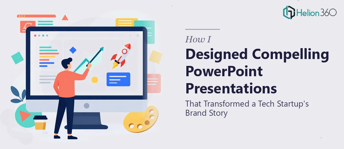
When a Startup's Vision Is Bigger Than Its Slides
I was handed what seemed like a straightforward task: build a PowerPoint presentation for a tech startup that would communicate their brand story, showcase key product features, and leave every viewer with a clear sense of what made this company worth paying attention to. The brief was ambitious — custom slide layouts, data visualizations, charts, branded graphics, and a visual language that felt as innovative as the company itself.
I knew presentation design. I had done it before. But this was a different kind of ask.
The Problem With Starting From Scratch
The startup had no consistent visual identity in place. There were scattered logo files, a rough color palette document, and a few product screenshots — nothing that added up to a coherent design system. Every slide I built felt like I was solving a new puzzle from scratch. The charts needed to work alongside illustrations. The typography had to feel modern without being trendy. The brand story needed to flow across slides in a way that felt intentional, not assembled.
I spent a full day trying to get the master slide template right. Then another few hours reworking the data visualization slides, which kept looking cluttered no matter how I simplified them. The presentation needed to do a lot of work — sell the vision, explain the product, and build trust — and getting all of that to coexist on professional-looking slides was harder than I expected.
It was not a skill gap so much as a time and scope gap. The project was growing faster than one person could manage well.
Bringing in a Team That Could Handle the Scope
After hitting that wall, I reached out to Helion360. I shared the brief, the raw brand assets, and the rough draft slides I had already built. Their team looked at everything and came back with a clear plan: a custom master template built around the startup's core colors and typography, a set of reusable slide layouts, and a visual storytelling structure that would guide the audience from problem to solution to product.
What stood out was how quickly they grasped the startup context. They understood that this was not a generic corporate presentation — it needed to feel dynamic and forward-looking. They rebuilt the charts so they were readable without being oversimplified, and created custom icon-based slides that made the product features feel tangible rather than abstract.
What the Final Presentation Actually Delivered
The finished PowerPoint was everything the brief asked for and more. The company profile slides established credibility right away. The product walkthrough section used a clean visual flow that made complex technical features easy to follow. The data slides used well-structured charts that communicated key metrics without overwhelming the viewer.
Perhaps most importantly, the presentation held together as a single visual experience. Every slide felt like it belonged to the same story. That consistency — something I had been struggling to achieve in my initial drafts — was exactly what the startup needed to make a strong impression.
What I Learned From the Process
Building a compelling startup PowerPoint is not just about making things look good. It is about constructing a visual argument — one that is credible, clear, and emotionally resonant. That requires both strong graphic design skills and an understanding of how audiences process information across a sequence of slides.
The back-and-forth process also reinforced something practical: the earlier you establish a proper template and slide structure, the faster everything else comes together. Trying to design and storytell at the same time, without a solid visual foundation, slows everything down.
If you are working on a company PowerPoint that needs to do real work — communicate a brand story, present data clearly, and look polished under pressure — Helion360 is the team worth contacting. They handled the parts of this project that I could not do justice to alone, and the result spoke for itself.