

When the Brand Story Was Clear But the Visuals Were Not
I had a clear vision for the brand. The story was there — the narrative arc, the values, the message we wanted to communicate. What I did not have was a visual language that could carry that story consistently across every medium it needed to live in.
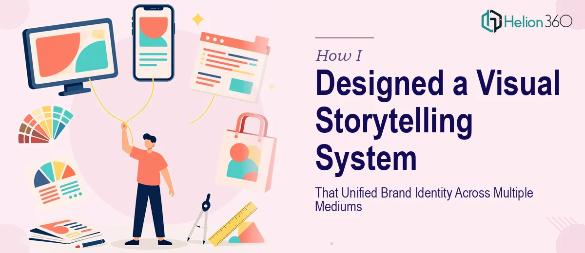
The project required creating graphic representations of complex narratives. Not just a logo or a single infographic, but a cohesive visual storytelling system that would hold together across promotional materials, presentations, social assets, and internal documentation. Each piece needed to feel like it belonged to the same world.
I started by sketching out concepts myself. I had a decent grasp of brand principles and understood how visual identity works at a surface level. I put together some rough concepts, referenced the brand colors, and started building out a few infographic layouts. For a while, it felt manageable.
Where the Complexity Started to Show
The problem appeared once I tried to scale those initial concepts. What worked as a standalone infographic did not translate cleanly to a presentation layout. The logo concepts I was developing did not feel consistent with the promotional material direction. Each piece was decent on its own, but together they lacked cohesion.
Graphic representation of storytelling is one of those disciplines that looks straightforward until you are actually doing it at scale. Translating an abstract brand narrative into visuals that feel intentional, not generic, requires a level of design thinking that goes beyond knowing the tools. I kept running into the same issue — the work looked competent, but it did not feel unified.
After a few rounds of revisions that were not moving things forward, I reached out to Helion360. I walked them through the brief: the brand story, the mediums involved, the visual direction I had been attempting, and where things were breaking down. Their team understood the problem quickly.
Handing Over the System Design
What Helion360 delivered was not just a set of individual design assets. They approached it as a system. They developed a visual identity framework that connected the logo concept, the infographic style, and the presentation design language into a single coherent direction. Every element — from typography hierarchy to icon style to color application — was defined so that any asset produced from that point forward would feel like part of the same story.
The infographics, in particular, came out stronger than I expected. They managed to take narratives that were dense with information and render them in a way that felt clean and purposeful rather than cluttered. The graphic representation of each concept was clear without oversimplifying what needed to be communicated.
The promotional material direction followed naturally from the identity system they had established. That consistency was exactly what had been missing from my earlier attempts.
What the Finished System Made Possible
Once the visual storytelling framework was in place, producing new assets became significantly faster. Because the design language was documented and consistent, extending it to new formats did not require starting from scratch each time. The brand finally had a visual presence that matched the strength of the story behind it.
I also learned something about the nature of brand identity design through this process. The hardest part is not designing individual pieces — it is creating the connective tissue between them. That is the work that requires genuine expertise in visual systems, not just software proficiency.
The project taught me that knowing what a brand needs to communicate and knowing how to build the visual architecture to communicate it are two separate skills. Having one does not automatically give you the other.
If you are working on a similar challenge — trying to create a graphic representation of your brand story that holds together across multiple mediums — Helion360 is worth reaching out to. They bring the kind of structured design thinking that turns disconnected assets into a unified visual identity.