

The Brief Was Bigger Than I Expected
When I first took on the task of building a PowerPoint presentation on salt batteries, I thought it would be a straightforward research-and-design job. The topic was clear enough — cover the history of salt batteries, their applications in renewable energy and transportation, current research, and future prospects. The presentation needed to run about 45 minutes, target both professionals and students, and include charts, images, and videos throughout.
Simple enough on paper. But once I started pulling the material together, I realized how layered this subject really is.
Where the Complexity Crept In
Salt batteries — also called sodium-ion batteries — sit at a fascinating intersection of electrochemistry, energy storage policy, and emerging industrial applications. The moment I started outlining the sections, I had a problem: how do you present something this technical without losing a general audience, and how do you keep it engaging for 45 minutes without turning it into a lecture?
I had the research. I could explain the electrochemical basics, the sodium-ion vs. lithium-ion comparison, the cost advantages, and the role salt batteries might play in grid-scale energy storage. But translating all of that into slides that actually worked visually — with charts that told a story, visuals that grounded the technical content, and a flow that kept the audience engaged — that was a different challenge entirely.
I drafted an opening slide and sketched out the main sections: introduction and history, how salt batteries work, real-world applications across renewable energy and electric vehicles, a look at current research, and a forward-looking section on future prospects and industry trends. It looked logical. But when I tried to build it out in PowerPoint, the slides felt flat. Dense text blocks, awkward chart placement, no visual hierarchy. The content was there, but it wasn't communicating.
Bringing in the Right Help
After a few frustrating revision cycles, I reached out to Helion360. I explained the full scope — the technical depth required, the mixed audience of students and industry professionals, the 45-minute runtime, and the need for a complete deck presentation with embedded media and data charts. Their team understood the assignment immediately.
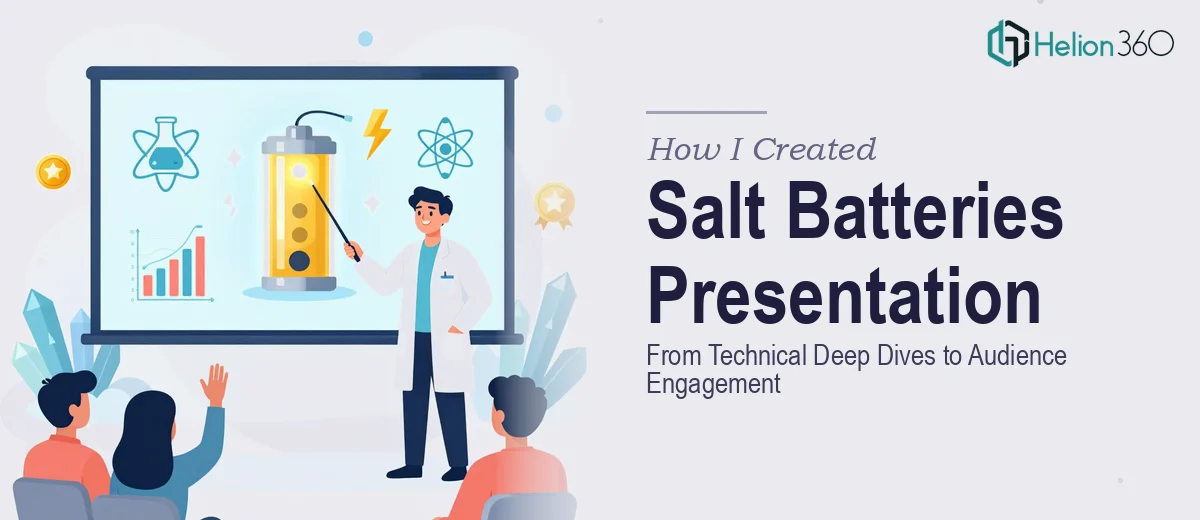
They took my outlined structure and research notes, then rebuilt the presentation from the ground up with a clear visual logic. Each section was given its own visual identity while staying within a consistent design framework. The history section used a clean timeline layout. The technical explanation of how salt batteries work was broken into a step-by-step visual sequence that made the electrochemistry accessible without oversimplifying it. Application slides used real-world imagery alongside comparative data charts — renewable energy storage versus traditional lithium systems, cost projections, adoption timelines.
For the research and future prospects sections, Helion360 incorporated infographic-style layouts that made trend data easy to read at a glance. They also flagged logical spots for video embeds, such as lab demonstrations and industry explainer clips, which added the engagement layer I had been struggling to build in.
What the Final Deck Actually Achieved
The finished presentation hit everything the brief asked for. It was built to carry a 45-minute delivery without any section feeling rushed or padded. The language throughout was clear and jargon-free — something I had specifically asked for — and the visual aids did real work on every slide rather than just decorating the content.
What surprised me most was how well the deck balanced depth and accessibility. Slides covering the technical aspects of sodium-ion chemistry sat comfortably next to slides on market adoption and industry trends, because the design system tied them together. Someone from an engineering background and someone from a policy or business background could both follow the same presentation without either feeling talked down to or left behind.
Working on this project taught me that presentation design for technical subjects is its own discipline. Getting the research right is one skill. Turning that research into a structured, visually engaging PowerPoint — especially one that has to hold an audience for nearly an hour — is something else entirely.
If you are working on a technical or research-heavy presentation and finding that the content alone is not enough to carry the slides, Helion360 is worth reaching out to. They handled the design and structure work that I could not pull off alone, and the result was a deck I was genuinely confident presenting.