

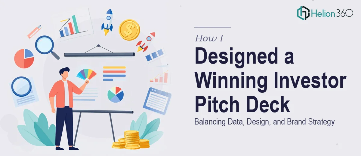
The Brief Seemed Simple Enough
We were preparing to approach investors and needed a pitch deck that could do a lot of work in a short amount of time. The deck had to tell our startup's story clearly, back it up with real data, and look polished enough that it didn't get dismissed in the first ten seconds of a meeting.
The scope was around 20 to 30 slides covering our company journey, traction metrics, market opportunity, product roadmap, and future plans. Charts and statistics needed to be woven in naturally, not just dumped onto slides. And because we're a tech-forward brand, the visual tone had to feel confident and modern — not generic corporate blue.
I figured I could pull this together myself. I had a working knowledge of PowerPoint and a rough outline in my head. I started building.
Where It Started to Fall Apart
The content came together faster than the design did. Writing the narrative wasn't the hard part. The hard part was making everything look like it belonged in the same deck.
I'd finish a data-heavy slide — say, a market size breakdown with a chart — and it would feel completely disconnected from the slides around it. The typography wasn't consistent. The color palette was drifting. One section felt like a startup pitch deck, the next felt like a business report someone threw into PowerPoint at 11pm.
I also struggled with the speaker notes. The investors we were meeting with use the notes section during prep, and writing clear, presentation-ready notes for 25 slides on top of designing them was simply more than I could manage well at the same time.
After two weeks, I had a deck that was functional but not investor-ready. The kind of deck that communicates "we tried" rather than "we're serious."
Bringing in the Right Team
At that point I reached out to Helion360. I explained where the deck stood — content mostly done, structure mostly there, but the design and polish were missing. I shared the draft along with our brand references and gave them the brief: 25 slides, modern tech-forward aesthetic, real data visualizations, and speaker notes on every slide.
Their team took over the design side completely. What I noticed almost immediately was that they weren't just making things look better — they were making structural decisions that improved the logic of the deck. Slides that had too much information got split. Data that was buried in bullet points got turned into clean visual charts. The brand identity came through consistently from the cover slide to the closing ask.
What the Final Deck Looked Like
The finished presentation was exactly what a startup pitch deck needs to be. The data visualization work was particularly strong — market size, growth projections, and traction charts were all rendered in a way that was readable at a glance but detailed enough to hold up under scrutiny.
The brand strategy aspect was also handled well. The tech-forward tone I had described wasn't just a color choice — it showed up in the layout decisions, the icon style, the type hierarchy, and how much white space was used. It felt like a coherent visual identity, not just a themed template.
The speaker notes were thorough and structured. Each slide had a clear talking track that matched what was on screen without simply repeating it word for word.
By the time I reviewed the final version, I realized I had been spending energy trying to do two jobs at once — content strategist and presentation designer — and doing neither as well as the situation required.
What I'd Tell Anyone in the Same Position
Building an investor pitch deck is not just a design task and not just a writing task. It's both simultaneously, and the two have to reinforce each other. When your brand strategy, data presentation, and visual design are all pulling in the same direction, the deck works. When they're not, investors notice — even if they can't articulate exactly why.
If you're at the stage I was — content ready but the deck not landing the way it should — Helion360 is worth reaching out to. They handled the design and structure work I couldn't finish alone, and the deck we walked into those meetings with was one I was genuinely confident in.