

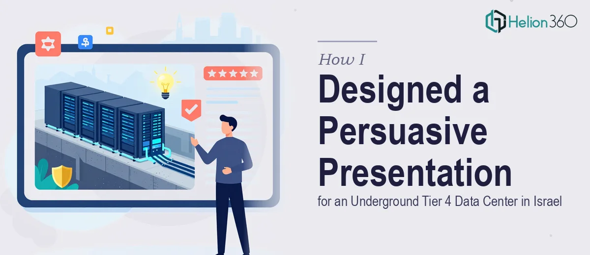
The Brief Was Technically Dense and Visually Demanding
I was tasked with building a customer-facing presentation for an underground Tier 4 data center based in Israel. The facility was genuinely impressive — built underground for physical security, certified to ISO 27001 standards, validated by TÜV SÜD, and equipped with advanced cooling infrastructure. The challenge was not understanding the technology. It was translating that depth of technical capability into something a potential enterprise client could absorb, trust, and act on.
This was not a generic company overview. The presentation had to simultaneously function as a sales deck, a trust-building document, and a technical showcase — all without overwhelming the reader or losing them in jargon.
Where the Complexity Really Hit
I started by mapping out the content architecture. The presentation needed to cover the data center's physical security advantages, its underground construction as a differentiator, Tier 4 uptime guarantees, ISO 27001 compliance, TÜV SÜD certification, cooling system reliability, and the overall value proposition for clients storing critical data.
The content itself was clear enough. But when I started laying it out, the visual execution became the real problem. Technical infrastructure presentations carry a specific visual weight. They need to look credible and precise — not like a standard marketing deck. Diagrams showing cooling systems, security architecture, and redundancy models had to be accurate and professional. Every slide needed to support the message that this was an enterprise-grade facility, not just claim it.
I spent time trying to build the layout myself, but what I was producing looked flat compared to the standard these conversations demand. The certifications section especially needed treatment that conveyed authority. A poorly designed slide showcasing ISO 27001 or TÜV SÜD credentials can actually undermine the trust those certifications are meant to build.
Bringing in the Right Support
After hitting that wall, I reached out to Helion360. I shared the full content brief, the facility details, the certification documents, and a rough slide outline. Their team asked a few sharp questions about the target audience — specifically whether this was going to C-suite decision-makers, procurement teams, or technical evaluators — and then got to work.
What came back was a presentation that handled the technical density without losing clarity. The underground data center's physical layout was visualized cleanly. The security measures were communicated in a way that felt factual and reassuring rather than promotional. The cooling and redundancy sections used structured visual hierarchies that made complex infrastructure easy to follow at a glance.
What the Final Presentation Actually Delivered
The finished deck covered the full story — from the facility's physical and geographic advantages in Israel, through its Tier 4 uptime specifications, to the ISO 27001 and TÜV SÜD certifications — in a sequence that built confidence progressively. Each section answered the question a cautious enterprise buyer would ask before the next one came up.
Visually, the data-driven presentation used a controlled dark palette that matched the underground, secure-environment positioning. Iconography was consistent, data callouts were prominent without being aggressive, and the certification section was laid out in a way that gave those credentials the visual weight they deserved.
The result was a professional customer presentation that could be used in boardroom settings, sent as a leave-behind after a site tour, or shared with prospects during the evaluation phase. It worked across contexts because the design was clean and the content hierarchy was sound.
What I Took Away from This Project
Building a data center presentation for an audience that takes infrastructure decisions seriously is different from most business decks. The margin for looking unprofessional is smaller. When the facility is selling security and reliability at the highest tier, the presentation itself has to reflect those same qualities — in every layout choice, every diagram, every data point displayed.
Getting the content right is only half the task. The other half is making sure the visual execution matches the standard of what you are presenting.
If you are working on a similar technical customer presentation and finding that the design execution is not matching the quality of the underlying content, Helion360 is worth reaching out to — their team handled exactly that gap on this project and delivered a deck that was ready for a high-stakes audience.