

The Brief Sounded Simple Enough
When our startup needed a presentation to explain a fairly technical product to a mixed audience — part investors, part potential partners — I volunteered to take the first pass at it. We had the data. We had the messaging. We had the brand guidelines. I figured pulling it all together into a clean deck would take a weekend at most.
It did not take a weekend.
Where Things Started to Break Down
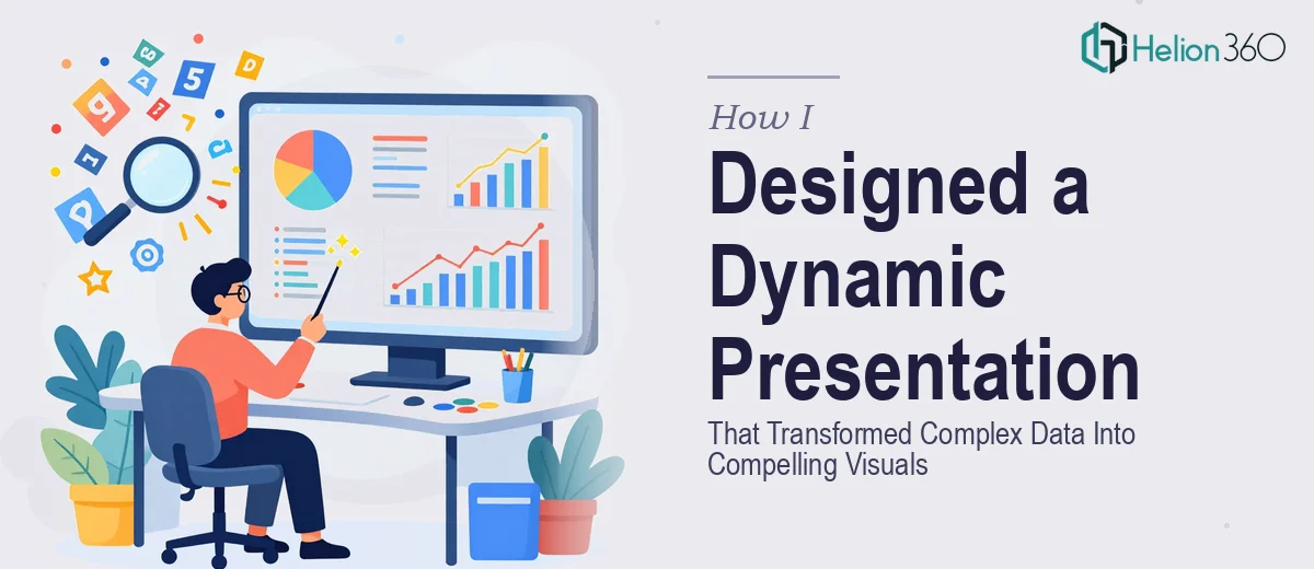
The content itself was solid. The problem was translating it visually. Our data covered market growth trends, feature comparisons, user adoption curves, and competitive positioning — all of which needed to land clearly without overwhelming the audience. Every time I laid it out in PowerPoint, it either looked too dense or too stripped down.
I tried reorganizing the slide flow, experimenting with chart types, and pulling in some free templates. None of it felt cohesive. The charts looked mismatched. The typography was inconsistent. And the overall deck had no visual rhythm — each slide felt like a standalone document rather than part of a continuous story.
The bigger issue was that I was thinking like someone who understood the data, not like someone who needed to be convinced by it. That gap between knowing the content and designing for an audience is harder to close than I expected.
Realizing This Needed More Than Good Intentions
After a few frustrating revision cycles, I accepted that this was not just a design problem — it was a data visualization and visual storytelling problem layered on top of a presentation design problem. That combination required a specific skill set I did not have at that level.
A colleague pointed me toward Helion360. I reached out, shared the raw content, our brand guidelines, and explained the audience and goal. Their team asked a few clarifying questions about tone, slide count, and where in the flow we needed the data to do the heavy lifting. Then they got to work.
What the Process Actually Looked Like
The turnaround was faster than I anticipated. Within the first review draft, the structure had already improved considerably. They had reorganized the slide sequence to build tension before releasing the key data points — which sounds like a small thing but makes a real difference when someone is watching a live presentation.
The data visualization work was where I noticed the most impact. Charts that I had been rendering as basic bar graphs were rebuilt as cleaner comparative visuals with clear callouts. The user adoption curve, which had looked like a flat line in my version, was redesigned with annotations that guided the viewer through the story the numbers were actually telling.
Branding stayed consistent throughout. Every slide used the same type scale, the same color logic, and the same spacing system — something I had struggled to enforce manually across 20-plus slides.
What a Well-Designed Presentation Actually Does
Seeing the finished deck side by side with my original draft made one thing obvious: dynamic presentation design is not about making things look impressive. It is about controlling where the audience's attention goes and in what order. When that works, the content feels effortless to follow — even when the underlying data is genuinely complex.
For a startup presentation specifically, that clarity matters more than most people realize. Audiences in those rooms are making fast judgments. A slide that requires effort to read loses the room before the speaker can recover it.
The version Helion360 delivered did not just look better. It communicated more effectively, moved with a consistent rhythm, and held together as a complete visual argument rather than a collection of slides.
If you are working on an informative presentation that involves dense data, multiple stakeholders, or a tight deadline, and you are hitting the same wall I hit, Helion360 is worth reaching out to — they handled the parts I could not and delivered something I could confidently present.