

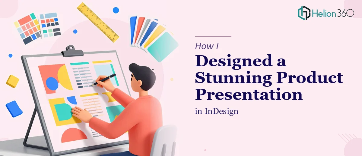
The Brief Looked Simple Enough
We had a new product line ready to go and needed a presentation to support it — something that could walk stakeholders through the full range, highlight each product's features and benefits, and do it in a way that felt polished and on-brand. The tool of choice was Adobe InDesign. The idea was to produce a document-style layout that looked more editorial than a standard slide deck, with clean typography, structured sections per product category, and visuals that actually did justice to what we were showcasing.
I had a clear picture in my head of what the final InDesign presentation should look like. I just needed to build it.
Where Things Got Complicated
I started by mapping out the sections — an intro spread, individual product category pages, a features breakdown per item, and a closing summary. The structure made sense. Getting it to look right in InDesign was a different challenge.
My familiarity with InDesign is functional but not deep. I can set up a basic document, work with master pages, and drop in images. But the moment I tried to create a layout system that would stay visually consistent across 20-plus product entries — each with its own image, copy block, spec highlights, and brand color treatment — things started to drift. Margins shifted between pages. The type hierarchy felt inconsistent. Images weren't aligning the way I wanted them to, and the overall presentation lacked the visual cohesion that professional product presentation design materials need.
I tried adjusting paragraph styles, rebuilding the master pages, and reworking the grid. It helped, but the layout still didn't feel like something I'd want in front of a client or at a product launch.
Bringing in Outside Help
After spending more hours on it than I had budgeted, I reached out to Helion360. I explained the goal — a multi-section InDesign product presentation, informative and visually engaging, with consistent design across all product entries. I shared the rough structure I'd built, the brand guidelines, and the image assets we had available.
Their team took it from there. They asked a few clarifying questions about font preferences, the color scheme, and how much white space we wanted in the layout — exactly the kind of detail that makes the difference between a generic document and something that feels intentional.
What the Final Presentation Looked Like
The result was a structured, well-layered InDesign presentation that actually matched what I had envisioned. Each product category had its own section opener with a strong visual and a clean headline treatment. Individual product spreads used a consistent grid that made the features easy to scan without feeling like a spec sheet. The typography was balanced — not decorative for the sake of it, but clear and purposeful.
The color application followed the brand palette without feeling flat. Where I had struggled to make the layout breathe, the redesigned version used spacing and visual hierarchy to guide the reader naturally through each product.
What I Took Away From This
InDesign is a powerful tool for product presentation design, but getting it right — especially at scale across a full product catalog — requires more than a basic working knowledge. The difference between a layout that functions and one that communicates well comes down to the details: consistent type styles, a solid grid system, intentional use of color and imagery, and a design sensibility that keeps everything feeling unified.
For this project, the complexity wasn't in the concept. It was in the execution. Having someone who works in InDesign at a professional level handle the build meant the final document was something I was genuinely proud to share.
If you're working on a product presentation in InDesign and finding that the execution isn't matching the vision, Helion360 is worth reaching out to — they stepped in at exactly the right point and delivered a presentation that did the product line real justice.