

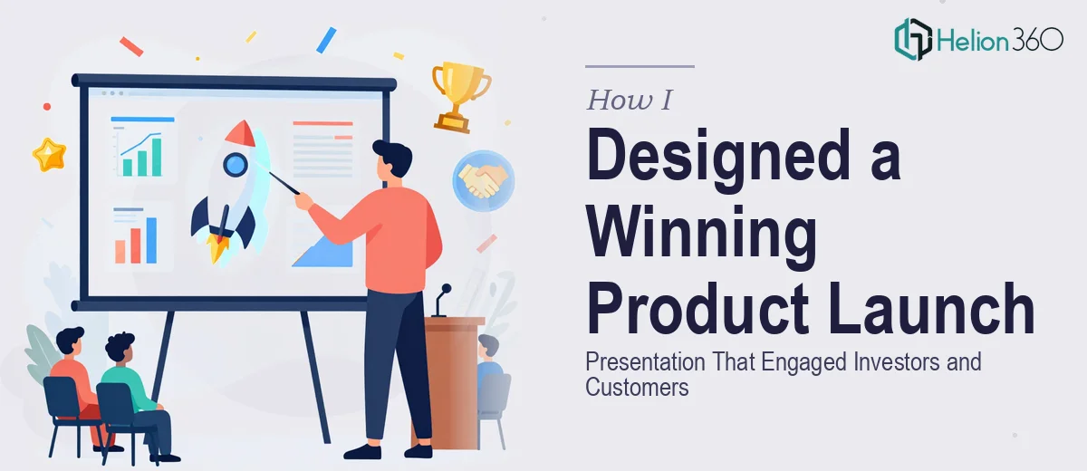
The Brief Sounded Simple. The Execution Was Not.
When our team launched a new product line, I volunteered to handle the presentation. The audience was mixed — potential customers, investors, and a few industry peers. I knew the content well. What I underestimated was how much work it would take to turn that content into something that actually looked as strong as the product itself.
I started in PowerPoint, building out slides with the core messaging, product features, and market positioning. The structure made sense. The problem was everything else — the visual design, the layout hierarchy, the color application, the typography choices. Every time I tried to make a slide look polished, something felt off. The charts were too heavy. The graphics clashed with the brand colors. The overall deck looked like a well-organized document, not a compelling presentation.
Where My Approach Hit a Wall
I spent two evenings trying to get the visual storytelling right. The issue was not a lack of content — it was a gap in design execution. A product launch presentation needs to do two things at once: inform and impress. For investors, it needs credibility and clarity. For customers, it needs to feel exciting and relatable. Balancing both within the same deck, while staying on-brand, is harder than it sounds.
I knew how to structure an argument. I did not know how to make a slide breathe — how to use white space intentionally, how to lead the eye from one element to the next, or how to make data visuals feel like part of the story rather than interruptions in it.
After hitting that wall, I came across Helion360. I explained the project — the audience mix, the brand guidelines, the tone we were going for — and their team took it from there.
What the Design Process Actually Looked Like
The Helion360 team asked the right questions upfront. They wanted to understand not just what the slides should say, but what impression each section needed to leave. For the investor-facing slides, the focus was on clean data visualization and a confident visual hierarchy. For the product showcase sections, they leaned into bolder visuals, product imagery, and layouts that gave the content room to land.
They reworked the color scheme to stay true to our brand identity while giving each section its own visual rhythm. Typography was standardized — something I had been inconsistent with throughout my draft. Icons and graphics were replaced with custom visuals that actually matched the content context. The animated transitions were subtle but purposeful, giving the presentation a sense of forward momentum without being distracting.
The result was a presentation that felt cohesive from the first slide to the last.
What the Final Deck Delivered
The presentation ran across three key sections: the product overview, the market opportunity, and the roadmap ahead. Each section had its own visual identity within the overall design system, so the audience always knew where they were in the story without needing a narrator to spell it out.
Investors responded to the clarity. Customers responded to the visuals. The feedback after the first run was that the deck felt professional without being stiff — which was exactly the balance we had been aiming for.
Looking back, the content I had built was solid. What it needed was a designer who understood both visual storytelling and the specific demands of a multi-audience presentation. That combination is harder to find than most people expect, and it is not something you can fully replicate by tweaking templates.
What I Took Away From This
A highly visual presentation is not just about making things look nice. It is about making sure every design decision — layout, color, type, imagery — is working in the direction of your message. When those elements are misaligned, even a strong product story can fall flat.
This project also taught me that knowing your content is only half the job. The other half is communicating it in a way that the audience receives it as intended, not just as information, but as an experience.
If you are in the same position — strong content, unclear design direction, and a high-stakes audience — Helion360 is worth a conversation. They handled the design complexity I could not manage alone and delivered a deck that held up in the room.