

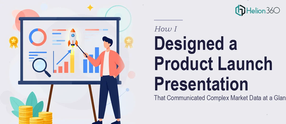
The Brief Looked Simple — Until I Opened the Draft
When our team decided it was time to put together a product launch presentation, I volunteered to lead the design effort. We had a rough draft, a clear message, and a real deadline. I figured a few focused days in PowerPoint would be enough to pull it together.
The deck needed to cover everything — product features, market analysis, the competitive landscape, and a clear argument for why our solution stood out. On paper, that is a straightforward structure. In practice, it turned into one of the more challenging design problems I had faced in a while.
Where the Complexity Started to Show
The content itself was solid. The marketing team had done good research, and the data we had on market size, competitor positioning, and customer pain points was genuinely compelling. The problem was translating all of it into a presentation that an audience could absorb quickly.
Market analysis data, when dropped into slides as raw numbers or dense paragraphs, stops communicating and starts overwhelming. I spent a couple of days trying different chart formats, layout approaches, and visual hierarchies. Each version either looked cluttered or stripped out too much of the substance.
The competitive landscape section was particularly stubborn. We had a multi-dimensional comparison that needed to show differentiation at a glance without turning into a wall of text or an oversized table. I tried comparison matrices, icon-based layouts, and simplified graphs — none of them felt right for the tone we needed.
I also ran into a structural issue. The draft had a logical flow as a document, but presentation logic is different. Slides need to guide attention and build a narrative, not just transfer information. Reorganizing it while keeping the content intact took more time than I expected.
Bringing in the Right Support
After hitting that wall, I reached out to Helion360. I shared the draft, explained what the deck needed to accomplish, and described the specific sections that were not coming together. Their team asked a few pointed questions about the audience, the setting, and the visual tone we were going for, then got to work.
What came back was a different level of execution. The market data slides were restructured around visual anchors — clean data visualization that guided the eye without hiding the numbers. The competitive landscape was redesigned into a positioning framework that made differentiation immediately readable. Each section had a clear opening slide that set up the narrative before the detail came in.
The overall design was consistent, branded, and built around how stakeholders actually read a presentation — scanning headlines first, then digging into supporting content. That structure was something I had been trying to build manually but could not quite land.
What the Final Deck Actually Delivered
The finished polished PowerPoint presentation worked on two levels. For someone reviewing it quickly, the key messages were visible within the first glance at any slide. For someone going deeper, the data and analysis were all there, organized in a way that built the argument methodically.
The competitive analysis section in particular came out sharper than I expected. It showed our product's position clearly without oversimplifying or making claims the data could not support. That balance — honest and compelling — is harder to achieve in slide design than most people realize.
We used the deck for stakeholder alignment internally and for the broader launch presentation. The feedback from both audiences was positive, and more importantly, the questions that came up after were the right ones — focused on strategy and next steps, not on trying to interpret what the slides meant.
A Few Things I Took Away From This
Product launch presentations are not just about looking polished. They are about making complex information usable under time pressure. Market data needs visual design to become insight. Competitive positioning needs structure to become persuasion. Those are design problems, not just content problems.
I also learned that knowing when a task has grown beyond what you can execute well in the time available is not a failure — it is just accurate project management. The outcome was better for it.
If you are working on a product launch or competitive analysis deck and the complexity is slowing you down, Helion360 is worth reaching out to — they handled exactly the kind of problem I was stuck on and delivered work that was ready to present.